Day 7 : HTML - 上下左右!如何用Flex的属性去控制grid?
这篇想和大家聊聊,如何用Flex的相关属性控制CSS grid的排列位置
和Flex能用的属性大致上一样,但多了justify-self和justify-content
也多了align和justify的缩写place
可用的语法能分成以下三种:
控制「水平方向」
- justify-items
- justify-self
- justify-content
控制「垂直方向」
- align-items
- align-self
- align-content
缩写
- place-items
- place-self
- place-content
那我们就来看该如何操作它们吧!
首先,我们先看一下HTML和CSS的代码
HTML:
<div class="grid_container">
    <div class="box box_self_2"></div>
    <div class="box box_self"></div>
    <div class="box"></div>
    <div class="box"></div>
    <div class="box"></div>
    <div class="box box_self_2"></div>
    <div class="box"></div>
    <div class="box box_self"></div>
</div>
CSS:
.grid_container {
    display:grid;
    grid-template-columns:60px 60px 60px 60px; /* 也可写成repeat(4, 60px) */
    grid-template-rows:35px 35px; /* 也可写成repeat(2, 35px) */
}
.box {
    background-color:rgb(238, 164, 44);
    width:40px;
    height:20px;
}
.box_self {
    /* 稍後示范self的时候会用到 */
}
.box_self_2 {
    /* 稍後示范align-self:baseline的时候会用到 */
}
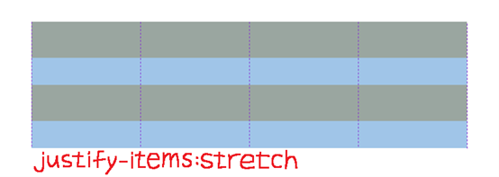
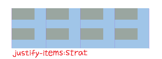
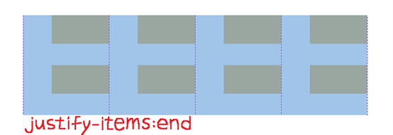
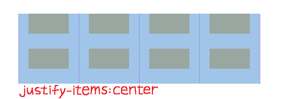
Justify-items
Justify-items是用来控制网格「内元素」的「水平方向」的对齐位置
可用属性有以下四种:
- Stretch (预设值,想测试请记得内元素不能设定width)
- strat
- end
- center
让我们看以下范例
CSS:
.grid_container {
    justify-items:stretch | start | end | center;
}
结果如下图所示:
Stretch是预设值,会往水平方向将内元素全部填满
如果你有设置width,则不会起作用
从水平方向的「起点」开始排
从水平方向的「终点」开始排
排在「起点」和「终点」的中间
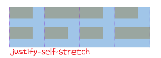
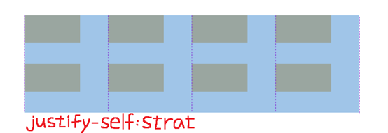
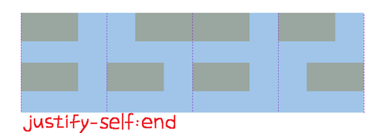
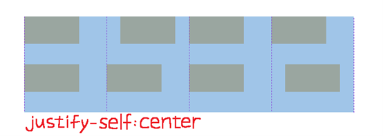
Justify-self
Justify-self和justify-items的功能一样,但它是针对「单一」对象
可用属性有以下四种:
- stretch (预设值,想测试请记得内元素不能设定width)
- start
- end
- center
让我们看以下范例
CSS:
(注意:这里的box_self只有box_2和box_8有)
.box_self {
	width:auto; /* 想测试stretch请记得加这行 */
    justify-self:stretch | start | end | center;
}
结果如下图所示:
Stretch是预设值,box_self会往水平方向将内元素全部填满
如果你有设置width,则不会起作用
box_self会从水平方向的「起点」开始排
box_self会从水平方向的「终点」开始排
box_self会排在「起点」和「终点」的中间
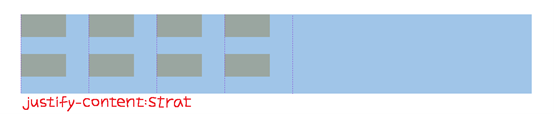
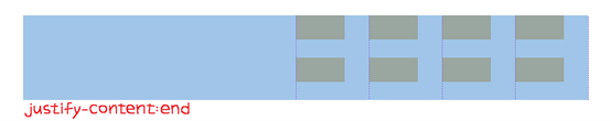
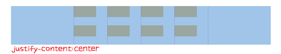
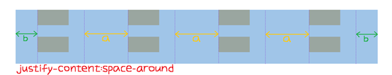
justify-content
justify-content是用来控制网格「本身」的「水平方向」的对齐位置
可用属性有以下六种:
- start (预设值)
- end
- Center
- Space-around
- Space-between
- Space-evenly
让我们看以下范例
CSS:
.grid_container {
    justify-content:start | end | center | space-around | space-between | space-evenly;
}
结果如下图所示:
从水平方向的「起点」开始排
从水平方向的「终点」开始排
排在「起点」和「终点」的中间
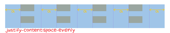
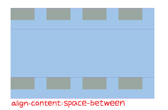
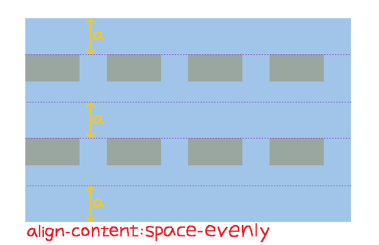
Space-around是平均分配「网格」位置,但左右两侧的间距会较小
Space-between是平均分配「网格」位置,但左右两侧会贴齐起点、终点
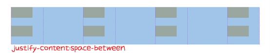
Space-evenly是「网格」和「左右两侧」的间距皆相同
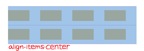
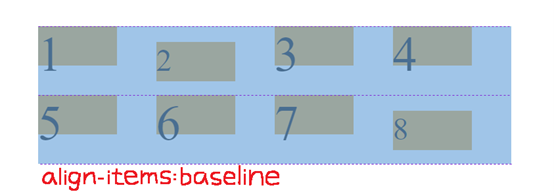
align-items
和jusitfy-items的用法类似,都是用来控制网格「内元素」,但align-items它是用来控制「垂直方向」的对齐位置
可用属性有以下五种:
- Stretch (预设值,想测试请记得内元素不能设定height)
- start
- end
- center
- baseline (要测试请记得在.box内设
font-size:25px,在.box_self内设font-size:unset)
让我们看以下范例
CSS:
.grid_container {
    align-items:stretch | start | end | center | baseline;
}
.box {
    font-size:25px; /* 想测试baseline请记得加这行 */
}
.box_self {
    font-size:unset; /* 想测试baseline请记得加这行 */
}
结果如下图所示:
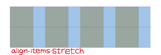
Stretch是预设值,会往垂直方向将内元素全部填满
如果你有设置height,则不会起作用
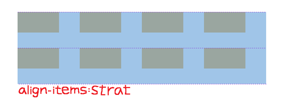
从垂直方向的「起点」开始排
从垂直方向的「终点」开始排
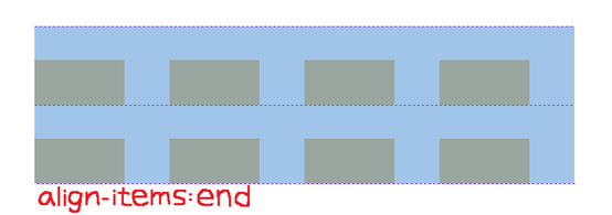
排在「起点」和「终点」的中间
baseline都是以「字体下方」去做对齐
要测试请记得在**.box内设font-size:25px,在.box_self**内设font-size:unset
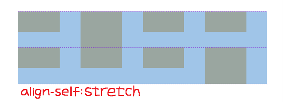
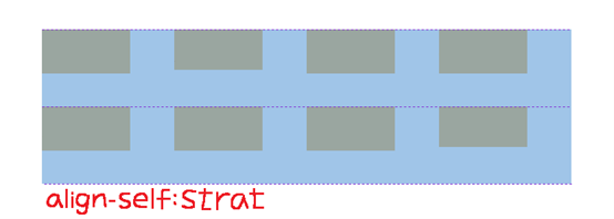
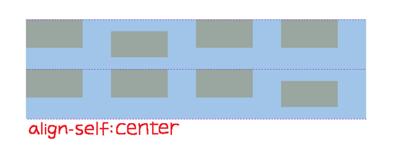
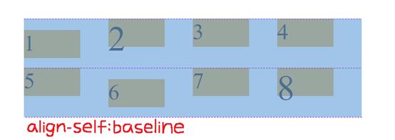
align-self
align-self和align-item的功能一样,但它是针对「单一」对象
可用属性有以下五种:
- Stretch (预设值,想测试请记得内元素不能设定height)
- start
- end
- center
- baseline (想测试请记得在.box_self内设
font-size:30px)
让我们看以下范例
CSS:
.box_self {
    height:auto; /* 想测试stretch请记得加这行 */
    align-self:stretch | start | end | center | baseline;
	font-size:25px; /* 想测试baseline请记得加这行 */
}
.box_self_2 {
    align-self:baseline; /* 想测试baseline请记得加这行 */
}
结果如下图所示:
Stretch是预设值,box_self会往垂直方向将内元素全部填满
如果你有设置height,则不会起作用
box_self会从垂直方向的「起点」开始排
box_self会从垂直方向的「终点」开始排
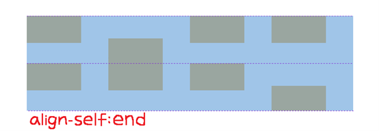
box_self会排在「起点」和「终点」的中间
box_self会排在「字体下方」
想测试请记得在.box_self内设font-size:25px,并在.box_self_2内设align-self:baseline
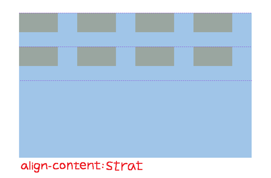
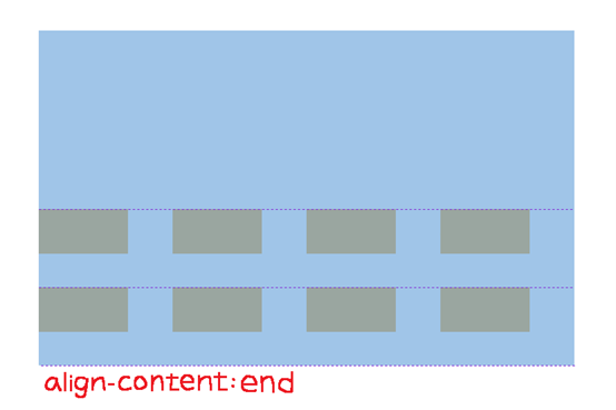
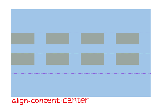
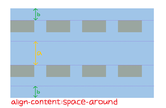
align-content
和justify-content的用法相似,都是用来控制网格「本身」,但align-content它是用来控制「垂直方向」的对齐位置
可用属性有以下六种:
- start (预设值)
- end
- center
- space-around
- space-between
- space-evenly
让我们看以下范例
CSS:
.grid_container {
    align-content:start | end | center | space-around | space-between | space-evenly;
}
结果如下图所示:
从垂直方向的「起点」开始排
从垂直方向的「终点」开始排
排在「起点」和「终点」的中间
Space-around是平均分配「网格」的位置,但上下两侧的间距会较小
Space-between是平均分配「网格」的位置,但上下两侧会贴齐垂直方向的起点、终点
Space-evenly是「网格」和「上下两侧」的间距皆相同
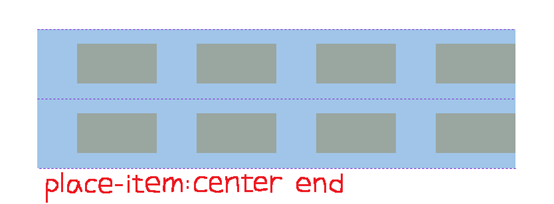
Place-items
Place-items是align-items和justify-items的缩写
写的顺序为place-items:align-items 「空格」 justify-items
让我们看以下范例
CSS:
.grid_container {
    place-items:center end;
}
结果如下图所示:
垂直方向为center,水平方向为end
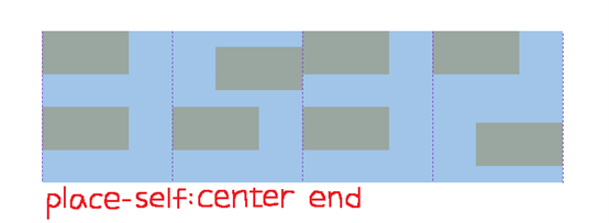
Place-self
Place-self是align-self和justify-self的缩写
写的顺序为place-self:align-self 「空格」 justify-self
让我们看以下范例
CSS:
.box_self {
    place-self:center end;
}
结果如下图所示:
垂直方向为center,水平方向为end
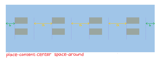
Place-content
Place-content是align-content和justify-content的缩写
写的顺序为place-content:align-content 「空格」 justify-content
让我们看以下范例
CSS:
.grid_container {
    place-content:center space-around;
}
结果如下图所示:
垂直方向为center,水平方向为space-around
以上就是用和Flex相关的属性去控制grid的介绍
有人会问,为什麽grid可以用justify-item和justify-self,而Flex不行?
这个我决定放在下篇(Day 8)和各位解释原因,并示范替代方案来展现justify-self的效果,想了解的明天记得来看喔!
希望大家看完Day 6和这篇,能够对grid的操作更加了解
如果还不会Flex,也欢迎去Day 5看一下相关介绍喔!
只要会了grid和Flex,并学会同时使用,保证没有什麽网页是你刻不出来的!
参考资料:
https://css-tricks.com/snippets/css/complete-guide-grid/#prop-justify-items
<<: 【Day6】重设密码页面X Firebase Auth
>>: 【没钱买ps,PyQt自己写】Day 6 – 我们的第一个 output 手段 – Qlabel
DAY09 - [CSS] 页签 与 其他小事
今日文章目录 页签应用情境 事前准备 CSS练习 参考资料 页签应用情境 页签不管是在小尺寸或大萤...
【Day 20】C 语言的阵列
阵列是由一群具有相同名称或者相同资料型态变数的顺序集合,而因为整个阵列中的变数名称都相同,所以我们需...
【Day 18】Shellcode 与他的快乐夥伴 (上) - Shellcode Loader
环境 Windows 10 21H1 Visual Studio 2019 前情提要 在【Day 0...
Day23-按钮分身术(上)_纯CSS汉堡图样与改变
今天明天要来写纯CSS可控制的按钮分身术 感谢室友的idea提供~ 之前在重写网站时的首页按钮也是类...
Vue CLI安装
前面都使引用CDN的script标签去使用Vue.js,今天要介绍的是用NPM去安装vue-cli ...