第二十七天:UI切版 & 元件-按钮元件、常用的表单元件
今天的内容
一、表单元件常用的属性
二、按钮元件:QBtn
三、文字输入:QInput
四、核取方块 (QCheckbox、QRadio)
五、下拉选单:(QSelect)
六、档案选择栏位:(QFile)
七、总结
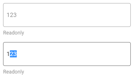
一、表单元件常用的属性
-
disable
相当於原生HTML的disable
无法进行栏位的资料选取和修改
input-class的样式也会稍微改变 -
readonly
可以选取资料,但是无法修改资料
不会改变input-class的样式 -
v-model
元件呈现的资料绑定
范例示意:
<template>
    <div class="q-pa-md">
        <div class="q-gutter-y-md column" style="max-width: 300px">
          <q-input input-class="input rounded-borders" borderless v-model="text" hint="Readonly" :dense="dense" disable></q-input>

          <q-input input-class="input rounded-borders" borderless v-model="text" hint="Readonly" :dense="dense" readonly></q-input>
    </div>
  </div>
</template>

<script>
export default {
  data () {
    return {
      text: '123'
    }
  }
}
</script>

<style lang="scss" scoped>
.input {
  padding: 0 7px;
  border: 1px solid #333;
}
</style>
二、按钮元件:QBtn
用途相当广泛的元件,经常用於
Quasar has a component called QBtn which is a button with a few extra useful features.
https://quasar.dev/vue-components/button#QBtn-API
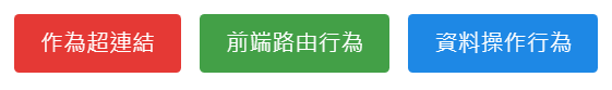
- 超连结行为
<div class="q-pa-md q-gutter-sm">
    <q-btn unelevated type="a" href="start/pick-quasar-flavour" label="作为超连结" color="red-7"></q-btn>
</div>
- 前端路由行为
<div class="q-pa-md q-gutter-sm">
    <q-btn unelevated :to="{ name: 'routeName' }" label="前端路由行为" color="green-7"></q-btn>
</div>
- 资料操作行为
<div class="q-pa-md q-gutter-sm">
    <q-btn unelevated @click="someMethod" label="资料操作行为" color="blue-7"></q-btn>
</div>
QBtn的display是inline-block,预设宽度会根据内容改变
可以使用第二十一天谈到的Flex Grid,设定宽度比例
以及第二十三天的class="full-width"设定与按钮外的容器等宽

<div class="q-pa-md">
    <div class="row q-col-gutter-sm">
      <div class="col-12 col-sm-4">
        <q-btn class="full-width" unelevated type="a" href="start/pick-quasar-flavour" label="作为超连结" color="red-7"></q-btn>
      </div>

      <div class="col-12 col-sm-4">
        <q-btn class="full-width" unelevated label="前端路由行为" color="green-7"></q-btn>
      </div>

      <div class="col-12 col-sm-4">
        <q-btn class="full-width" unelevated @click="someMethod" label="资料操作行为" color="blue-7"></q-btn>
      </div>
    </div>
</div>
三、文字输入:QInput
用於输入文字的栏位
The QInput component is used to capture text input from the user. It uses v-model, similar to a regular input. It has support for errors and validation, and comes in a variety of styles, colors, and types.
https://quasar.dev/vue-components/input
除了一般的text,还包括了textarea和number
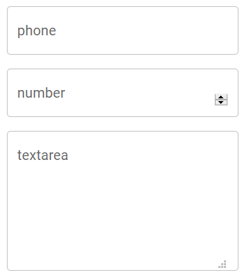
<div class="q-pa-md" style="max-width: 300px">
    <div class="q-gutter-md">
      <q-input
        outlined
        v-model="phone"
        label="phone"
      ></q-input>
      <q-input
        type="number"
        outlined
        v-model="number"
        label="number"
      ></q-input>
      <q-input
        type="textarea"
        outlined
        v-model="textarea"
        label="textarea"
      ></q-input>
    </div>
</div>
Quasar提供了很多预设的样式
如果不喜欢的话,可以使用borderless属性,另外使用class与input-class自订样式
https://quasar.dev/vue-components/input

<template>
    <div id="q-app">
      <div class="q-pa-md">
        <div class="q-gutter-y-md column" style="width: 300px; max-width: 100%">
          <q-toolbar class="q-pa-sm bg-primary text-white rounded-borders">
            <q-btn round dense flat icon="menu" class="q-mr-xs"></q-btn>
            <q-avatar class="gt-xs">
              <img src="https://cdn.quasar.dev/logo/svg/quasar-logo.svg">
            </q-avatar>

            <q-space></q-space>

            <q-input dense borderless v-model="text" class="text-input" class="q-ml-md">
              <template v-slot:append>
                <q-icon v-if="text === ''" name="search"></q-icon>
                <q-icon v-else name="clear" class="cursor-pointer" @click="text = ''"></q-icon>
              </template>
            </q-input>
          </q-toolbar>
        </div>
      </div>
    </div>
</template>

<script>
export default {
  data () {
    return {
      text: ''
    }
  }
}
</script>

<style lang="scss" scoped>
.text-input {
  margin: 3px 12px;
  padding: 5px;
  background: white;
  border-radius: 10px;
}
</style>
QInput 前後可以透过<template v-slot:append>加入ICON
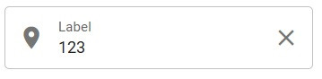
 <q-input outlined bottom-slots v-model="text" label="Label" counter :dense="dense">
        <template v-slot:prepend>
          <q-icon name="place" />
        </template>
        <template v-slot:append>
          <q-icon name="close" @click="text = ''" class="cursor-pointer" />
        </template>
 </q-input>
「clear属性」自带清除内容的功能

<q-input
    clearable
    clear-icon="close"
    outlined
    v-model="text"
    label="Label"
/>
「mask属性」可以用於特定格式的文字输入

<div class="q-pa-md" style="max-width: 300px">
    <div class="q-gutter-md">
      <q-input
        outlined
        v-model="phone"
        label="phone"
        mask="####-### ###"
        fill-mask="#"
      ></q-input>
    </div>
</div>
搭配QForm,可以做简单的格式校验
https://quasar.dev/vue-components/form

<template>
  <div class="q-pa-md" style="max-width: 400px">

    <q-form
      @submit="onSubmit"
      @reset="onReset"
      class="q-gutter-md"
    >
      <q-input
        filled
        v-model="name"
        label="Your name *"
        hint="Name and surname"
        lazy-rules
        :rules="[ val => val && val.length > 0 || 'Please type something']"
      />

      <q-input
        filled
        type="number"
        v-model="age"
        label="Your age *"
        lazy-rules
        :rules="[
          val => val !== null && val !== '' || 'Please type your age',
          val => val > 0 && val < 100 || 'Please type a real age'
        ]"
      />

      <q-toggle v-model="accept" label="I accept the license and terms" />

      <div>
        <q-btn label="Submit" type="submit" color="primary"/>
        <q-btn label="Reset" type="reset" color="primary" flat class="q-ml-sm" />
      </div>
    </q-form>

  </div>
</template>

<script>
export default {
  data () {
    return {
      name: null,
      age: null,
      accept: false
    }
  },
  methods: {
    onSubmit () {
      if (this.accept !== true) {
        this.$q.notify({
          color: 'red-5',
          textColor: 'white',
          icon: 'warning',
          message: 'You need to accept the license and terms first'
        })
      }
      else {
        this.$q.notify({
          color: 'green-4',
          textColor: 'white',
          icon: 'cloud_done',
          message: 'Submitted'
        })
      }
    },
    onReset () {
      this.name = null
      this.age = null
      this.accept = false
    }
  }
}
</script>
四、核取方块 (QCheckbox、QRadio)
(一) 多选核取方块: QCheckbox
常用於某组资料的多选
或者类似加入会员的同意条款选项
The QCheckbox component is another basic element for user input. You can use this to supply a way for the user to toggle an option.
https://quasar.dev/vue-components/checkbox
多选的v-model要指向同一个data阵列变数
<template>
<div class="q-pa-md">
<div class="q-gutter-sm">
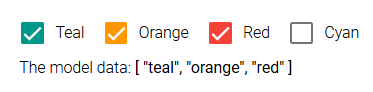
<q-checkbox v-model="selection" val="teal" label="Teal" color="teal" />
<q-checkbox v-model="selection" val="orange" label="Orange" color="orange" />
<q-checkbox v-model="selection" val="red" label="Red" color="red" />
<q-checkbox v-model="selection" val="cyan" label="Cyan" color="cyan" />
</div>
<div class="q-px-sm">
The model data: <strong>{{ selection }}</strong>
</div>
</div>
</template>
<script>
export default {
data () {
return {
selection: [ 'teal', 'red' ]
}
}
}
</script>
单一选项的勾选状态,data变数的值为true或false

<template>
  <div class="q-pa-md">
    <div class="q-gutter-sm">
      <q-checkbox
        v-model="customModel"
        color="secondary"
        label="Do you agree with the terms & conditions?"
      ></q-checkbox>
    </div>

    <div class="q-px-sm">
      The model data: <strong>'{{ customModel }}'</strong>
    </div>
  </div>
</template>

<script>
export default {
  data () {
    return {
      customModel: false
    }
  }
}
</script>
(二) 单选选取方块:QRadio
相对於Checkbox,用於某组资料的单选
The QRadio component is another basic element for user input. You can use this to supply a way for the user to pick an option from multiple choices.
v-model要指向同一个data变数
<template>
<div class="q-pa-md">
<div class="q-gutter-sm">
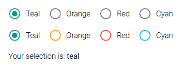
<q-radio v-model="color" val="teal" label="Teal" color="teal" />
<q-radio v-model="color" val="orange" label="Orange" color="orange" />
<q-radio v-model="color" val="red" label="Red" color="red" />
<q-radio v-model="color" val="cyan" label="Cyan" color="cyan" />
</div>
<div class="q-gutter-sm">
<q-radio keep-color v-model="color" val="teal" label="Teal" color="teal" />
<q-radio keep-color v-model="color" val="orange" label="Orange" color="orange" />
<q-radio keep-color v-model="color" val="red" label="Red" color="red" />
<q-radio keep-color v-model="color" val="cyan" label="Cyan" color="cyan" />
</div>
<div class="q-px-sm q-mt-sm">
Your selection is: <strong>{{ color }}</strong>
</div>
</div>
</template>
<script>
export default {
data () {
return {
color: 'cyan'
}
}
}
</script>
五、下拉选单:QSelect
具有强大筛选功能的单选或下拉选单
The QSelect component has two types of selection: single or multiple. This component opens up a menu for the selection list and action. A filter can also be used for longer lists.
https://quasar.dev/vue-components/select
其中QSelect的选单选项格式允许:
- String
<template>
  <div class="q-pa-md" style="max-width: 300px">
    <div class="q-gutter-md">
      <q-badge color="secondary" multi-line>
        Model: "{{ model }}"
      </q-badge>

      <q-select filled v-model="model" :options="options" label="Standard" />
    </div>
  </div>
</template>

<script>
export default {
  data () {
    return {
      model: null,
      options: [
        'Google', 'Facebook', 'Twitter', 'Apple', 'Oracle'
      ]
    }
  }
}
</script>
- Object
<template>
  <div class="q-pa-md" style="max-width: 300px">
    <div class="q-gutter-md">
      <q-badge color="secondary" multi-line>
        Model: "{{ model }}"
      </q-badge>

      <q-select filled v-model="model" :options="options" label="Standard" />
    </div>
  </div>
</template>

<script>
export default {
  data () {
    return {
      model: null,
      options: [
        {
          label: 'Google',
          value: 'Google',
          description: 'Search engine',
          category: '1'
        },
        {
          label: 'Facebook',
          value: 'Facebook',
          description: 'Social media',
          category: '1'
        },
        {
          label: 'Twitter',
          value: 'Twitter',
          description: 'Quick updates',
          category: '2'
        },
        {
          label: 'Apple',
          value: 'Apple',
          description: 'iStuff',
          category: '2'
        },
        {
          label: 'Oracle',
          value: 'Oracle',
          disable: true,
          description: 'Databases',
          category: '3'
        }
      ]
    }
  }
}
</script>
要注意的是
如果选项是JSON格式
至少要包含「label」和「value」
label是显示在QSelect上面的文字,value是代表这个选项的值
此时v-model预设的格式,会是整个选项的JSON格式
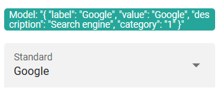
{ label: 'Test', value: 0 }
如果你希望v-model的格式,是JSON选项的value,在QSelect显示label
使用emit-value + map-options 属性
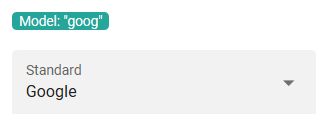
<q-select
    filled
    v-model="model"
    :options="options"
    label="Standard"
    emit-value
    map-options
/>
若要使用QSelect的筛选功能
需要设定「@filter」、「use-input」、「hide-selected」

<template>
  <div class="q-pa-md">
    <div class="q-gutter-md row">
      <q-select
        filled
        v-model="model"
        use-input
        hide-selected
        fill-input
        input-debounce="0"
        :options="options"
        @filter="filterFn"
        hint="Basic filtering"
        style="width: 250px; padding-bottom: 32px"
      >
        <template v-slot:no-option>
          <q-item>
            <q-item-section class="text-grey">
              No results
            </q-item-section>
          </q-item>
        </template>
      </q-select>
    </div>
  </div>
</template>

<script>
const stringOptions = [
  'Google', 'Facebook', 'Twitter', 'Apple', 'Oracle'
]
export default {
  data () {
    return {
      model: null,
      options: stringOptions
    }
  },
  methods: {
    filterFn (val, update, abort) {
      update(() => {
        const needle = val.toLowerCase()
        this.options = stringOptions.filter(v => v.toLowerCase().indexOf(needle) > -1)
      })
    }
  }
}
</script>
六、档案选择栏位:QFile
有写过档案上传的人应该知道
\原生的type=file,是不能使用v-model
QInput也是,不能使用v-model
Do NOT use a v-model when QInput is of type="file". Browser security policy does not allow a value to be set to such an input. As a result, you can only read it (attach an @input event), but not write it.
https://quasar.dev/vue-components/input

<template>
  <q-page class="flex flex-center q-gutter-md">
    <div>
      <q-input type="file" @change="selectData" borderless></q-input>
      <q-img :src="dataUri" v-show="dataUri !== null" width="300px"></q-img>
    </div>
  </q-page>
</template>

<script>
export default {
  name: 'PageIndex',

  data () {
    return {
      file: null,
      dataUri: null
    }
  },
  methods: {
    selectData (e) {
      const reader = new FileReader()

      this.file = e.target.files[0]

      reader.readAsDataURL(this.file)
      reader.onload = (e) => {
        this.dataUri = e.target.result
      }
    }
  }
}
</script>
你可使用QFile代替
QFile本身包含了@change => data 这段过程
QFile is a component which handles the user interaction for picking file(s).
https://quasar.dev/vue-components/file-picker

<template>
  <q-page class="flex flex-center q-gutter-md">
    <div style="width: 300px;">
      <q-file stack-label="选择档案" label-color="white" input-class="text-white" class="bg-grey-9 q-pa-sm" borderless v-model="file" @input="selectData"></q-file>
      <q-img :src="dataUri" v-show="dataUri !== null" width="300px"></q-img>
    </div>
  </q-page>
</template>

<script>
export default {
  name: 'PageIndex',

  data () {
    return {
      file: null,
      dataUri: null
    }
  },
  methods: {
    selectData (file) {
      const reader = new FileReader()

      this.file = file

      reader.readAsDataURL(this.file)
      reader.onload = (e) => {
        this.dataUri = e.target.result
      }
    }
  }
}
</script>
七、总结
今天大致介绍了比较常用表单元件
如果对其他的元件有兴趣,可以参考Quasar的官方元件
明天接着介绍经常与表单搭配使用的Dialog
[Day 06] 特徵图想让人分群 ~模型们的迁移学习战~ 第一季 (迁移学习)
前言 「指月录」卷二十八有道: 「见山是山,见水是水;见山不是山,见水不是水;见山仍是山,见水仍是水...
DAY29-如何与人协同工作与好好沟通-英文很重要,中文也很重要,你有注意过你的欧化中文吗?
英文对工程师来说是非常重要可以说是必备的技能之一。很多最新的技术介绍或是文件,几乎都是用英文撰写,如...
【Day4】 环境建置 - 安装 VisualStudio Code on Mac
前言 最近刚好换了 macbook pro m1,可以趁着这个机会顺便学习如何在Mac上安装编译器。...
JavaScript Day 3. 变数:布林、undefined、null
开始学习 JavaScript 之後遇到的变数五花八门,不理解用法或是不懂的回传的型态,就很容易会卡...
2021年国外http代理评测
1、roxlabs roxlabs提供ip资源遍布全球220+国家与地区,每日高达9000万真实住宅...