【Day11】数据展示元件 - Badge
元件介绍
Badge 可以让我们在其 children element 的右上角(预设位置)显示一个小徽章,通常用来表示需要处理的讯息数量,透过醒目的视觉形式来吸引用户处理。

参考设计 & 属性分析
Badge 位置
一般的 Badge 位置都是预设出现在右上角,但可能有些情境会需要调整位置,MUI 这边提供了 anchorOrigin 的 props,这个 anchorOrigin 比较特别,是一个物件,里面有两个栏位,分别是 vertical 和 horizontal,顾名思义,就是提供我们可以决定要放在右上、右下、左上、左下这四个位置。
<Badge
  anchorOrigin={{
    vertical: 'bottom', // top, bottom
    horizontal: 'right', // right, left
  }}
>
  {children}
</Badge>
当然 MUI 除了这四个位置可以透过 props 调整之外,也能够藉由 overrides documentation 提供我们的方法,透过 class 去覆写 css 属性(ex: top, right)来微调偏移,所以可以客制化的幅度还蛮弹性的。
Antd 提供的 props 叫做 offset ,传入值为一阵列,格式为 [left, top],用来表示其水平及垂直的偏移量。
<Badge count={5} offset={[10, 10]}>
  {children}
</Badge>
展示的内容
比较常见的展示内容一般来说都是数字,所以 Antd 的 props 叫做 count,一般我们看到 count 的直觉会觉得应该要填入的是数字,但很特别的是,count 支援的类型为 ReactNode ,因此,如下范例,他也可以是一个 icon。
// Antd Badge
<Badge count={0} showZero>
  {children}
</Badge>

<Badge count={<ClockCircleOutlined style={{ color: '#f5222d' }} />}>
  {children}
</Badge>

MUI 所提供的 props 为 badgeContent ,其型别为 node,因此也支援我们传入数字以外的资料。
最大展示值
Antd: overflowCount
MUI: max
variant
有时候我们希望 Badge 只是提醒我们有东西更新就好,不需要呈现数字,因此除了我们常见的 default 样式之外,也提供了 dot 样式。
在 MUI 上一样是提供我们 variant 这个 props ,可以填入的值是 dot, standard,预设是 standard。
Antd 上则是提供我们一个布林值 dot,若为 true ,则只呈现一个小红点,没有内容;若为 false,则为我们常见的 Badge 含数字内容的样式。
颜色
这个元件一样在 MUI 及 Antd 都提供我们颜色的客制化弹性,因为虽然大家印象中 Badge 都是红色的,但是难免在其他情境我们需要别的颜色。 MUI 的 color 可传入一样为预设的保留字 default, error, primary, secondary,而 Antd 除了预设的保留字之外,也支援我们色票的传入。
是否呈现 0
当 Badge 的数字为 0 时,是否要展示 Badge 呢? MUI 及 Antd 都提供给我们这样的选择,很有共识的,两边的 props 命名很一致,都是 showZero 的 boolean。
介面设计
| 属性 | 说明 | 类型 | 默认值 |
|---|---|---|---|
| placement | 徽章位置 | top-left, top-right, bottom-left, bottom-right |
top-right |
| badgeContent | 展示内容 | ReactNode | |
| max | 最大显示值 | number | 99 |
| variant | 变化模式 | standard, dot |
standard |
| themeColor | 颜色 | primary, secondary, 色票 | #FE6B8B |
| showZero | 是否呈现 0 | boolean | false |
| children | 内容 | ReactNode |
元件实作
最基本的 Badge 使用方式如下:
<Badge badgeContent={7}>
  <MailIcon />
</Badge>
因此根据上述的使用介面,把 Badge 的结构设计如下:
<BadgeWrapper>
  {children}
  <StandardBadge
    className={className}
    $color={color}
    $placement={placement}
  >
    {badgeContent}
  </StandardBadge>
</BadgeWrapper>
由於 Badge 会跟 children 有重叠的区块,因此 Badge 势必要设为 position: absolute;,并把 <BadgeWrapper /> 设为 position: relative; 如此 Badge 才能相对於他做定位。
徽章位置 Placement
在 Badge 当中我们需要一个 props 来决定 Badge 的位置是在 右上、左上、右下、左下

我想要用跟在 FormControl 一样的手法,透过 Object 的 key-value 对应,来取得相对应的样式:
const placementStyleMap = {
  'top-left': topLeftStyle,
  'top-right': topRightStyle,
  'bottom-left': bottomLeftStyle,
  'bottom-right': bottomRightStyle,
};
因为前面我们已经将 Badge 设为 absolute 了,因此在定位方面,我们就能够使用 top, left, right, transform 来调配出 右上、左上、右下、左下 各种位置:
const topLeftStyle = css`
  top: 0px;
  left: 0px;
  transform: translate(-50%, -50%);
`;

const topRightStyle = css`
  top: 0px;
  right: 0px;
  transform: translate(50%, -50%);
`;

const bottomLeftStyle = css`
  bottom: 0px;
  left: 0px;
  transform: translate(-50%, 50%);
`;

const bottomRightStyle = css`
  bottom: 0px;
  right: 0px;
  transform: translate(50%, 50%);
`;
变化模式 variant
Badge 有两种变化模式,一个是 standard,另一个是 dot。
其中 dot 的样式就比较单纯,因为不需要考虑到内容的变化,他就只有一个点而已。

const DotBadge = styled.div`
  position: absolute;
  width: 6px;
  height: 6px;
  border-radius: 100%;
  background-color: ${(props) => props.$color};
  ${(props) => placementStyleMap[props.$placement] || topRightStyle}
`;
<BadgeWrapper>
  {children}
  {variant === 'dot' && (
    <DotBadge
      className={className}
      $color={color}
      $placement={placement}
    />
  )}
</BadgeWrapper>
在 standard 当中,特别需要留意的是会使用到 box-sizing: border-box; 这个属性,在 金鱼都能懂的CSS必学属性 当中有很详细的讲解,border-box 主要是让我们能将宽高设定作用在边框外缘的范围内,所以当我们在设定 width 以及 height 的时候,指的是 border-box 范围内的宽跟高。

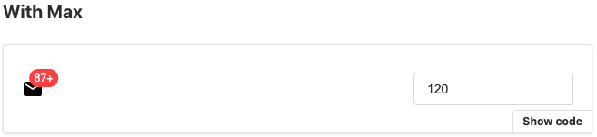
最大值 max
Badge 内容当然不能让人家随便输入,甚至也需要限制他的最大数字,否则就会像下图这样悲剧:

因此至少要有一个简单的判断,来限制我们最大值的输入
const content = badgeContent > max ? `${max}+` : badgeContent;
是否呈现 0
最後一个小问题就是,到底 0 要不要呈现?可能有些情境要,有些情境不用,因此我们需要一个 boolean 来做到这件事,所以跟上述 max 的逻辑合并,我们来做一个 function 来产生我们 Badge 的内容:
const makeBadgeContent = ({ showZero, max, badgeContent }) => {
  if (showZero && badgeContent === 0) {
    return '0';
  }
  if (!showZero && badgeContent === 0) {
    return null;
  }
  return badgeContent > max ? `${max}+` : badgeContent;
};

Badge 元件原始码:
Source code
Storybook:
Badge
>>: Python - PyEnchant 英文单字拼写检查套件参考笔记
Django - template filter and tags
context的内容: sub_dual = [{'start':1, 'end':2, 'text...
Day02 捷径只能自己写吗?
Hello 大家 今天下班就是四天的连假了! 要去哪里玩呢? 疫情这样我应该是把自己关在家吧 其实捷...
[Day19] SCSS 学习笔记
写 CSS 的时候常常会有些设定是重复出现的,SASS(SCSS)是一个方便的预处理器,提供了变数、...
拥有这些知识就不会迷失在浩瀚的宇宙
开启虚幻世界的大门 虚拟技术地端前哨站,首先登场的是VirtualBox。此篇,会简单讲述虚拟技术V...
【在 iOS 开发路上的大小事-Day16】透过 Firebase 来管理使用者 (Sign in with E-mail 篇) Part2
昨天我们已经将注册帐号、帐号登入实作完成了,今天我们要来把剩下的帐号登出以及密码重设功能来实作完成 ...