Python 演算法 Day 10 - Feature Selection
Chap.II Machine Learning 机器学习
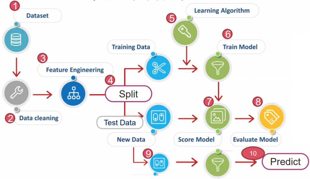
https://yourfreetemplates.com/free-machine-learning-diagram/
Part 2. Feature Engineering 特徵工程
在开始跑演算法前,会藉由特徵工程提高准确率、优化收敛速度。
常用的特徵工程为以下三种:
2-1. Feature Scaling 特徵缩放:
将 scale 缩放,达到方便辨识。(常用: 'Normalization' & 'Stadardization)
2-2. Feature Selection 特徵选择:
将与 y 强相关的 x 选择出来,透过减少互相干扰、或预测能力差的 x 变数,达到加快演算。
常见方法有 SBS、Random Forest...等。
EX. 铁达尼号中,将 'alone' (与 'sibsp', 'parch' 干扰且重复)删除。
2-3. Feature Extraction 特徵萃取:
将与 y 强相关的 x 选择出来,透过揉合数个 x 变数(将数个变数揉合为单个),达到加快演算。
常见方法有 PCA、TSVD、T-SNE...等。
EX. 铁达尼号中,将 'sibsp', 'parch' 揉合成 'family_size'。
特徵工程的 2&3 又称 Dimensionality Reduction 降维,好处为:
A. 精度改进。
B. 过拟合风险降低。
C. 加快训练。
D. 改进的数据可视化。
E. 增加模型的可解释性。
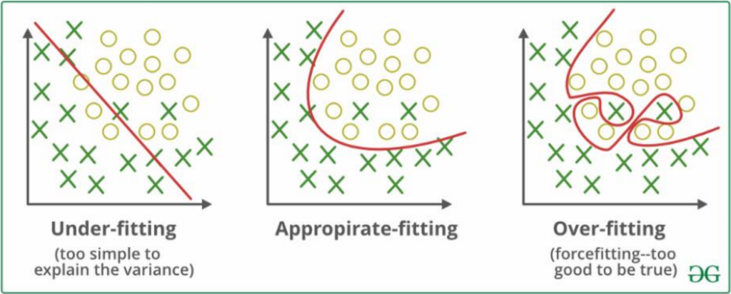
刚刚优点中的名词,"Overfitting 过度拟合"是甚麽?
Overfitting 过度拟合:模型受到训练资料影响过大,使其预测测试资料时效果不佳。
Underfitting 低度拟合:模型对资料的描述能力太差,无法正确解释资料。
至於造成过拟合的原因,要从偏差或变异说起。
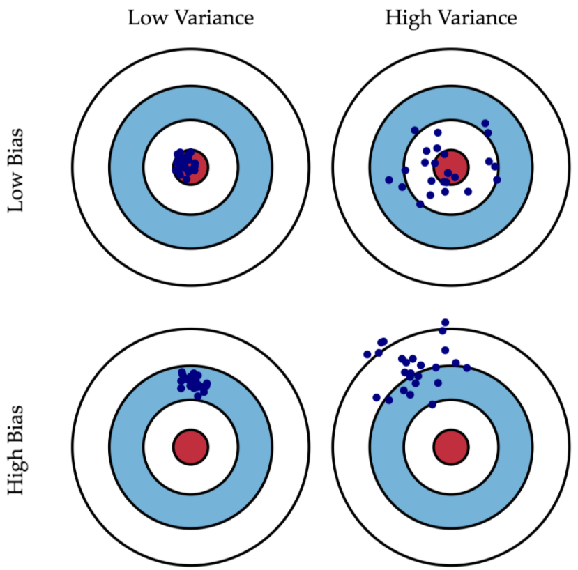
什麽是偏差(Bias)? 什麽是变异(Variance)?
Bias 偏差:指的是预测值与实际值的差距。(打靶打得准)
Variance 变异:指预测值的离散程度。(打靶打得精)
理论上,我们会希望把 Model 训练的"既准又精",使它可直接描述数据背後的真实规律、意义。
以便後续用它来执行一些描述性或预测性的任务。
然而,实作上就有以下:
1.随机误差(Random error)
2.偏差(Bias error)
3.方差(Variance error)。
随机误差源於数据本身,基本无法消除。
而 Bias 与 Variance,又跟 Overfitting & Underfitting 的问题息息相关。
那麽,把 Bias error 跟 Variance error 都降到最低就好了吗?
理论上,若有"无穷的数据"+"完美的模型"+"究极运算能力",是可以达成的!
实际上,我们的数据跟计算能力都很有限,且模型也不可能完美。
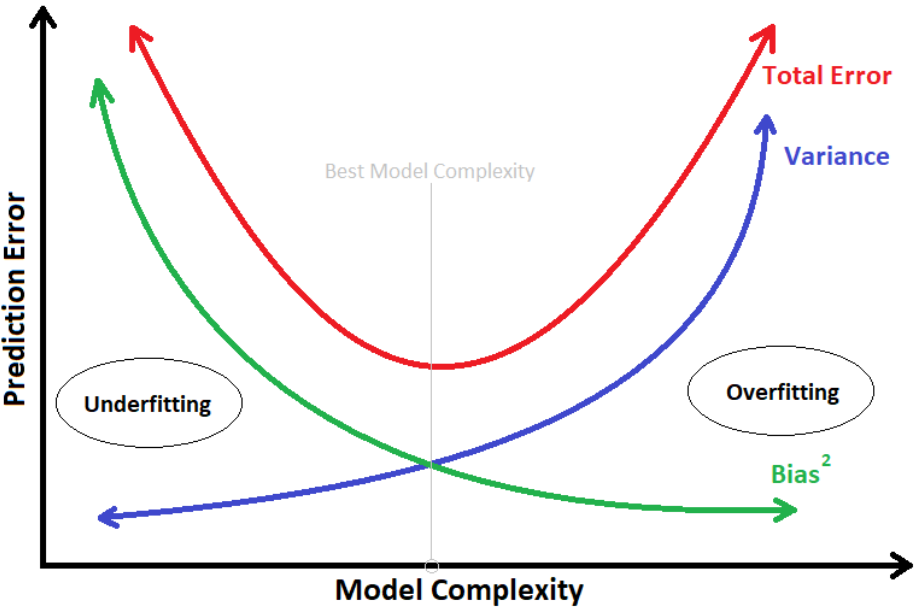
打个比方:建模过程中,若想把 Bias error 降到最低,则须建出非常复杂的模型。
等於让模型把训练资料特徵全部硬背,连同随机误差也全拟合进模型,使模型失去了泛化能力。
这样的结果,就称"Overfitting 过度拟合"。
一旦过拟合,对於未知的资料预测的能力就会很差,造成高 Variance error。
*模型的复杂度 与 模型预测的误差
为了避免过拟合,在训练模型时,会将资料集拆分成 training & testing(training 中再拆分 validation)。
再透过调整超参数(Hyperparameter)来改变模型,以适配不同的资料。
但现在,还是先回到特徵工程上。
PS. 因特徵缩放在 Day13 已经有稍微提过,以下会着重在特徵选择 & 特徵萃取。
2-2. Feature Selection 特徵选择
特徵选择上,有几种方式可帮助我们判断/选取,以下提到 SBS & RandomForest。
A. Sequential Backward Selection (SBS) 循序向後选择
以鸢尾花作为例子,见以下
# 1. Datasets
import pandas as pd
import matplotlib.pyplot as plt
import seaborn as sns
from sklearn.datasets import load_wine
from sklearn.linear_model import LogisticRegression
from sklearn.neighbors import KNeighborsClassifier
from sklearn.model_selection import train_test_split

ds=load_wine()

X=ds.data
y=ds.target

X.shape, y.shape
>>  ((178, 13), (178,))


# 4. Split Data
X_train, X_test, y_train, y_test = train_test_split(X, y, test_size=0.5)


# 5. Learning Algorithm
# 6. Traing Model
# 7. Score Model
from sklearn.metrics import accuracy_score

def calc_score(X_train, y_train, X_test, y_test, indices):

    # Choose Regression
    LR = LogisticRegression()
    print(indices, X_train.shape)

    # Fit model
    LR.fit(X_train[:, indices], y_train)
    y_pred = LR.predict(X_test[:, indices])

    # Score model
    score = accuracy_score(y_test, y_pred)

    return score
接着运用回圈迭代各个排列组合,计算跑分:
from itertools import combinations
import numpy as np

score_list = []
combin_list = []

best_score_list=[]

# 外回圈:dim = 1~13
for dim in range(1, X.shape[1]+1):
    score_list = []
    combin_list = []

    # all_dim = (0, 1, 2, 3, 4, 5, 6, 7, 8, 9, 10, 11, 12)
    all_dim = tuple(range(X.shape[1]))

    # 内回圈:C 13 取 n,n 从 1~13
    for c in combinations(all_dim, r=dim):
        score = calc_score(X_train, y_train, X_test, y_test, c)

        # 分数加入 score_list,跑合加入 combin_list
        score_list.append(score)
        combin_list.append(c)

    # 找出最高分的项次
    best_loc = np.argmax(score_list)

    best_score = score_list[best_loc]
    best_combin = combin_list[best_loc]
    print(best_loc, best_combin, best_score)

    # 把所有结果最好的丢进 list
    best_score_list.append(best_score)

>>  6 (6,) 0.8539325842696629
>>  5 (0, 6) 0.9325842696629213
>>  278 (8, 9, 12) 0.9662921348314607
>>  65 (0, 2, 4, 6) 0.9662921348314607
>>  120 (0, 1, 5, 8, 9) 0.9662921348314607
>>  71 (0, 1, 2, 5, 7, 9) 0.9662921348314607
>>  59 (0, 1, 2, 3, 6, 9, 11) 0.9775280898876404
>>  66 (0, 1, 2, 3, 5, 6, 9, 11) 0.9775280898876404
>>  107 (0, 1, 2, 3, 6, 7, 8, 9, 12) 0.9775280898876404
>>  232 (1, 2, 3, 4, 5, 6, 8, 9, 11, 12) 0.9775280898876404
>>  68 (1, 2, 3, 4, 5, 6, 7, 8, 9, 11, 12) 0.9775280898876404
>>  7 (0, 1, 2, 3, 4, 6, 7, 8, 9, 10, 11, 12) 0.9662921348314607
>>  0 (0, 1, 2, 3, 4, 5, 6, 7, 8, 9, 10, 11, 12) 0.9438202247191011
将 best_score_list 视觉化:
import matplotlib.pyplot as plt

No = np.arange(1, len(best_score_list)+1)
plt.plot(No, best_score_list, marker='o', markersize=6)
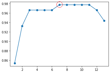
从图中可知,选 7 项变数(97.7%)来演算结果,与选 11 项(97.7%)相近,
且变数变少,大幅提升运算效率。
当然,若再进一步想增加运算效率,也可选用 3 项变数(96.6%)。
B. Random Forest Classifier 随机森林演算法
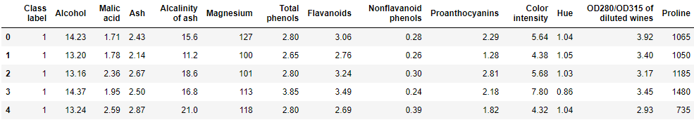
以红酒分类作为例子,见以下
- 载入必要套件 & Datasets
import numpy as np
import pandas as pd

df_wine = pd.read_csv('https://archive.ics.uci.edu/'
                      'ml/machine-learning-databases/wine/wine.data',
                      header=None)

# if the Wine dataset is temporarily unavailable from the
# UCI machine learning repository, un-comment the following line
# of code to load the dataset from a local path:

# df_wine = pd.read_csv('wine.data', header=None)


df_wine.columns = ['Class label', 'Alcohol', 'Malic acid', 'Ash',
                   'Alcalinity of ash', 'Magnesium', 'Total phenols',
                   'Flavanoids', 'Nonflavanoid phenols', 'Proanthocyanins',
                   'Color intensity', 'Hue', 'OD280/OD315 of diluted wines',
                   'Proline']

print('Class labels', np.unique(df_wine['Class label']))
df_wine.head()
- Split Data
from sklearn.model_selection import train_test_split

# 'Class label' 是 Y
X, y = df_wine.drop('Class label', axis=1), df_wine[['Class label']]

X_train, X_test, y_train, y_test = train_test_split(X, y, test_size=0.5)
运用回圈迭代各个排列组合,并计算他们的跑分:
from sklearn.ensemble import RandomForestClassifier
# 载入 wine 的 columns
wine_col = df_wine.columns[1:]
# 随机森林演算法
forest = RandomForestClassifier(n_estimators=500, random_state=1)
forest.fit(X_train, y_train)
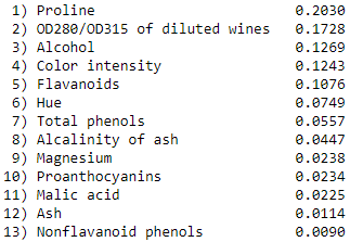
# 把每一个变数特徵的重要性列出,从大排到小
ipt = forest.feature_importances_
ipt_sort = np.argsort(ipt)[::-1]
# 依序迭代出重要特徵
for f in range(X_train.shape[1]):
print(f"{f+1:>2d}) {wine_col[ipt_sort[f]]:<30s} {ipt[ipt_sort[f]]:.4f}")
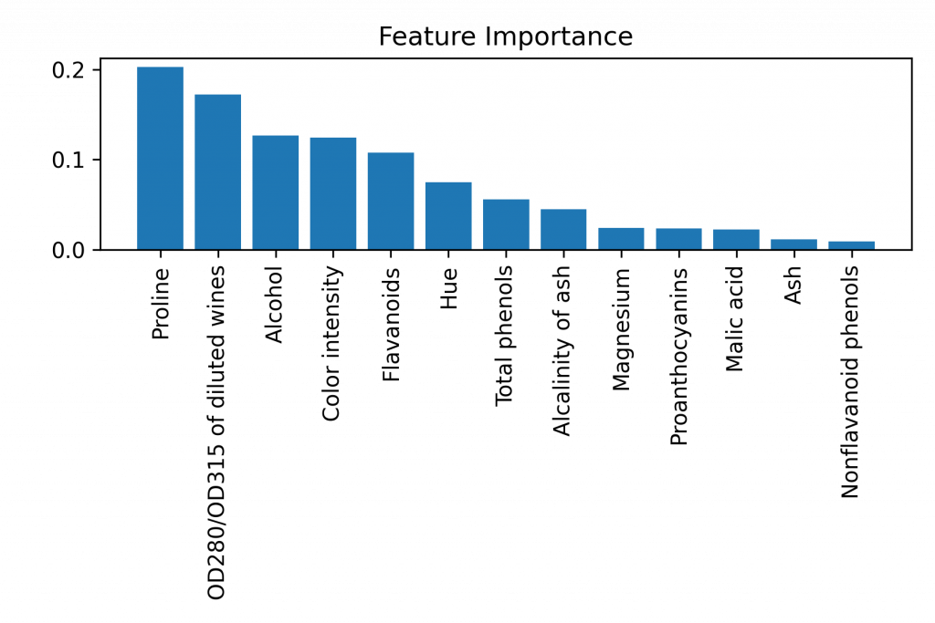
视觉化:
import matplotlib.pyplot as plt

plt.title('Feature Importance')
plt.bar(range(X_train.shape[1]), ipt[ipt_sort], align='center')

# 以 wine_col 代换掉 x 轴的 0~12
plt.xticks(range(X_train.shape[1]), wine_col[ipt_sort], rotation=90)

# 把图上下缩短
plt.tight_layout()

plt.show()
柏拉图式(QC 七工具)
又称主次因素分析法,是一种条形图和折线图的组合,为品质管理上经常使用的一种图表方法。
其好处是,可以设定一个目标(比方说 80%),将影响最大的几个因子挑出。
var_exp = ipt[ipt_sort]

# 把 ipt 里的机率逐个加总(最後肯定会是 1)
cum_var_exp = np.cumsum(var_exp)

>>  array([0.20302504, 0.17278228, 0.12686498, 0.12430788, 0.10764943,
        0.0748521 , 0.05569083, 0.04471882, 0.02379331, 0.02336044,
        0.02253831, 0.01137369, 0.0090429 ])
作图
# Pareto Chart
import matplotlib.pyplot as plt

# 划出 bar 条
plt.bar(range(1, 14), var_exp, alpha=0.5, label='individual explained variance') #  , align='center'

# 划出 上升阶梯
plt.step(range(1, 14), cum_var_exp, where='mid', label='cumulative explained variance')

plt.ylabel('Explained variance ratio')
plt.xlabel('Principal component index')

plt.legend(loc='best')
plt.tight_layout()
plt.axhline(0.9, color='r', linestyle='--', linewidth=1)

plt.show()
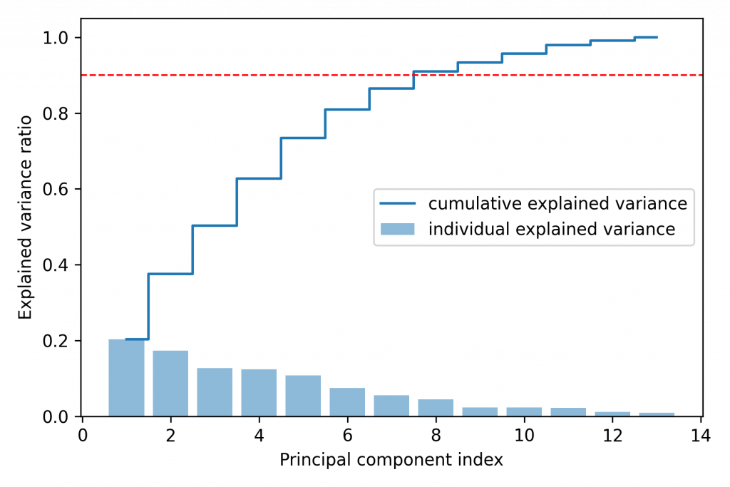
从图中可得需要选取至少 8 项特徵,方可包含 90% 影响因子。
当然还有其他方法可以达到特徵选取,可以参考。
到这里,就完成了特徵选择的实作!
结论:
特徵选取拥有数种方法,每种都有其优势。须根据不同场合及资料类型选用。
但後续的特徵萃取(又称降维),较能有效加速演算及减少变异偏差。
.
.
.
.
.
Homework Answer:
请参考铁达尼号的流程,使用钻石清理资料来完成演算法。
import pandas as pd
import seaborn as sns
import matplotlib.pyplot as plt
import numpy as np
df = pd.read_csv('diamond.csv')
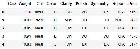
df.head()
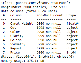
df.info()
# 确认 NaN
df.isna().sum()

>>  Carat Weight    0
    Cut             2
    Color           2
    Clarity         1
    Polish          2
    Symmetry        2
    Report          2
    Price           0
    dtype: int64
# 使用前一笔填补 NaN
df = df.fillna(method='ffill')
df.isna().sum()

>>  Carat Weight    0
    Cut             0
    Color           0
    Clarity         0
    Polish          0
    Symmetry        0
    Report          0
    Price           0
    dtype: int64
# 印出每个栏位种类个数
for x in df.columns[1:-1]:
    print(x)
    print(df[x].value_counts())
    print()

>>  Cut
    Ideal              2483
    Very Good          2426
    Good                708
    Signature-Ideal     253
    Fair                129
    VeryGood              1
    Name: Cut, dtype: int64

    ...(中间略)

    Report
    GIA     5265
    AGSL     735
    Name: Report, dtype: int64
# 将明显是 'Very Good' 但填错的 'VeryGood' 取代掉
df['Cut'] = df['Cut'].str.replace('VeryGood', 'Very Good')
df['Cut'].value_counts()
plt.figure(figsize=(14, 8))
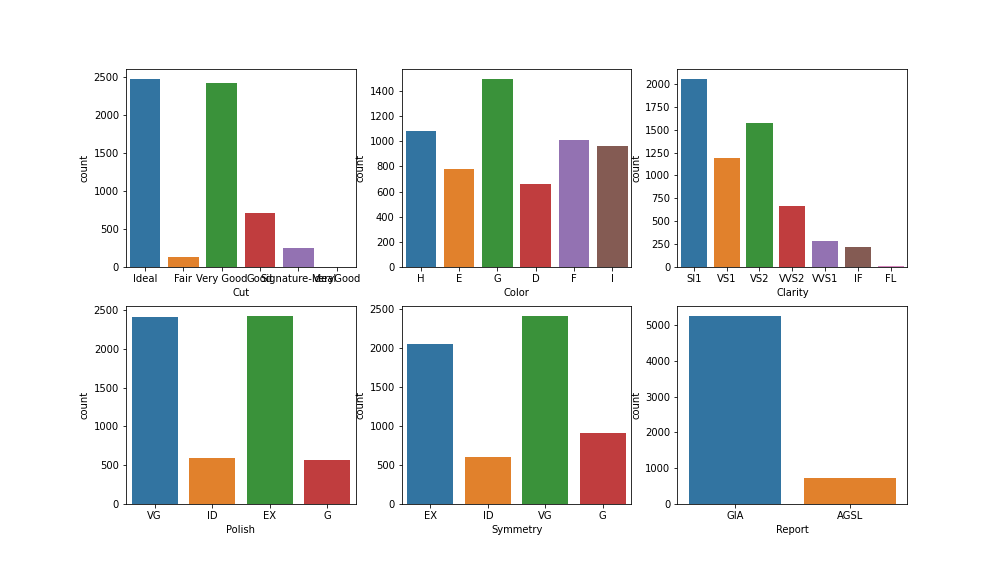
plt.subplot(2, 3, 1)
# enumerate(): 把 (项次, 内容) 迭代出来,丢进 i 与 x
# 画出数量图
for i, x in enumerate(df.columns[1:-1]):
plt.subplot(2, 3, i+1)
sns.countplot(x=x, data=df)
# 划出 'Carat Weight' 克拉重
# sns.distplot(df['Carat Weight'])

sns.distplot(np.log(df['Carat Weight']))
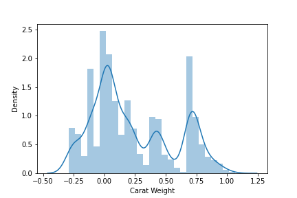
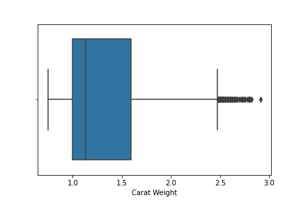
# 'Carat Weight' 无异状
sns.boxplot(df['Carat Weight'])
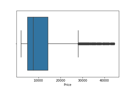
# 'Price' 发现有离群点
sns.boxplot(df['Price'])
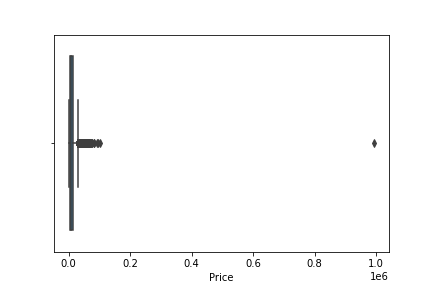
# 把 <= 平均价格+2*价格标准差 以外的异常点排除
df = df[df['Price']<=df['Price'].mean()+2*df['Price'].std()]
sns.boxplot(df['Price'])
余下的部分就选一个演算法进行跑分即可~
.
.
.
.
.
Homework:
试着用 sklearn 的资料集 breast_cancer,操作 Featuring Selection (by RandomForest)。
<<: Day 36 - 使用 Container 建立 Amazon SageMaker 端点
[第十只羊] 迷雾森林舞会III 参见排版神器 Tailwind
天亮了 昨晚是平安夜 关於迷雾森林故事 第九夜 站在方舟甲板的洛神 数了一下玩家人数 就问 怎麽少了...
Day 02-购物车系统简介
前言 随着网路逐渐普及,越来越多人选择'网购',而网购中最後结帐的部分极为重要。 今天要来讲讲:离线...
Day 0x5 UVa10062 Tell me the frequencies!
Virtual Judge ZeroJudge 题意 对每一列输入,输出各字元的 ASCII &a...
【Day29】this - DOM
今天要来讲解 DOM 与 this 的关系, 对於 DOM 的操作有两种方式, 第一种是直接将方法写...
今晚,我想来点。。。 (菜单在哪?)
今晚,我想来点。。。 这是之前很流行的广告台词,会让人联想到菜单在哪? 那要怎麽在Python GU...