Material UI in React [ Day 7 ] Inputs (Button Group & Floating action button) & Styles
今天会接续Button的部分做个总结。
Button Group
ButtonGroup 组件可用於对相关按钮进行分组:
<ButtonGroup color="primary" aria-label="预设就是outlined">
  <Button>One</Button>
  <Button>Two</Button>
  <Button>Three</Button>
</ButtonGroup>
<ButtonGroup
  variant="contained"
  color="primary"
  aria-label="contained & text 要另外下"
>
  <Button>One</Button>
  <Button>Two</Button>
  <Button>Three</Button>
</ButtonGroup>
<ButtonGroup
  variant="text"
  color="secondary"
  size="small"
  aria-label="size & color的逻辑和前面的Button是一致的"
>
  <Button>One</Button>
  <Button>Two</Button>
  <Button>Three</Button>
</ButtonGroup>
orientation: vertical可以将水平调成垂直
<ButtonGroup
  orientation="vertical"
  color="primary"
  aria-label="vertical"
>
  <Button>One</Button>
  <Button>Two</Button>
  <Button>Three</Button>
</ButtonGroup>
在官方文件中有 Split button 的范例,这里我就不再详细解说了,因为实际用到的机会还不如它本身下拉或是autoComplete来的多,如果有兴趣的朋友可以研究看看。
Floating action button
一个浮动操作按钮出现在所有屏幕内容的前面,通常是一个圆形,中间有一个图标,详细可看连结
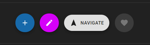
用法跟IconButton一样:
<Fab color="primary" size="small" aria-label="add">
  <AddIcon />
</Fab>
<Fab color="secondary" size="medium" aria-label="edit">
  <EditIcon />
</Fab>
<Fab variant="extended" size="large">
  <NavigationIcon style={{ marginRight: 8 }} />
  Navigate
</Fab>
<Fab disabled aria-label="like">
  <FavoriteIcon />
</Fab>
以上就是 material Button 组件的大部分内容了,如果有 follow 官方文件的话会发现有些范例他们会用 makeStyles 以外的方式处里,这里我还是提一下比较基础的应用好了,因为我有些观念是从styled-component借镜过来的,但这篇的目的还是希望给更多新手可以更快上手,所以我提及的章节会尽量以完全都不懂的情况去着想,那麽就跟我一起跳到Styles的章节,补齐基本的观念吧!
使用 Material-UI Styles 的优点
Material-UI 的样式解决方案的灵感来自许多其他样式库,例如 styled-components 和 emotion。
CSS-in-JS 解决方案克服了许多这些限制,并释放了许多强大的功能(主题嵌套、动态样式、自支持等)。
- CSS-in-JS 解决方案与styled-components相同的优势。
- 速度很快。
- 它可以通过插件 API 进行扩展。
- 它以 JSS 为核心——一种高性能的 JavaScript 到 CSS 编译器,可在运行时和服务器端工作。
- 压缩後小於 15 KB;如果与 Material-UI 一起使用,则不会增加包大小。
基础可以使用 3 种方法来生成和应用样式,但是它们都共享相同的底层逻辑。
Hook API (也就是先前一直在用的 makeStyles 的做法)
import React from 'react';
import { makeStyles } from '@material-ui/core/styles';
import Button from '@material-ui/core/Button';

const useStyles = makeStyles({
  root: {
    background: 'linear-gradient(45deg, #FE6B8B 30%, #FF8E53 90%)',
    border: 0,
    borderRadius: 3,
    boxShadow: '0 3px 5px 2px rgba(255, 105, 135, .3)',
    color: 'white',
    height: 48,
    padding: '0 30px',
  },
});

export default function Hook() {
  const classes = useStyles();
  return <Button className={classes.root}>Hook</Button>;
}
Styled components API
import React from 'react';
import { styled } from '@material-ui/core/styles';
import Button from '@material-ui/core/Button';

const MyButton = styled(Button)({
  background: 'linear-gradient(45deg, #FE6B8B 30%, #FF8E53 90%)',
  border: 0,
  borderRadius: 3,
  boxShadow: '0 3px 5px 2px rgba(255, 105, 135, .3)',
  color: 'white',
  height: 48,
  padding: '0 30px',
});
// styled(x) x的值可以换成任何html Tag
export default function StyledComponents() {
  return <MyButton>Styled Components</MyButton>;
}
Higher-order component API
import React from 'react';
import PropTypes from 'prop-types';
import { withStyles } from '@material-ui/core/styles';
import Button from '@material-ui/core/Button';

const styles = {
  root: {
    background: 'linear-gradient(45deg, #FE6B8B 30%, #FF8E53 90%)',
    border: 0,
    borderRadius: 3,
    boxShadow: '0 3px 5px 2px rgba(255, 105, 135, .3)',
    color: 'white',
    height: 48,
    padding: '0 30px',
  },
};

function HigherOrderComponent(props) {
  const { classes } = props;
  return <Button className={classes.root}>Higher-order component</Button>;
}

HigherOrderComponent.propTypes = {
  classes: PropTypes.object.isRequired,
};

export default withStyles(styles)(HigherOrderComponent);
以上三种方式都可以依照个人喜好去选择方式修改,我个人是偏好 hook & styled component。
在三种方式中都支持巢状结构编写style sheet:
const useStyles = makeStyles({
  root: {
    color: 'red',
    '& p': {
      color: 'green',
      '& span': {
        color: 'blue'
      }
    }
  },
});
既然是css in js那麽自然也可以将变数带入style sheet之中,
const useStyles = makeStyles({
  // style rule
  foo: props => ({
    backgroundColor: props.backgroundColor,
  }),
  bar: {
    // CSS property
    color: props => props.color,
  },
});

function MyComponent() {
  // props也可以是从父辈传递的值
  const props = { backgroundColor: 'black', color: 'white' };
  // 将 props 作为 useStyles() 的一个变数传入
  const classes = useStyles(props);

  return <div className={`${classes.foo} ${classes.bar}`} />
}
另外三种 API 的详细用法请至官方文档查看,这里就不再过多的赘述了。
那麽今天的内容就先讲解到这里,之後的讲解会着重於components的章节,希望这些东西能帮助大家更快了解范例的应用
>>: [Day 03] 用 Gradle 安装 Exposed 框架
SSRS Pass a Report Parameter Within a URL
欲找,RS可以指定汇出的档案名称否,结果看到这个. URL access parameter ref...
[Day 3] Atomic Operation
前言 昨天简单猜测了非同步框架所应具备的基本功能 ( 某种资料模式, thread schedule...
#8-选单华丽开起来!超简单!(animation-delay)
昨天做完了会动的汉堡动画传送门 今天来开关侧边栏吧! 当然只要控制 width0 —> 100...
NIST风险管理框架(RMF)-系统分类
根据机密性,应将要求国家安全信息的第12356号行政命令分类为“最高机密”,“机密”或“机密”只是对...
JS 题:将变数宣告在全域环境是否为好习惯?
今天分享一个对经典 JS 面试题的探讨。 原本完整的问题: Why is it, in genera...