Python 演算法 Day 7 - 理论基础 统计 & 机率
Chap.I 理论基础
Part 4:统计 & 机率
Analyze the data through data visualization using Seaborn
2. Statistics Fundamentals 基础统计
import pandas as pd
df = pd.DataFrame({
    'Name': ['Dan', 'Joann', 'Pedro', 'Rosie', 'Ethan', 'Vicky', 'Frederic'],
    'Salary':[50000, 54000, 50000, 189000, 55000, 40000, 59000],
    'Hours':[41, 40, 36, 30, 35, 39, 40],
    'Grade':[50, 50, 46, 95, 50, 5, 57]
    })
2-1. Descriptive Statistics 叙述统计量
统计学中,描绘或总结观察量的基本状态的统计总称为描述统计量。
A. 数值的描述统计量:
pd.set_option('precision', 2)   # 显示两位数

print(df.describe())
>>            Salary  Hours  Grade
    count       7.00   7.00   7.00
    mean    71000.00  37.29  50.43
    std     52370.48   3.90  26.18
    min     40000.00  30.00   5.00
    25%     50000.00  35.50  48.00
    50%     54000.00  39.00  50.00
    75%     57000.00  40.00  53.50
    max    189000.00  41.00  95.00
B. 文字类型的描述统计量:
print(df.describe(include='O'))
>>          Name
    count       7   # 计数
    unique      7   # 不同类型的资料数
    top     Vicky   # 最上方资料
    freq        1   # 重复频率最高次数
C. Mean 平均数
为总数的平均。平均数容易因为极值导致失去准确性。
print(df['Salary'].mean())

>>  71000.0
D. Median 中位数
所有数据位於正中间的那个。相对平均数,中位数较不易因极端值导致预测失准。
print(df['Salary'].median())

>>  54000.0
E. Mode 众数
即投票,票多者胜。
print (df['Salary'].mode())

>>  0    50000
    dtype: int64
2-2. Distribution and Density 分配与密度
一样使用上一个 DataFrame,我们将它画成直方图 (Histogram)
import matplotlib.pyplot as plt

# n: 每个级距中资料的个数,共 25 级距
# x: 级距的边缘,共 26 个 (含头尾)
# _: matplotlib 物件名称
S = df['Salary']
n, x, _ = plt.hist(S, histtype='step', bins=25, color='lightblue')

plt.axvline(S.mean(), c='m', linestyle='--')     # 平均
plt.axvline(S.median(), c='g', linestyle='--')   # 中位数

plt.show()
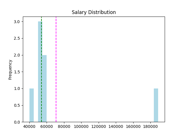
发现资料分布是一个 right-skewed 右偏态,极值将平均向右拉扯。
可以使用 pandas 指令来呈现偏态:
density = stats.gaussian_kde(S)
plt.plot(x, density(x)*250000, c='orange')

plt.show()
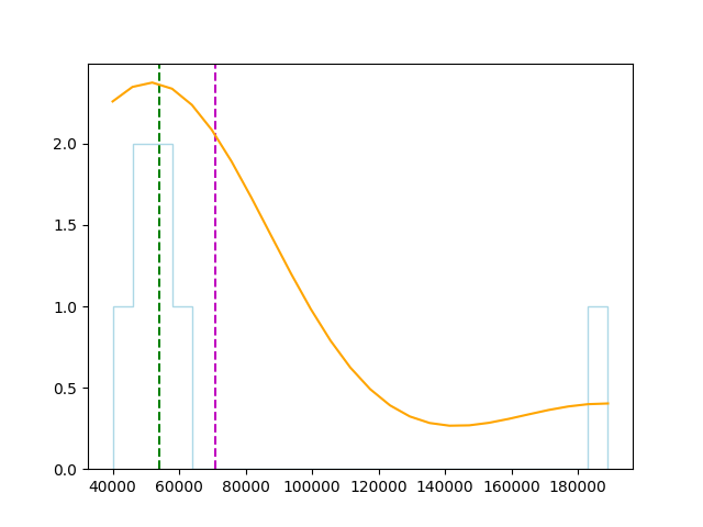
偏度与峰度:
print('Skewness: ' + str(S.skew()))
print('kurtosis: ' + str(S.kurt()))
>>  Skewness: 2.57316410755049    # 偏度
    Kurtosis: 6.719828837773431   # 峰度
2-3. Measures of Variance 变异数的衡量
A. Range (max-min)
numcols = ['Salary', 'Hours', 'Grade']
for col in numcols:
     print(df[col].name + ' range: ' + str(df[col].max() - df[col].min()))

>>  Salary range: 149000
    Hours range: 11
    Grade range: 90
B. Percentiles 百分位数
strict: 表示小於这个值的百分位数。
weak: 表示小於或等於这个值的百分位数。
rank: 表示碰到相同值,他们共享这个百分位数。
method = ['strict', 'weak', 'rank']
for i in method:
    a = pr(df['Grade'], df.loc[6, 'Grade'], i)
    print(f'Grade ({i}): {a:.2f}')

>>  Grade (strict): 71.43
    Grade (weak): 85.71
    Grade (rank): 85.71
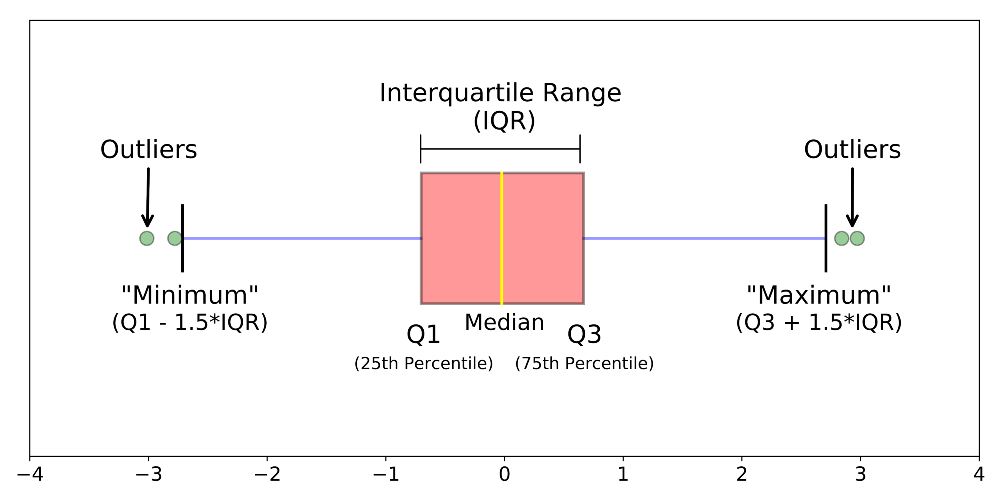
C. Quartiles 四分位数
Box plot可以观察以下
- 左右两侧为最大(Q3+1.5IQR)与最小值(Q1-1.5IQR)
- 中间线段为中位数
- 盒子两侧为Q1(25% Percentiles)、Q3(75% Percentiles)
使用 seaborn 中的内建资料集 'tips' 来分析:
import seaborn as sns
import matplotlib.pyplot as plt

df2 = sns.load_dataset('tips')

sns.boxplot('day', 'tip', data=df2)
plt.show()
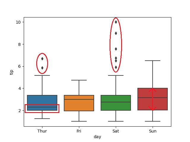
- 周四的平均值比周五、周六、周日少(红框)
- 周六的离群值多出许多(红圈)
- 周日的小费上下区间差异最大(箭头)
D. Variance and Standard Deviation 变异数与标准差
D-1. Variance

# 1. pandas 预设为样本变异数,ddof=1,即分母为 N-1
df['Grade'].var()

>>  685.6190476190476

# 2. numpy 预设为母体变异数,ddof=0,即分母为 N
np.var(np.array(df['Grade']))

>>  587.6734693877551
D-2. Standard Deviation
由於变异数为求距离为正数,作了平方和,导致与实际值相差甚远,
因此,变异数再开根号,使规模相符,称之为标准差。

# 1. pandas 预设为样本标准差,ddof=1,即分母为 N-1
df['Grade'].std()

>>  26.184328282754315

# 2. numpy 预设为母体标准差,ddof=0,即分母为 N
np.std(np.array(df['Grade']))

>>  24.24197742321684
3. Comparing Data 资料比较
3-1. 变数类型
A. Univariate Data 单变数
以上述例子为例,若资料仅包含薪资待遇,则为一个单变数资料。
常利用箱型图、直方图分析特性。
df = pd.DataFrame({
    'Name': ['Dan', 'Joann', 'Pedro', 'Rosie', 'Ethan', 'Vicky', 'Frederic'],
    'Salary':[50000, 54000, 50000, 189000, 55000, 40000, 59000],
    })
B. Bivariate or Multivariate Data 双变数或多变数
常利用散布图、多个箱型图分析特性。
df = pd.DataFrame({
    'Name': ['Dan', 'Joann', 'Pedro', 'Rosie', 'Ethan', 'Vicky', 'Frederic'],
    'Salary':[50000, 54000, 50000, 189000, 55000, 40000, 59000],
    'Hours':[41, 40, 36, 30, 35, 39, 40],
    'Grade':[50, 50, 46, 95, 50, 5, 57]
    })
3-2. Feature Scaling 特徵缩放
- 使特徵规模一致,求解收敛速度快
- 提高准确率
通常有以下两种方式:
A. Standard Score (Z-score) 标准化
藉由从单一(原始)分数中减去母体的平均值,再依照母体(母集合)的标准差分割成不同的差距。
白话文: x 与平均数之间相隔多少个标准差。
from sklearn.preprocessing import StandardScaler
scaler = StandardScaler()
df[['Salary', 'Hours', 'Grade']] = scaler.fit_transform(df[['Salary', 'Hours', 'Grade']])
print(df)
>>         Name  Salary  Hours  Grade
    0       Dan   -0.43   1.03  -0.02
    1     Joann   -0.35   0.75  -0.02
    2     Pedro   -0.43  -0.36  -0.18
    3     Rosie    2.43  -2.02   1.84
    4     Ethan   -0.33  -0.63  -0.02
    5     Vicky   -0.64   0.47  -1.87
    6  Frederic   -0.25   0.75   0.27
B. Normalizing 归一化
重新缩放特徵的范围到[0, 1]或[-1, 1]。
白话文: x 在 max 和 min 中等比例的位置。
from sklearn.preprocessing import MinMaxScaler
scaler = MinMaxScaler()
df[['Salary', 'Hours', 'Grade']] = scaler.fit_transform(df[['Salary', 'Hours', 'Grade']])
print(df)
>>         Name  Salary  Hours  Grade
    0       Dan    0.07   1.00   0.50
    1     Joann    0.09   0.91   0.50
    2     Pedro    0.07   0.55   0.46
    3     Rosie    1.00   0.00   1.00
    4     Ethan    0.10   0.45   0.50
    5     Vicky    0.00   0.82   0.00
    6  Frederic    0.13   0.91   0.58
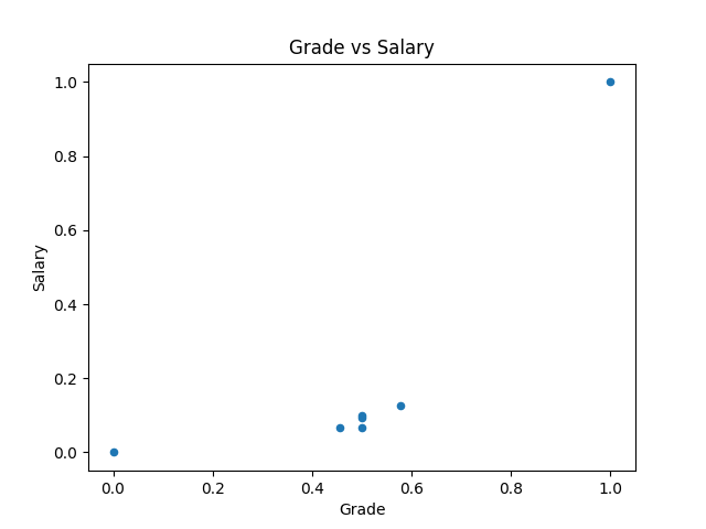
归一化的资料在小型计算上并不会体现差异,
但若演算庞大数据,利用归一化後的资料 scale 小,其收敛速度较快。
import matplotlib.pyplot as plt
df.plot(kind='scatter', title='Grade vs Salary', x='Grade', y='Salary')
plt.show()
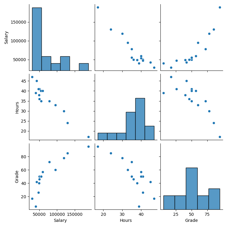
3-3. Pairplot 配对图
在 seaborn 中,可以用 pairplot 指令画出所有变数对应的散布图。
3个变数 → 得到 3*3 张图
首先我们把更大量的资料丢进python
df = pd.DataFrame({
    'Name': ['Dan', 'Joann', 'Pedro', 'Rosie', 'Ethan', 'Vicky', 'Frederic', 'Jimmie', 'Rhonda', 'Giovanni', 'Francesca', 'Rajab', 'Naiyana', 'Kian', 'Jenny'],
    'Salary':[50000,54000,50000,189000,55000,40000,59000,42000,47000,78000,119000,95000,49000,29000,130000],
    'Hours':[41,40,36,17,35,39,40,45,41,35,30,33,38,47,24],
    'Grade':[50,50,46,95,50,5,57,42,26,72,78,60,40,17,85]
    })
接着
import seaborn as sns
import matplotlib.pyplot as plt
sns.pairplot(df)

plt.show()
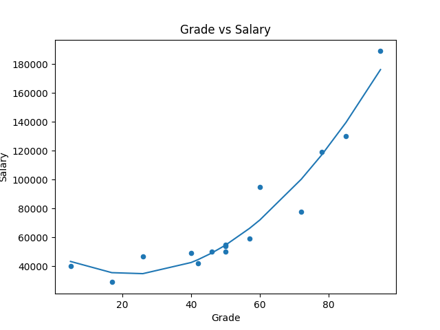
进一步使用 numpy 内建的 poly1d, polyfit 来做线性回归:
df.plot(kind='scatter', title='Grade vs Salary', x='Grade', y='Salary')

# 先求出回归线
reg = np.polyfit(df['Grade'], df['Salary'], 2)

# 定义 x 与 y
x = np.unique(df['Grade'])  # 去除重复数字
y = np.poly1d(reg)(x)       # 带入回归线涵式

plt.plot(x, y)
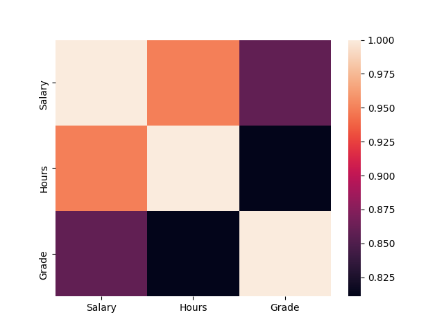
3-4. Correlation 关联性
用数字表示两个不同资料间,存依关系大小,称关联性。
公式如下:

其值会介於 -1~1 间(正相关与反相关),其绝对值越靠近 1 表示关联性越大。
一般而言,超过 0.8 即高度相关。
print(df.corr())   # 自己与自己必定全关联

>>          Salary  Hours  Grade
    Salary    1.00  -0.95   0.86
    Hours    -0.95   1.00  -0.81
    Grade     0.86  -0.81   1.00
如果将其视觉化,可运用 seaborn 热力图:
import seaborn as sns
import matplotlib.pyplot as plt

sns.heatmap(np.abs(df.corr()))   # 取绝对值才能看出相关
plt.show()
4. Probability 机率
4-1. Basic
.Experiment 实验:
表示一具有不确定结果的动作。如:抛硬币。
.Sample space 样本空间:
实验所有可能结果的集合。抛硬币中,有一组两种可能的结果(正和反)。
.Sample point 样本点:
是单个可能的结果。如:正面
.Event 事件:
某次实验发生的结果。如:正面
.Probability 机率:
某种事件发生的可能性。如:正面机率为 50%
事件发生机率 = 某事件的样本点/样本空间所有样本点
EX.1 若丢两次骰,总和为7的机率为?
- Sample space = 6*6 = 36
- Sample point = 6
- Probability = 6/36 = 16.7%
EX.2 若丢两次骰,总和大於4的机率为?
(此例用反面机率计算较快)
计算总和小於等於4
- Sample space = 6*6 = 36
- Sample point = 6
- P(A) = 1 - 0.167 = 83.3%
4-2. Conditional Probability and Dependence 条件机率与相依性
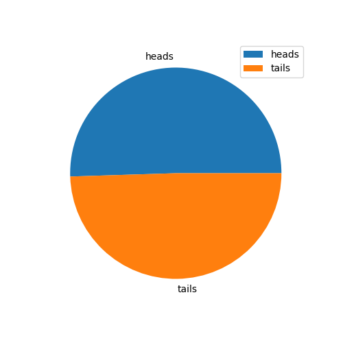
A. Independent Events 独立事件
EX. 丢硬币
第一次丢正面,并不影响第二次丢正面的机率。
import random

# 创建一个 list 代表正面与反面
heads_tails = [0, 0]

# 重复丢一万次
trial = 0
while trial < 10000:
    trial += 1
    toss = random.randint(0,1)
    heads_tails[toss] += 1
print (heads_tails)
>> [5050, 4950]

# 作成 pie chart
from matplotlib import pyplot as plt
plt.figure(figsize=(5,5))
plt.pie(heads_tails, labels=['heads', 'tails'])
plt.legend()

plt.show()
B. Dependent Events 相依事件
第一事件的结果会影响第二事件。
如抽扑克牌(且不放回)两张,其中一张为红的机率为何:
(26/52) * (26/51) = 25.49%
C. Mutually Exclusive Events 互斥事件
事件 A 与 事件 B 同时发生的机率为 0,即 ?(?^?)=0,
如丢骰,丢到 6 点,及丢到奇数,为互斥事件。
4-3. Variables and Distributions 二项变数与分配
.Bernoulli 白努力分配:
作一次二分类的实验。如:抛 1 次硬币。
.Binomial 二项分配:
作多次二分类的实验。
.Multinomial 多项分配:
作多次多分类的实验。如:丢多次骰。
A. Permutation 排列
须讲究"顺序"的取用方式。以下为程序码:
# 3 取 2 排列
from itertools import permutations

perm = permutations([1, 2, 3], 2)
for i in list(perm):
    print (i)
>>  (1, 2)
    (1, 3)
    (2, 1)
    (2, 3)
    (3, 1)
    (3, 2)

print(len(list(perm)))

>>  6
B. Combination 组合
不讲究顺序,仅在乎取用物件。以下为程序码:
from itertools import combinations

comb = combinations([1, 2, 3], 2)

for i in list(comb):
    print(i)

>>  (1, 2)
    (1, 3)
    (2, 3)
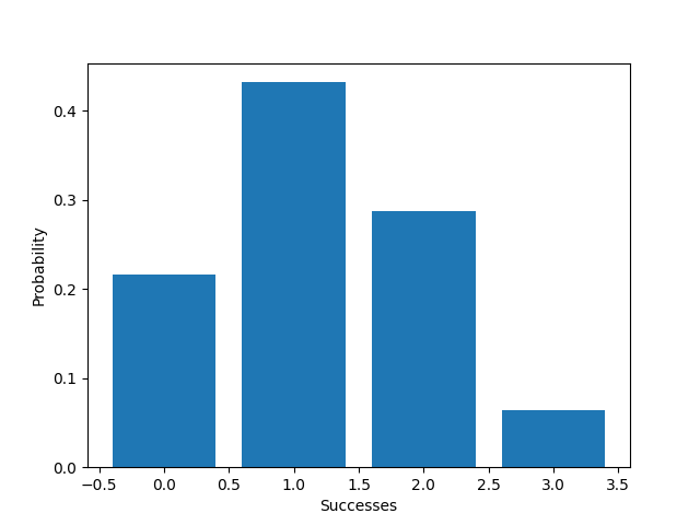
C. Allowing for Bias 允许偏差(机率不相等)
EX1. 重复丢硬币3次,丢出各组合的机率为何?(正面机率为40% 反面为60%)
from scipy.stats import binom
import matplotlib.pyplot as plt
import numpy as np

trials = 3
p = 0.5
x = np.array(range(0, trials+1))

prob = [binom.pmf(k, trials, p) for k in x]

# 作图
plt.xlabel('Successes')
plt.ylabel('Probability')
plt.bar(x, prob)
plt.show()
EX2. 我们拿最近很夯的丁特抽天堂 M 紫布来看看...
n = 475 # 总共抽卡475次
p = 0.1 # 抽卡中奖机率 10%
x = np.array(range(0, n+1)) # 中奖次数

P = [binom.pmf(k, n, p) for k in x]

plt.xlabel('x')
plt.ylabel('Prob')
plt.bar(x, P)   # 把中奖次数作 x 轴,发生此事件的机率作 y 轴
plt.axvline(11, c='r', linestyle='--', linewidth=2)

print('丁特抽卡475次,机率10%情况,只中11次的机率为: ', f'{binom.pmf(11, n, p)}')
>> 丁特抽卡475次,机率10%情况,只中11次的机率为:  3.633598716610176e-11
plt.show()
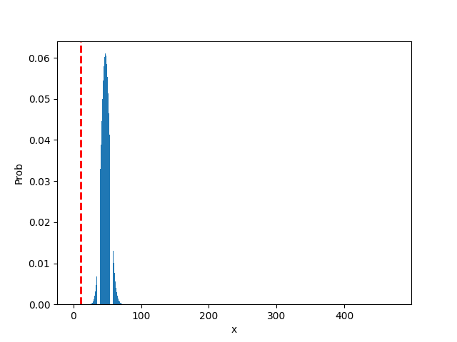
从图中可以发现,最有可能出现的次数为 47.5 次,根据基础统计来看...
橘子公司内部调整的紫布机率肯定不会是10%!!!
- mean = n*p = 475 * 0.1 = 47.5
- var = n * p * (1-p)
- std = (n * p * (1-p)) ^ 0.5
4-4. Binomial Distribution Expected Value & Variance 二项分配的期望值与变异数
A. Expected Value 期望值
B. Variance 变异数

C. Standard Deviation 标准差

.
.
.
.
.
Homework:
#1. 今彩 539
- 请问各个奖项中奖机率为?
- 请问每张彩券平均报酬率?
须从 01~39 的号码中任选5个号码进行投注。
开奖时,开奖单位将随机开出五个号码,这一组号码就是该期今彩539的中奖号码,也称为「奖号」。
五个选号中,如有二个以上(含)对中当期开出之五个号码,即为中奖,并可依规定兑领奖金。
各奖项的中奖方式如下表:
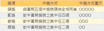
奖金如下:

#2. 使用 sklearn 内建资料集 "load_boston" 来预测波士顿房价
提示:
- Data prepare 准备资料
- Data clean 资料清理
- Feature Engineering 特徵工程
- Split 拆分资料
- Train Model 机器训练
- Score Model 为模型打分
.
.
.
.
.
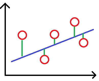
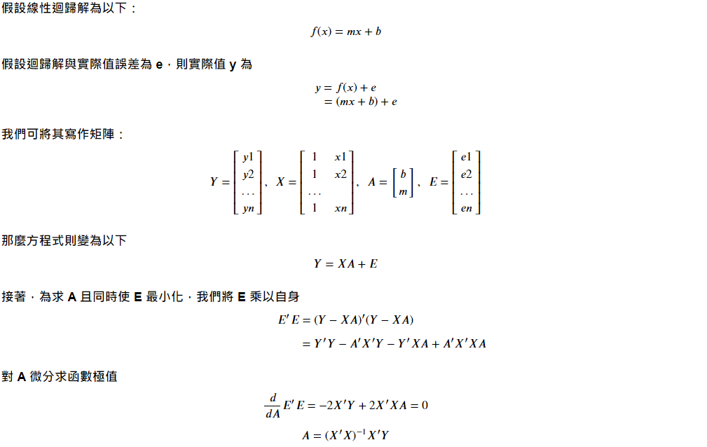
补充:线性回归
假设有一资料如下图,红点为资料,蓝线为其回归线
<<: [ JS个人笔记 ] const、let、var的区别—DAY3
>>: 系统分析师养成之路-当责Accountability
卡夫卡的藏书阁【Book24】- Kafka - KafkaJS Admin 1
“Better to have, and not need, than to need, and ...
33岁转职者的前端笔记-DAY 23 JavaScript 变数与型别
Nan => Not a Number,要判断是不是NaN要用:isNaN(); 注意自动转...
D4 - 彭彭的课程#Python 简介、安装、与快速开始
今天开始来看一下彭彭的课程 Python 简介、安装、与快速开始 参考连结如下: https://w...
C#入门之文本处理(上)
作为一名 IT,和日志打交道是必不可少的,我们经常需要去查看一些日志文件,以从中获取一些有用的信息,...
Day9-"格式化符号"
昨天在练习scanf时,题目规定说输入为字串,一开始都是以%d,做为字串的格式,但在printf时发...