Day 8 (CSS)
1.transition-timing-function 使用 曲线设置
通常:
     #d2{
        transition-timing-function: linear;
        }
可利用两个控制点,决定一个曲线:
https://cubic-bezier.com/
(左边的图案可以拉,GO看变化)
     #d2{
        transition-timing-function:cubic-bezier(.09,1.13,1,-0.14);
        }
2.属性
- img属於行内属性(inline)
- a标签属於行内属性(inline),所以
display:block会变成一栏
      nav a {
        font-size: 1.2rem;
        display: block;
      }
3.强迫在同一排
display: flex;
使用这个才会换行
flex-wrap: wrap;
4.小图示的缩放
先往左推-1.1rem,图片消失(0倍)
        }
        nav a .fa {
            transform: scale(0);
            transition: 0.3s all linear;
            margin-right: -1.1rem;
        }
滑鼠碰到之後归0,并让图片出现(1倍)
        nav a:hover .fa {
            margin-right: 0rem;
            transform: scale(1);
            }
5.transform v.s animation
摸与不摸图形改变
-
transform(摸)
2D =>
transform: translateX(100px)
3D =>
transform: rotateX(40deg);
transform: rotateY(50deg);
transform: rotateZ(60deg); -
animation(不摸)
      div {
        animation-name: apple;
        animation-duration: 2s;
        animation-iteration-count: infinite;
      }
6.transform: translate(位移)
置中对齐
     .wavy {
        position: absolute;
        top: 50%;
        left: 50%;
        transform: translate(-50%, -50%);
      }
原理
7.### animation 动画制作
      .box {
        /* 使用jump(可自定义) */
        animation-name: jump;
        animation-duration: 1s;
        animation-iteration-count: infinite;

      }
@定义
      @keyframes jump {
        0% {
          top: 0px;
        }
        50% {
          /* 外推80px */
          top: 80px;
          border-radius: 0 0 30px 0;
        }
        100% {
          top: 0px;
        }
      }
8.改变位置
position: static;"以外"的都可以
因为static是预设,位置(top)就不可以被移动
 .box {
        position: relative;
      }
      @keyframes jump {
        0% {
          top: 0px;
        }
        50% {
          /* 外推80px */
          top: 80px;
          border-radius: 0 0 30px 0;
        }
        100% {
          top: 0px;
        }
      }
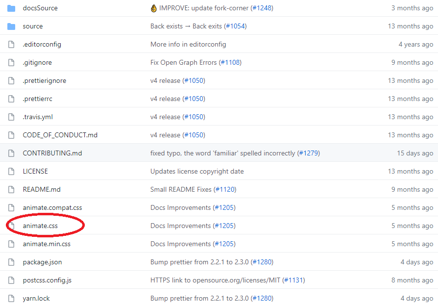
9.引用animate.css制作animate
先抓取档案,放到档案下引用animate.css
https://github.com/animate-css/animate.css
找喜欢的效果套入(右侧)
https://animate.style/
使用方法
1.一定要有
animate__animated
animate__bounce
2.delay
/* All delay classes will take 2x longer to start */
:root {
  --animate-delay: 2s;
}
3.重复次数 infinite无限次
.my-element {
  --animate-repeat: 2;
}
>>: PMI PMP 练习测试 - 在实际 PMP 考试中确认成功
Day 28 - Vue 与 HTTP请求 (3)
不过我们在前端与後端进行资料交换时,极有可能会遇到跨域问题。 何谓跨域问题呢? CORS(Cross...
Day 29 JavaScript : promise
昨天我们了解到 JavaScript 的非同步执行方法,但有时我们想要等到 A 事件结束後,再来进行...
Day7# Array & Slice(上)
嗨,连假後的第一天上班大家还好吗...(›´ω`‹ )... 在 Day3 有提到会在更仔细的介绍 ...
食谱资料库架构图
MySQL 学习 由於Icebear在学习创建资料库时,FORGIEN KEY 後面都会有ON DE...
Day30 file system, inode
前言 时间终於过到了最後一天,昨天看了三个特别的虚拟文件系统,今天就看看实际存在的文件管理系统吧! ...