[Android Studio 30天自我挑战] Switch 元件介绍
这篇的Switch button与前几篇的ToggleButton很类似,
但ToggleButton为点击後切换,而Switch则可以明显的看出开关的移动
Switch元件常用属性
android:splitTrack	//设定文字与开关之间的距离
android:switchMinWidth	//设定开关的最小宽度
android:switchPadding	//设定Switch内文字的间隔
android:switchTextAppearance  //设定Switch的文字外观
android:textOff	//当按钮没被打开时的文字
android:textOn	//当按钮被开启时的文字
android:textStyle	//文字样式
android:track	//Switch底部的图片
android:thumb	//Switch滑动的图片
android:typeface //设定文字样式
简单的范例如下:
先在activity_main.xml档下插入一个Switch
<?xml version="1.0" encoding="utf-8"?>
<LinearLayout xmlns:android="http://schemas.android.com/apk/res/android"
    xmlns:app="http://schemas.android.com/apk/res-auto"
    xmlns:tools="http://schemas.android.com/tools"
    android:layout_width="match_parent"
    android:layout_height="match_parent"
    android:orientation="vertical"
    tools:context=".MainActivity" >

    <Switch
        android:id="@+id/switch1"
        android:layout_width="wrap_content"
        android:layout_height="wrap_content"
        android:layout_gravity="center"
        android:layout_marginTop="40dp"
        android:showText="true"
        android:text="开关灯"
        android:textOff="关"
        android:textOn="开"
        android:textSize="30dp"
        android:textStyle="bold"
        android:thumb="@drawable/switchthumb"
        android:track="@drawable/switchtrack" />
</LinearLayout>
如果想要变更Switch的图案,就在drawable下新增thumb和track样式的xml档
thumb样式:
<?xml version="1.0" encoding="utf-8"?>
<selector xmlns:android="http://schemas.android.com/apk/res/android">

    <item android:state_checked="true">

        <shape android:shape="rectangle">
            <solid android:color="#ffffff"/>
            <size android:height="40dp"
                android:width="50dp"/>
            <corners android:radius="40dp"/>
            <stroke android:width="2dp"
                android:color="@color/black"/>
        </shape>
    </item>
    <item android:state_checked="false">

        <shape android:shape="rectangle">
            <solid android:color="#ffffff"/>
            <size android:height="40dp"
                android:width="50dp"/>
            <corners android:radius="40dp"/>
            <stroke android:width="2dp"
                android:color="#cdcdcd"/>
        </shape>
    </item>
</selector>
track样式:
<?xml version="1.0" encoding="utf-8"?>
<selector xmlns:android="http://schemas.android.com/apk/res/android">

    <item android:state_checked="true">

        <shape android:shape="rectangle">
            <solid android:color="@color/black"/>
            <corners android:radius="200dp"/>
        </shape>
    </item>
    <item android:state_checked="false">

        <shape android:shape="rectangle">
            <solid android:color="#cdcdcd"/>
            <corners android:radius="200dp"/>
        </shape>
    </item>

</selector>
设定好样式後打开MainActivity.java设定打开时会跳出Toast提示目前电源开关资讯
package com.example.itt;
import androidx.appcompat.app.AppCompatActivity;
import android.os.Bundle;
import android.widget.CompoundButton;
import android.widget.CompoundButton.OnCheckedChangeListener;
import android.widget.Switch;
import android.widget.Toast;
public class MainActivity extends AppCompatActivity implements OnCheckedChangeListener {
private Switch aSwitch;
@Override
protected void onCreate(Bundle savedInstanceState) {
super.onCreate(savedInstanceState);
setContentView(R.layout.activity_main);
aSwitch = (Switch) findViewById(R.id.switch1);
aSwitch.setOnCheckedChangeListener(this);
}
@Override
public void onPointerCaptureChanged(boolean hasCapture) {
}
public void onCheckedChanged(CompoundButton compoundButton, boolean b) {
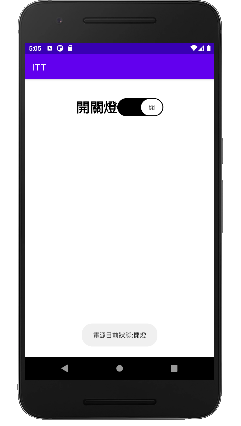
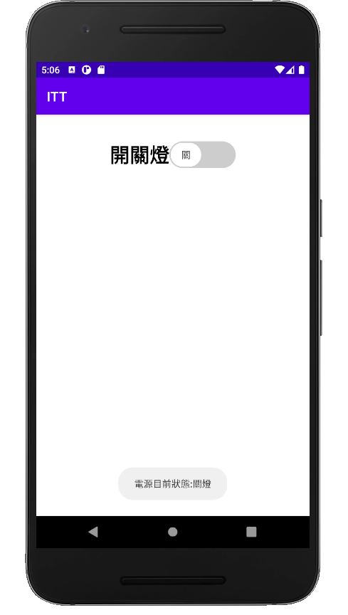
String state = compoundButton.isChecked() ? "开灯" :"关灯";
Toast.makeText(this,"电源目前状态:"+state,Toast.LENGTH_SHORT).show();
}
}
APP成功画面:
<<: [Day 22 - Redux] 有了Redux,状态管理没烦恼
[Python 爬虫这样学,一定是大拇指拉!] DAY27 - 实战演练:重复使用 TCP 连线
重复使用 TCP 连线 本篇章请搭配以下一起服用: HTTP - 复习传送门 TCP / UDP -...
纪录工作大小事,来看他人成长
如何改善痛点问题,不只有在工作,也可以用於纪录自己的生活以及家庭。在每个 Sprint 结束都有 R...
Day 27 : Python - 什麽是列表推导式?又该如何将它和if、if-else一起做使用?
如标题,这篇想和大家聊聊「列表推导式」是什麽东西 我们先看看范例再说明,这样大家会比较好理解 Ex ...
Day 15: GCP-Storage
Doc https://cloud.google.com/storage/docs/storage-...
【踩坑】为什麽a标签没有包住我要的范围!?
前几天看了落落长的grid使用 相信应该有一滴滴的概念了 今天来轻松一下~ 看看我干过的蠢事⊙▽⊙ ...