网页表单-30天学会HTML+CSS,制作精美网站
表单在网页上有不同呈现的功能,像是网路投票、注册、购物、问券、搜寻等,用来收集浏览者的资讯,增加与使用者的互动。
<form>
包含表单元素的区域(input、textarea、select...),用来让使用者输入资料
<form action="送出目的地" method="资料传送方式">
	<!-表单元素->
</form>
表单资料传递方式:
填好表单按送出按钮後,透过get或post方传送到服务器(Web Server)
post
放在 HTTP 传输封包 body 中送出,安全性较高,因为已封包方式传送,所以传送资料大小没有档案限制。像是写完信件,会将信件放到信封里面,不会有人知道里面写什麽内容,安全性较高。
get
会将表单内的资料放在action请求的URL上面送出,安全性较差,且只有255个字元限制,适合用在搜寻等资料量少的表单。get传送方式就像是明信片,容易被其他人看到内容,安全性较低。
表单元件
制作表单,会有输入框、下拉选单、按钮等元件组成。下面就会一一介绍每个元件功能
<input>
是让使用者输入的资料的元件,常用在搜寻(text)、密码(password)、信箱(email)等。
通用属性:
- name:栏位名称
- value:指定初始值
- placeholder:提醒使用者输入内容的提示讯息
文字输入(预设值)
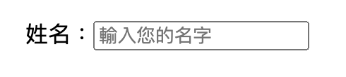
姓名:<input type="text" name="username" placeholder="输入您的名字">
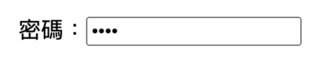
密码
不会被明码显示在萤幕画面中
<input type="password">
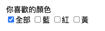
多选核取方块
name需要都是一样,一个群组内,可以复选,预设选取可以使用checked
你喜欢的颜色<br>
<input type="checkbox" name="color" id="all" checked>全部
<input type="checkbox" name="color" id="blue">蓝
<input type="checkbox" name="color" id="red">红
<input type="checkbox" name="color" id="yellow">黄
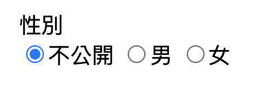
单选按钮
name需要都是一样,一个群组内,只能单选,预设选取可以使用checked
性别<br>
<input type="radio" name="gender" id="noopen" checked>不公开
<input type="radio" name="gender" id="man">男
<input type="radio" name="gender" id="woman">女
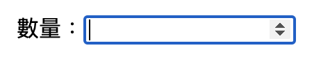
数字
只能输入数字,选取input输入框右边可以点选上下箭头符号,增减数字
<input type="number">
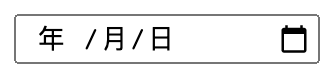
日期格式
- type="date":输入日期,格式为YYYY-MM-DD
- type="dateTime":
- type="time":输入时间,格式为hh:mm:ss
- type="week":第几周,格式为YYYY-Www
- type="month":输入年份及月份,格式为YYYY-MM
- type="datetime-local":本地与世界标准时间,格式为YYYY-MM-DDThh:mm:ss
<input type="date">
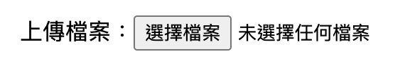
档案上传
<input type="file">
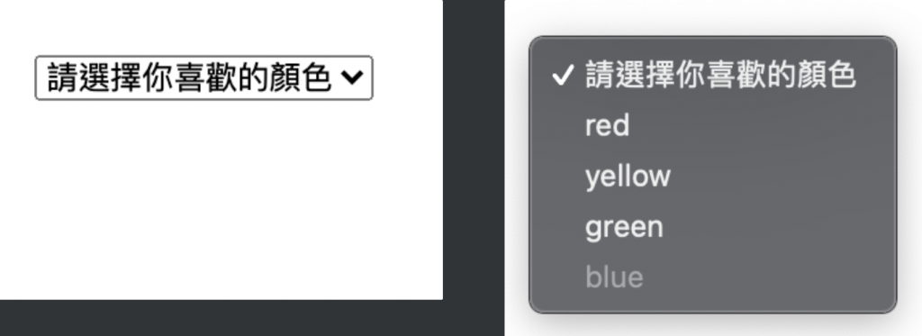
<select>
用来建立下拉式选单 (dropdown menu),让使用者可以从一堆选项中选择出一个或多个选项
- name:栏位名称
- value: 指定如果选了该选项,表单要传送什麽值给远端服务器,如果没设定 value,预设是送 的内容
- selected: 预设选取的
<option> - disabled: 不可选取
<option>
<select>
    <option>请选择你喜欢的颜色</option>
    <option value="red">red</option>
    <option selected>yellow</option>
    <option>green</option>
		<option disabled>blue</option>
</select>
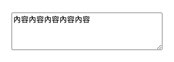
<textarea>
多行文字输入栏位
- name:栏位名称
- rows:设定输入框的高度是几行文字 (lines),预设是 2
- cols:设定输入框的宽度是多少文字 (characters),预设是 20
<textarea name="mytext" rows="4" cols="30">内容内容内容内容内容</textarea>
<label>
label可以将栏位名称及表单元件做关联。用for属性值设定与表单元件id做关联。或是直接把表单元件包在label里面。
<div>
	方法一:
	<label for="emailAddress">Email address: </label>
	<input type="email" name="emailAddress" id="emailAddress">
</div>
<div>
	方法二:
	<label>
		Email address:
		<input type="email" name="emailAddress">
	</label>
</div>
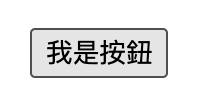
<button>
- submit:送出,预设值
- reset:重设
- button:一般按钮,需搭配javascript使用
<button type="button">我是按钮</button>
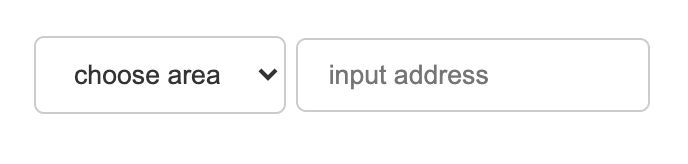
改造表单元件样式
表单元件像是输入框、下拉选单...的样式预设都丑丑的,透过css可以随心所欲的将元件变得美美的,以下是我比较常用的表单样式
设定文字颜色、边框、间距、圆角
<select class="form-control">
		<option>choose area</option>
		<option>Taichung</option>
		<option>Taipei</option>
	</select>
	<input type="text" class="form-control" placeholder="input address">
.form-control{
	color:#333;
	border:1px solid #ccc;
	padding:10px 15px;
	margin-bottom:10px;
	border-radius:5px;
}
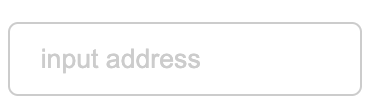
设定placeholder属性样式
.form-control::placeholder {
  color: #ccc;
}
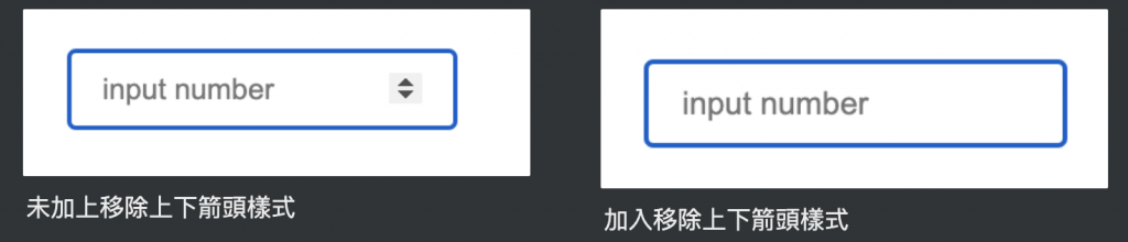
移除input[number]的上下箭头
/*chrome浏览器移除*/
input::-webkit-outer-spin-button,
input::-webkit-inner-spin-button {
  -webkit-appearance: none;
}
/*firefox浏览器移除*/
input[type="number"]{
  -moz-appearance: textfield;
}
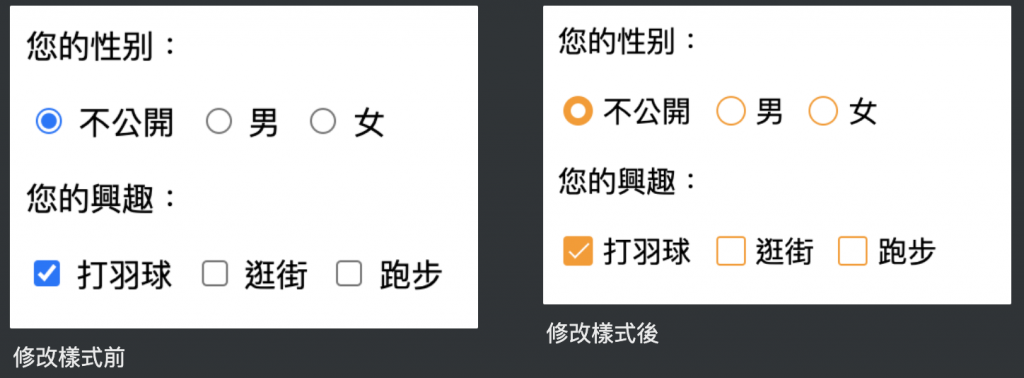
美化radio、checkbox预设样式
<p>您的性别:</p>
<div class="select-item radio-item">
  <input type="radio" id="noopen" name="sex" checked>
  <label for="noopen"></label>不公开
</div>
<div class="select-item radio-item">
  <input type="radio" id="man" name="sex">
  <label for="man"></label>男
</div>
<div class="select-item radio-item">
  <input type="radio" id="woman" name="sex">
  <label for="woman"></label>女
</div>

<p>您的兴趣:</p>
<div class="select-item checkbox-item">
  <input type="checkbox" id="noopen" name="sex" checked>
  <label for="noopen"></label>打羽球
</div>
<div class="select-item checkbox-item">
  <input type="checkbox" id="man" name="sex">
  <label for="man"></label>逛街
</div>
<div class="select-item checkbox-item">
  <input type="checkbox" id="woman" name="sex">
  <label for="woman"></label>跑步
</div>
.select-item {
  position: relative;
  display: inline-block;
  margin-right: 5px;
}
.select-item input {
  vertical-align: middle;
  width: 14px;
  height: 14px;
  appearance: none;
  -webkit-appearance: none;
  opacity: 0;
  outline: none;
  margin: 0 5px 0 0 ;
}
.select-item label {
  position: absolute;
  left: 3px;
  top: 3px;
  z-index: -1;
  width: 14px;
  height: 14px;
  border: 1px solid #409eff;
  border-radius: 50%;
}
.select-item input:checked + label {
  background-color: #409eff;
}
/*radio style*/
.radio-item input[type="radio"]:checked + label::after {
  content: "";
  position: absolute;
  left: calc(50% - 4px);
  top: calc(50% - 4px);
  width: 8px;
  height: 8px;
  background-color: #fff;
  border-radius: 50%;
}
/*checkbox style*/
.checkbox-item label{
  border-radius: 2px;
}
.checkbox-item input[type="checkbox"]:checked + label::after {
  content: "";
  position: absolute;
  left: 5px;
  top: 0px;
  width: 4px;
  height: 10px;
  border-right: 1px solid #fff;
  border-bottom: 1px solid #fff;
  transform: rotate(45deg);
}
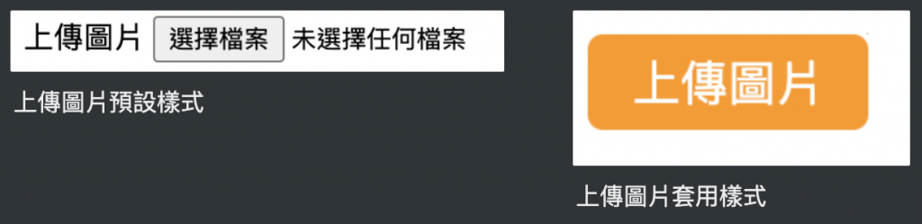
上传图片改为按钮样式
<div class="upload-box">
  <label for="file-upload" class="customer-upload">
    上传图片
  </label>
  <input id="file-upload" type="file"/>
</div>
.upload-box input[type="file"] {
  position: absolute;
  width: 1px;
  height: 1px;
  padding: 0;
  margin: -1px;
  overflow: hidden;
  border: 0;
}
.upload-box .customer-upload {
  background-color:#ff9800;
  display: inline-block;
  padding: 5px 15px;
  cursor: pointer;
  color:#fff;
  border-radius:5px;
}
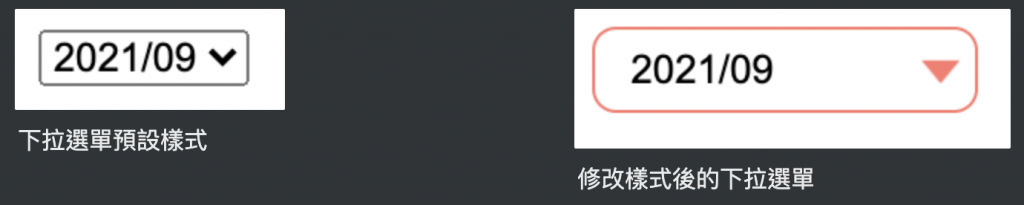
自订select箭头样式
<select class="form-control">
  <option>2021/09</option>
  <option>2021/10</option>
</select>
select {
  width: 130px;
  padding:5px 25px 5px 8px;
  background-color: #fff;
  background-clip: padding-box;
  border-radius: 0.25rem;
  border-radius: 8px;
  border: 1px solid #ff786e;
	line-height: 1;
	/*将预设的select选择框样式清除*/
  appearance: none;
  -moz-appearance: none;
  -webkit-appearance: none;
	/*箭头样式及箭头位置*/
  background: url(img/arr.png) no-repeat scroll 96% center #fff;
  background-size: 13px 8px;
  outline: 0;
}
参考资料:
https://medium.com/ui-ux练功坊/form表单中的get与post有什麽差别-d2a04845769a
https://medium.com/@small2883/表单结构-表单中的get-与-post区别-685b0bfe15ea
https://developer.mozilla.org/en-US/docs/Web/CSS/::placeholder
https://www.itread01.com/p/632603.html
<<: Day23 vue.js 自订 api (fastapi)
[JS] You Don't Know JavaScript [this & Object Prototypes] - this All Makes Sense Now! [上]
前言 在this Or That?中提到了许多对於this的误解,并且也对於这些误解做了一些解释,我...
Day43 ( 电子元件 ) 触碰开灯 ( 引脚按下 )
触碰开灯 ( 引脚按下 ) 教学原文参考:触碰开灯 ( 引脚按下 ) 这篇文章会介绍如何使用「当引脚...
Day05:工程师必学的 Markdown 笔记语法
一、前言 大家一定都知道并且常使用 Markdown 吧?那你们常使用的工具有哪些呢?以下我就简...
Day 04:金鱼记忆力太短暂,交给外挂记吧!autosuggestions 与 substring-search
我把从第一天到现在每天的 Home 目录都放上 GitHub 了,README.md 里面有说明 ...
iOS APP 开发 OC 第十一天,使用 typedef 简化 block
tags: OC 30 day 问题:简化block变量的时候,要写好大一串,类型好长。 typed...