27. 解释 CSS 的 BFC(Block Formatting Context)
Formatting Context
所有的HTML元素,在CSS里都可以视为box(盒子),在Normal Flow里的boxes会具备formatting context。
Everything on a page is part of a formatting context, or an area which has been defined to lay out content in a particular way.
在一个页面上,每个元素都是formatting context的一部份,而区域环境内的元素会依照特定的方式排版。他们可能是block或inline,且不会同时具备两者。
( Formatting → 格式 / Context → 区域环境;上下文 )
CSS的Formatting Context包含这几种:
- BFC(Block formatting context) : 块状物件(block-level boxes)属於block formatting context
- IFC(Inline formatting context) : 行内物件(inline-level boxes)属於inline formatting context
- FFC(Flex formatting context)
- GFC(Grid formatting context)
BFC(Block Formatting Context)
BEC的性质(在水平模式):
“In a block formatting context, boxes are laid out one after the other, vertically, beginning at the top of a containing block. The vertical distance between two sibling boxes is determined by the 'margin' properties. Vertical margins between adjacent block-level boxes in a block formatting context collapse.
In a block formatting context, each box's left outer edge touches the left edge of the containing block (for right-to-left formatting, right edges touch).” - 9.4.1
引用自 Block and inline layout in normal flow - CSS: Cascading Style Sheets | MDN
(预设为水平方向排列的情况)
- 一个接着一个的垂直排列。
- 顺序是由上而下。
- 两个同级box的垂直距离由'margin'属性决定。
- 每个外层box的左外缘,接合内部box的左缘。
Margin collapsing 边界重叠
if you have an element with a top margin immediately after an element with a bottom margin, rather than the total space being the sum of these two margins, the margin collapses, and so will essentially become as large as the larger of the two margins.
边界重叠是指,当两个block元素相邻,如果同时设定了一个 Block 的 下外距 ( margin-bottom ) ,和另一个 Block 的 上外距 ( margin-top ) , 两个block的距离不会是外距的总和,而是较大的那个外距。
举例来说:
// html
<div class="div div1">
  margin bottom = 50px;
</div>
<div class="div div2">
  margin top = 50px; margin bottom = 0;
</div>
<div class="div div3">
  margin top = 50px
</div>
// css
.div {
  border: 2px solid blue;
}
.div1 {
  margin-bottom: 50px;
}
.div2, .div3 {
  margin-top: 50px;
}
执行结果:
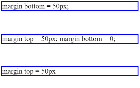
可以看到,
div1虽然设定了底部的外距,但因为div2也设定了上方的外距,所以他们之间的距离只有50px。
in-flow & Out of flow
所有的元素都是in-flow,除了 :
- floated items
- items with position: absolute (including position: fixed)
- the root element (html)
而这些Out of flow的物件,会创建一个新的BFC,
所以也可将他们视为一个小范围的独立布局(mini layout)。
→ 因为根元素(html)是Out of flow,所以整个document本身就会建立BFC。
→ 设定为 float 或绝对定位的元素,不会产生边界重叠。
举例:
<!-- Out of flow -->
<div class="outer">
  <div class="float">Hello, I'm a floating box.</div>
  lements participating in a BFC use the rules outlined by the CSS Box Model, which defines how an element's margins, borders, and padding interact with other blocks in the same context.
</div>

<div class="outer">
  <div class="float">Hello, I'm a floating box.</div>
  lements participating in a BFC
</div>
// scss
.outer {
  border: 2px solid red;
  width: 300px;
  padding: 10px;
  margin-top: 10px;
  .float {
    float: left;
    background: black;
    color: white;
    width: 100px;
  }
}
执行结果:
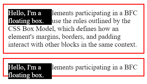
一个容器的内容会决定block的高度,所以在第一个div里,外层的div还刚好能包裹住内层的div。
然而,因为float本身会导致Out of flow,所以如果容器的高度不超过浮动(float)的物件,
那可能就会像下方的div一样,外层的div会无法包覆住内层的div。
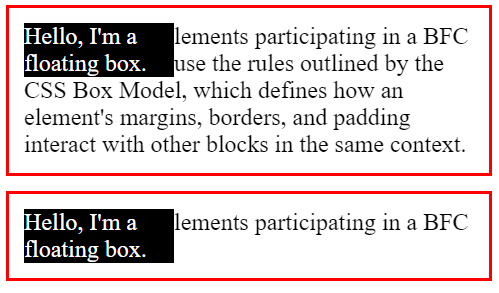
比较容易的解决办法,除了硬性规定height高度外,
可以在外部的div加入overflow:auto; :
// scss
.outer {
  border: 2px solid red;
  width: 300px;
  padding: 10px;
  margin-top: 10px;
  overflow: auto;   // 当内容溢出flow时,自动调整高度
  .float {
    float: left;
    background: black;
    color: white;
    width: 100px;
  }
}
这样看起来应该比较美观了:
提供范例的 codepen完整程序码
最後,如果想要建立一个全新的BFC,
除了上面举例的作法外,也可以参考MDN的其他范例。
【如内文有误还请不吝指教>< 并感谢阅览至此的各位:D 】
参考资料
- Visual formatting model
- Block and inline layout in normal flow - CSS: Cascading Style Sheets | MDN
- Understanding CSS Layout And The Block Formatting Context
---正文结束---
<<: DAY 21 『 连接 API 实作 - 天气 APP 』Part3
[第16天]理财达人Mx. Ada-已实现损益
前言 本文说明帐户已实现损益资讯。 程序实作 程序 # 特定时间已实现损益 profit_loss ...
Day18 动画介绍(2)
前言: 昨天介绍完进入时的渐入效果,今天会继续将剩下的范例介绍完 并在最後会介绍自定义前缀词 范例:...
Day 10 : 用於生产的机械学习 - Data Define 与建立基准
接续介绍 ML 专案生命周期,本日说明第 2 阶段「资料 Data」的工作流程,依其说法分为2大步...
纯手工打造UART版资料清洗工具之 Pyside2 GUI 大补帖 - Part A
笔者想要在网路上实在很难找到好用又齐全的PySide2教学大全,那乾脆自己做一份自己想要的大补帖出来...
[Day5]Count on Cantor
今天要讲的题目是Count on Cantor 先付上程序码 import java.util.; ...