TailwindCSS 从零开始 - 设定自己想要的 TailwindCSS 样式 Variant

前面有提到 TailwindCSS 在所有的 DOM 元素前面几乎都可以使用伪类变体来控制,但几乎也就代表了没有全部的元素都可以这样做,那如果专案需要设定效果,但 TailwindCSS 没有支援怎麽办。
那就自己用 CSS 刻阿!然後这篇就到这里结束了(被揍)
贴心的 TailwindCSS 也提供可以客制化的方式给开发者。
使用 Variant 来设定自己想要的样式
基本上许多常用的效果 TailwindCSS 都已经帮开发者设定好,那为什麽要可以自订呢?
因为还是有许多较少使用的样式,没有被设定。因为较少使用,所以要用到的时候,会发现我打了样式,却没有出现效果...
例如:
我想在 hover 效果的时候使用 border-dashed 双外框线效果,就没有出现。
demo: https://codepen.io/hnzxewqw/pen/poeBpoK
虽然我也可以每次要用的时候再去翻文件就好,但就是每次要写就要去找一次,有点麻烦。
可能常写也会记得啦!
但如果可以都不要写不是更好(误)...
建构属於自己的设定档
预设设定档
在文件中有一个指令
npx tailwindcss init
会将专案根目录建立一个最基本的 tailwind.config.js 档案,也就是一开始安装的时候出现的那支,会看到内容都是空的。
// tailwind.config.js
module.exports = {
  purge: [],
  darkMode: false, // 或 'media' 或 'class'
  theme: {
    extend: {},
  },
  variants: {
    extend: {},
  },
  plugins: [],
}
完整的设定档
如果想看到 TailwindCSS 完整的设定档,可以输入指令
npx tailwindcss init --full
这时候就会看到 TailwindCSS 完整的预设配置档,因碍於篇幅关系就不再放到文章中,可点选连结查看。
建议覆盖预设配置档的内容
虽然得到完整的预设配置档,可以改成专案需求的样式,但官方文件建议只在需要客制化地方,使用覆盖的方式去取代原本预设的样式,会是比较推荐的做法,避免一次引入太多没使用到的样式,让 CSS 变得很肥。
官方有给一个使用覆盖预设样式的范例:
// `tailwind.config.js` 范例档案
const colors = require('tailwindcss/colors')

module.exports = {
  theme: {
    colors: {
      gray: colors.coolGray,
      blue: colors.lightBlue,
      red: colors.rose,
      pink: colors.fuchsia,
    },
    fontFamily: {
      sans: ['Graphik', 'sans-serif'],
      serif: ['Merriweather', 'serif'],
    },
    extend: {
      spacing: {
        '128': '32rem',
        '144': '36rem',
      },
      borderRadius: {
        '4xl': '2rem',
      }
    }
  },
  variants: {
    extend: {
      borderColor: ['focus-visible'],
      opacity: ['disabled'],
    }
  }
}
可以看见此范例覆盖了以下几个内容:
- 主题
theme下有两个子项目:字型fontFamily与延伸区块extend改变 间距spacing以及 边框弧度borderRadius。 - 变化模式 variants 的项目:边框线条
borderColor与 透明度opacity。
更改 tailwind.config.js 的 Variants 内容
本篇重点在 variants 区块,超级多属性!!
tailwind.config.js
variants: {
    accessibility: ['responsive', 'focus-within', 'focus'],
    alignContent: ['responsive'],
    alignItems: ['responsive'],
    alignSelf: ['responsive'],
    animation: ['responsive'],
    appearance: ['responsive'],
    backdropBlur: ['responsive'],
    backdropBrightness: ['responsive'],
    backdropContrast: ['responsive'],
    backdropDropShadow: ['responsive'],
    backdropFilter: ['responsive'],
    backdropGrayscale: ['responsive'],
    backdropHueRotate: ['responsive'],
    backdropInvert: ['responsive'],
    backdropSaturate: ['responsive'],
    backdropSepia: ['responsive'],
    backgroundAttachment: ['responsive'],
    backgroundBlendMode: ['responsive'],
    backgroundClip: ['responsive'],
    backgroundColor: ['responsive', 'dark', 'group-hover', 'focus-within', 'hover', 'focus'],
    backgroundImage: ['responsive'],
    backgroundOpacity: ['responsive', 'dark', 'group-hover', 'focus-within', 'hover', 'focus'],
    backgroundPosition: ['responsive'],
    backgroundRepeat: ['responsive'],
    backgroundSize: ['responsive'],
    blur: ['responsive'],
    borderCollapse: ['responsive'],
    borderColor: ['responsive', 'dark', 'group-hover', 'focus-within', 'hover', 'focus'],
    borderOpacity: ['responsive', 'dark', 'group-hover', 'focus-within', 'hover', 'focus'],
    borderRadius: ['responsive'],
    borderStyle: ['responsive'],
    borderWidth: ['responsive'],
    boxDecorationBreak: ['responsive'],
    boxShadow: ['responsive', 'group-hover', 'focus-within', 'hover', 'focus'],
    boxSizing: ['responsive'],
    brightness: ['responsive'],
    clear: ['responsive'],
    container: ['responsive'],
    contrast: ['responsive'],
    cursor: ['responsive'],
    display: ['responsive'],
    divideColor: ['responsive', 'dark'],
    divideOpacity: ['responsive', 'dark'],
    divideStyle: ['responsive'],
    divideWidth: ['responsive'],
    dropShadow: ['responsive'],
    fill: ['responsive'],
    filter: ['responsive'],
    flex: ['responsive'],
    flexDirection: ['responsive'],
    flexGrow: ['responsive'],
    flexShrink: ['responsive'],
    flexWrap: ['responsive'],
    float: ['responsive'],
    fontFamily: ['responsive'],
    fontSize: ['responsive'],
    fontSmoothing: ['responsive'],
    fontStyle: ['responsive'],
    fontVariantNumeric: ['responsive'],
    fontWeight: ['responsive'],
    gap: ['responsive'],
    gradientColorStops: ['responsive', 'dark', 'hover', 'focus'],
    grayscale: ['responsive'],
    gridAutoColumns: ['responsive'],
    gridAutoFlow: ['responsive'],
    gridAutoRows: ['responsive'],
    gridColumn: ['responsive'],
    gridColumnEnd: ['responsive'],
    gridColumnStart: ['responsive'],
    gridRow: ['responsive'],
    gridRowEnd: ['responsive'],
    gridRowStart: ['responsive'],
    gridTemplateColumns: ['responsive'],
    gridTemplateRows: ['responsive'],
    height: ['responsive'],
    hueRotate: ['responsive'],
    inset: ['responsive'],
    invert: ['responsive'],
    isolation: ['responsive'],
    justifyContent: ['responsive'],
    justifyItems: ['responsive'],
    justifySelf: ['responsive'],
    letterSpacing: ['responsive'],
    lineHeight: ['responsive'],
    listStylePosition: ['responsive'],
    listStyleType: ['responsive'],
    margin: ['responsive'],
    maxHeight: ['responsive'],
    maxWidth: ['responsive'],
    minHeight: ['responsive'],
    minWidth: ['responsive'],
    mixBlendMode: ['responsive'],
    objectFit: ['responsive'],
    objectPosition: ['responsive'],
    opacity: ['responsive', 'group-hover', 'focus-within', 'hover', 'focus'],
    order: ['responsive'],
    outline: ['responsive', 'focus-within', 'focus'],
    overflow: ['responsive'],
    overscrollBehavior: ['responsive'],
    padding: ['responsive'],
    placeContent: ['responsive'],
    placeItems: ['responsive'],
    placeSelf: ['responsive'],
    placeholderColor: ['responsive', 'dark', 'focus'],
    placeholderOpacity: ['responsive', 'dark', 'focus'],
    pointerEvents: ['responsive'],
    position: ['responsive'],
    resize: ['responsive'],
    ringColor: ['responsive', 'dark', 'focus-within', 'focus'],
    ringOffsetColor: ['responsive', 'dark', 'focus-within', 'focus'],
    ringOffsetWidth: ['responsive', 'focus-within', 'focus'],
    ringOpacity: ['responsive', 'dark', 'focus-within', 'focus'],
    ringWidth: ['responsive', 'focus-within', 'focus'],
    rotate: ['responsive', 'hover', 'focus'],
    saturate: ['responsive'],
    scale: ['responsive', 'hover', 'focus'],
    sepia: ['responsive'],
    skew: ['responsive', 'hover', 'focus'],
    space: ['responsive'],
    stroke: ['responsive'],
    strokeWidth: ['responsive'],
    tableLayout: ['responsive'],
    textAlign: ['responsive'],
    textColor: ['responsive', 'dark', 'group-hover', 'focus-within', 'hover', 'focus'],
    textDecoration: ['responsive', 'group-hover', 'focus-within', 'hover', 'focus'],
    textOpacity: ['responsive', 'dark', 'group-hover', 'focus-within', 'hover', 'focus'],
    textOverflow: ['responsive'],
    textTransform: ['responsive'],
    transform: ['responsive'],
    transformOrigin: ['responsive'],
    transitionDelay: ['responsive'],
    transitionDuration: ['responsive'],
    transitionProperty: ['responsive'],
    transitionTimingFunction: ['responsive'],
    translate: ['responsive', 'hover', 'focus'],
    userSelect: ['responsive'],
    verticalAlign: ['responsive'],
    visibility: ['responsive'],
    whitespace: ['responsive'],
    width: ['responsive'],
    wordBreak: ['responsive'],
    zIndex: ['responsive', 'focus-within', 'focus'],
  },
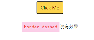
找到 borderStyle 属性,因为刚刚我想在 hover 时使用 border-dashed,但此属性预设,没有这 hover 效果。预设如下:
borderStyle: ['responsive'],
又看到其他属性有加上 hover 与 focus 的伪类值,所以我也照样照句,把 hover 加入到 borderStyle 中。
新增後会变这样:
borderStyle: ['responsive','hover'],
这时候再回到 HTML 上就会发现智能提示会出现之前想要设定的 border-dashed 样式!

HTML
 <div class="container sm:mx-auto">
  <button
    class="
        flex
        sm:mx-auto
        rounded
        py-2
        px-3
        m-2
        bg-yellow-300
        text-black
        hover:text-white
        hover:bg-green-500
        focus:outline-none
        border-black border-2
        hover:border-red-900 hover:border-dashed hover:border-8
        "
  >
    Click Me
  </button>
  <br />
  <p class="text-center">
    <code class="bg-pink-200 p-2 text-red-500">border-dashed</code>没有效果
  </p>
</div>
重新编译後,滑鼠移动到画面上,也会出现一样的效果。
no hover
hover

如果要用覆盖的方式,可以写在 variants 属性内,也会达到一样的效果。
tailwind.config.js
module.exports = {
    purge: {
        enabled: true,
        content: ["./*.html"],
    },
    darkMode: false, // or 'media' or 'class'
    theme: {
        extend: {},
    },
    variants: {
        extend: {
            borderStyle: ["responsive", "hover"],
        },
    },
    plugins: [],
};
以上笔记客制化 variants 变化模式如何新增效果在预设设定档中,或是覆盖想要改变的样式,自己一开始用会全部展开修改,因为太多属性,还要去翻找文件有时候满麻烦的,但相信未来熟稔之後,应该就可以用覆盖的方式来写了。
参考资料
html 汇入图片
今天来说如何汇入图片,我想要在标题栏的左侧加一个logo,避免版权问题我自己画了一个Logo的示意图...
Day 19 - 卷积神经网络 CNN (4)-Pooling layer & Activation Function
Pooling Layer 影像的spatial information不会因scale而消失,所以...
BPM懒人包 让你一次搞懂BPM的大小事
为了要了解企业流程管理(BPM),很多人上网搜寻到的文章,常常都有些八股,或是看不到想要了解的部分,...
为什麽要学Python
如今,人人都在谈人工智慧,而程序语言百百种,我们到底要学习哪一种呢?如过现在想要学习一种好入门、好上...
[13th-铁人赛]Day 8:Modern CSS 超详细新手攻略 - 伪元素 Pseudo Element
伪类与伪元素差别 如果你只在伪元素前加一个冒号,你有时会发现也可以正常运行,但在CSS3之後伪元素改...