Day15 这什麽水平
- Histogram
我们在看一组资料时常会以统计观点来评断,例如最大最小值、平均值、标准差等,以图表则会用直方图(histogram)来观察资料的分布。今天就来练习画histogram。
- Calculation
首先来做计算统计数据的function,分成两部分一个是最大最小值、平均值、标准差,另一个是histogram的分bin。
在计算最大最小值、平均值、标准差时最麻烦的反而是最大最小值(如果不挂其他套件),因为原生Math.max和Math.min无法处理浮点数,所以我们就用loop写个简单土炮版本的,其余平均值、标准差就用array的reduce照公式写:
	let totalNumber = data.length;
	let dataMin = "";
	let dataMax = "";
	for (let i = 0; i < totalNumber; i++) {
		let tempData = data[i];
		if (dataMin) {
			if (tempData < dataMin) {
				dataMin = tempData;
			}
 		}
		else {
			dataMin = tempData;
		}
		if (dataMax) {
			if (tempData > dataMax) {
				dataMax = tempData;
			}
 		}
		else {
			dataMax = tempData;
		}
	}
	let sum = data.reduce((preValue, curValue) => preValue + curValue);
	let dataMean = sum / totalNumber;
	let squrSum = data.reduce((preValue, curValue) => preValue  + (curValue - dataMean)** 2);
	let dataSTD = (squrSum / totalNumber) ** 0.5;
接下来是分bin的部分,我们做了两种option,可以选择切bin的总数,或是bin的宽度,再用if条件判断换算完後,我们是从最小的值开始,往上加上bin宽度,然後计算区间内的数量为y值,区间范围的中心点为x值,组成{x, y}的物件(这个长条图也能吃喔),然後依序往上,而最後要注意的是再加bin的宽度时会有误差,而在最高bin时要涵盖最大值的那个计数,所以我们用if条件判断特别处理最高的那个bin,是用小於等於资料的max值计数:
	let botValue = dataMin;
	let topValue;
	if (Number.isInteger(binNumber)) {
    binWidth = (dataMax - dataMin) / binNumber;
	}
	else if (!Number.isNaN(binWidth)) {
		let dataSwing = dataMax - dataMin;
		binNumber = Math.ceil(dataSwing / binWidth);
		botValue = botValue + 0.5 * dataSwing - 0.5 * binWidth * binNumber;
	}
    let dataset = [];
	for (let i = 0; i < binNumber; i++) {
		topValue = botValue + binWidth;
		let subList;
		if (i === binNumber - 1) {
			subList = data.filter(function(item) {
				return (item >= botValue) & (item <= dataMax);
			});
		}
		else {
			subList = data.filter(function(item) {
				return (item >= botValue) & (item < topValue);
			});
		}
		dataset.push({x: (topValue + botValue) / 2, y: subList.length})
		botValue = topValue
	}
- Chart
接下来是图表的设定(可以参考里面一系列的说明范例),我们初始化的设定如下面的code所示,部分是空的或是注解的是特别标记给上面的function计算後填入参数,另外其中比较重要的设定是options.scale.x.type设定linear、data.dataset的categoryPercentage和barPercentage和要设定为1,这样长条图间的缝隙才会连起来:
const data = {
	datasets: [
		{
			label: 'DATA',
			data: [],
			borderColor: CHART_COLORS.blue,
			backgroundColor: RGBwithA(CHART_COLORS.blue, 0.8),
			borderWidth: 1,
			barPercentage: 1,
			categoryPercentage: 1,
		},
	]
};
const config = {
	type: "bar",
	data: data,
	options: {
		scales: {
			x: {
				type: 'linear',
				offset: false,
				grid: {
					offset: false,
				},
				ticks: {
					//stepSize: ,
				},
				//min:
				//max:
			},
			y: {

			},
		},
		plugins:{
			legend:{
				display: false,
			},
		}
	},
};
最後我们用一个function可以random建data测试,然後将上方所写的计算结果更新进chart中,其中设定options.scales.x.min、options.scales.x.max和options.scales.x.ticks.stepSize就能将格线与切bin对齐:
		let histData = calculateHistogram(data, binWidth, binNumber);
		chart.data.datasets.forEach(dataset => {
			dataset.data = histData.dataset
		});
		chart.options.scales.x.min = histData.histMin;
		chart.options.scales.x.max = histData.histMax;
		chart.options.scales.x.ticks.stepSize = histData.binWidth;
		chart.update();
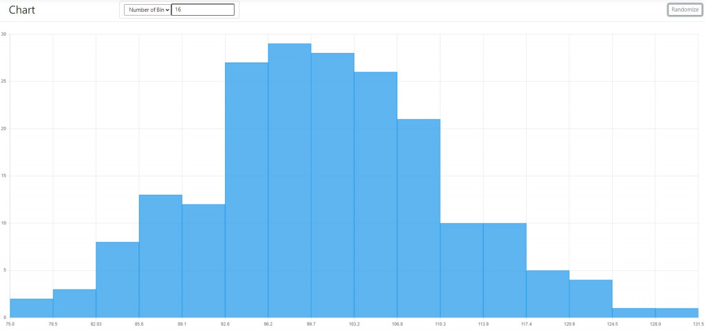
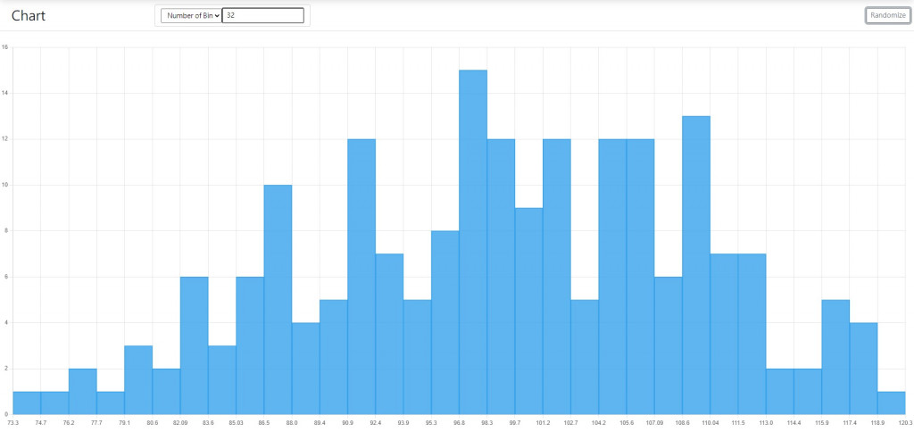
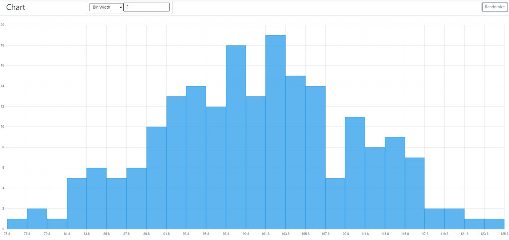
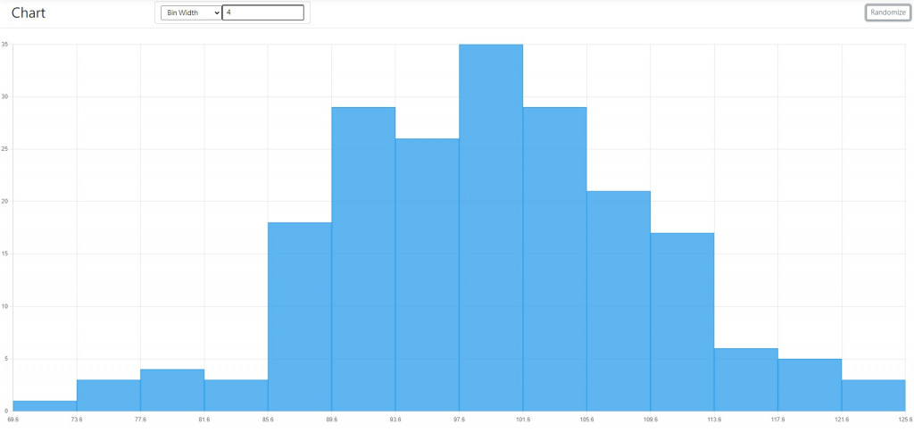
成果如下,以一组200个点的常态分布乱数资料:
用Number of bin=16:
用Number of bin=32:
用Bin width=2:
用Bin width=4:
<<: 【DAY 2 】Microsoft 365 Developer Program - Microsoft 365 开发人员计画
学习书单与资源
如果你还在个人修炼的阶段,有几本我认为是经典的书籍很推荐你尽早阅读,吸收消化成为自己的东西。 1.&...
黑死病消灭欧洲一半人口,对14世纪的社会造成什麽影响? #文章心得 #接续前篇
https://www.thenewslens.com/article/94283 历史可以借镜,...
Day 30 赛後感想
第一次参加铁人赛,很开心能写完30天的文章,原本还以为会开天窗,不过幸好没有 这两个月的暑假学了许多...
不要再用print来debug 了 ...
笔者相信有非常多的朋友很爱用print 列印相关的讯息来当作除错讯息的参考使用,类似下面的做法 笔者...
Day22:欧印万
在尚未出现java.util.concurrent套件以前,多执行绪的程序都需要自己设计wait()...