Backtrader - 绘图
以下内容皆参考 Backtrader 官网
有了策略可以让我们进行评估,有了历史资料可以进行回测,加上 Backtrader 有 trade_notify, order_notify,我们可以看到每笔交易的价格,如果要进行策略优化,也有 stop 这个事件,可以在执行完策回测後进行回报成果,基本上这样就结束了...吗?如果只是程序在跑,的确是结束了,不过人是视觉的动物,所以补上绘图这一块才算是完整。
在之前就有大概介绍过如何进行绘图,今天再说明仔细一点,Backtrader 的绘图指令很简单,只有一行:
cerebro.plot()
它就会自动绘出以下的资料:
- datafeed 的资料集
- indicators 指标
- observers - 最基本的就是 现金, 收益, 买进/卖出 这 3 个
datafeed
datafeed 的部份,不管是使用 adddata, resampledata, replaydata 都会新增一笔资料,也会在绘图的时候一并显示。
indicators
指标的话,就是在 init 的地方,我们可以新增指标,不管有没有指定变数,只要我们有初始化,那就会显示
def __init__(self):
    self.sma_short = btind.SimpleMovingAverage(period = 5)
    self.sma_long = btind.SimpleMovingAverage(period = 30)
    # 或者不指定变数
    # btind.SimpleMovingAverage(period = 5)
    # btind.SimpleMovingAverage(period = 30)
observers
如果还有记得第一天,我们在初始化 cerebro 的时候是这样子的
cerebro = bt.Cerebro(stdstats=False)

# 也可以在执行的时候指定
# cerebro.run(stdstats=False)
stdstats 指的就是上面 3 个基本的 observers,所以第一天画出来的图,并没有 observers 的资讯。
我们以一段简单的策略来示范:
import backtrader as bt
import backtrader.indicators as btind
import backtrader.feeds as btfeeds
class St(bt.Strategy):
    def __init__(self):
        self.sma_short = btind.SimpleMovingAverage(period = 5)
        self.sma_long = btind.SimpleMovingAverage(period = 30)

data = btfeeds.PandasData(dataname=df, timeframe=bt.TimeFrame.Minutes)

cerebro = bt.Cerebro(stdstats=True)

cerebro.resampledata(data, timeframe=bt.TimeFrame.Days)

cerebro.addstrategy(St)
cerebro.run()
cerebro.plot()
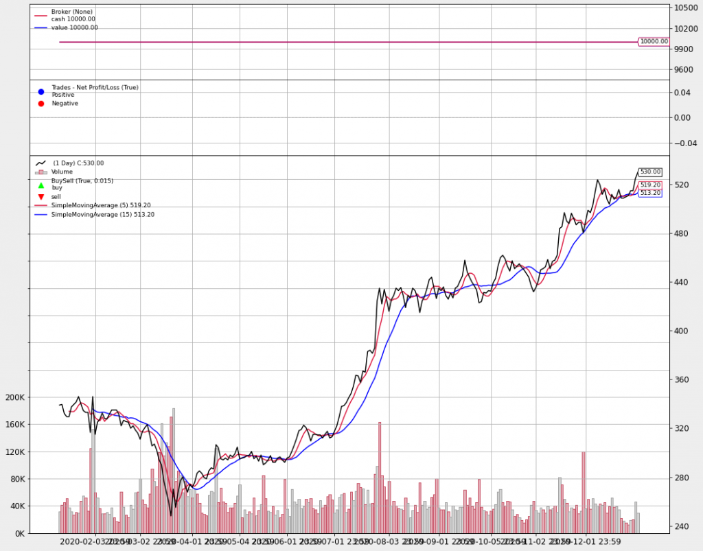
上面的2个图就是,现金/收益, 买进/卖出,下面最主要的图就是 datafeed/指标,之前说过指标也是以 line 的型式在储存资料,所以可以在这上面画出一条线来,要加画线的话,可以在 init 增加我们的指标,而且不一定要指定变数。像是这样
indicators, observers 绘图设定
在绘制 indicators 和 observers 的时候,有一些选项可以进行细部设定选项如下所例:
- plot (bool): 是否要绘制
- subplot (bool): 是否为 datafeed 的副图
- plotname (string): 图形名称
- plotabove (bool): 在 subplot = true 时,是否要绘制在 datafeed 的图形之上
- plotlinelabels (bool): subplot = False,图例是否显示 plotname
- plotlinevalues (bool): subplot = False,图例是否显示 值
- plotvaluetags (bool): 是否显示最後数值的标签
- plotymargin (dicimal): 每个图示之间的间距
- plothlines (数组): 根据数组的值绘制一横线
- plotyticks (数组): 根据数组的值绘制一直线
- plotylines (数组): 根据数组的值绘制一横线
- plotforce (bool): 某些时候可能会绘制失败,可以试试这个参数,强制它一定要绘图
- plotmaster (line): 要绘制在哪个主视图
- plotylimited (bool): 目前只适用 datafeed 的图,控制是否变更比例(如果不变更比例,超出的部份会无水显示)
设定的方法有 2 种:
# 在初始化 indicators 时指定 kwargs
btind.SimpleMovingAverage(period = 5, plot = False)

# 在初始化後,依照指定的变数设定
sma = btind.SimpleMovingAverage(period = 5)
sma.plotinfo.plot = False
indicators|observers 系统层设定
def plot(self, plotter=None, numfigs=1, iplot=True, **kwargs):
- plotter: 系统层设定的物件,如果是 None 的话,就使用预设的 PlotScheme 物件
- numfigs: 要拆分多少张图显示
- iplot: 自动在 jupyter notebook 使用 plot inline
- **kwaargs: 变更 plotter 的选项
class PlotScheme(object):
    def __init__(self):
        # to have a tight packing on the chart wether only the x axis or also
        # the y axis have (see matplotlib)
        self.ytight = False

        # y-margin (top/bottom) for the subcharts. This will not overrule the
        # option plotinfo.plotymargin
        self.yadjust = 0.0
        # Each new line is in z-order below the previous one. change it False
        # to have lines paint above the previous line
        self.zdown = True
        # Rotation of the date labes on the x axis
        self.tickrotation = 15

        # How many "subparts" takes a major chart (datas) in the overall chart
        # This is proportional to the total number of subcharts
        self.rowsmajor = 5

        # How many "subparts" takes a minor chart (indicators/observers) in the
        # overall chart. This is proportional to the total number of subcharts
        # Together with rowsmajor, this defines a proportion ratio betwen data
        # charts and indicators/observers charts
        self.rowsminor = 1

        # Distance in between subcharts
        self.plotdist = 0.0

        # Have a grid in the background of all charts
        self.grid = True

        # Default plotstyle for the OHLC bars which (line -> line on close)
        # Other options: 'bar' and 'candle'
        self.style = 'line'

        # Default color for the 'line on close' plot
        self.loc = 'black'
        # Default color for a bullish bar/candle (0.75 -> intensity of gray)
        self.barup = '0.75'
        # Default color for a bearish bar/candle
        self.bardown = 'red'
        # Level of transparency to apply to bars/cancles (NOT USED)
        self.bartrans = 1.0

        # Wether the candlesticks have to be filled or be transparent
        self.barupfill = True
        self.bardownfill = True

        # Wether the candlesticks have to be filled or be transparent
        self.fillalpha = 0.20

        # Wether to plot volume or not. Note: if the data in question has no
        # volume values, volume plotting will be skipped even if this is True
        self.volume = True

        # Wether to overlay the volume on the data or use a separate subchart
        self.voloverlay = True
        # Scaling of the volume to the data when plotting as overlay
        self.volscaling = 0.33
        # Pushing overlay volume up for better visibiliy. Experimentation
        # needed if the volume and data overlap too much
        self.volpushup = 0.00

        # Default colour for the volume of a bullish day
        self.volup = '#aaaaaa'  # 0.66 of gray
        # Default colour for the volume of a bearish day
        self.voldown = '#cc6073'  # (204, 96, 115)
        # Transparency to apply to the volume when overlaying
        self.voltrans = 0.50

        # Transparency for text labels (NOT USED CURRENTLY)
        self.subtxttrans = 0.66
        # Default font text size for labels on the chart
        self.subtxtsize = 9

        # Transparency for the legend (NOT USED CURRENTLY)
        self.legendtrans = 0.25
        # Wether indicators have a leged displaey in their charts
        self.legendind = True
        # Location of the legend for indicators (see matplotlib)
        self.legendindloc = 'upper left'

        # Plot the last value of a line after the Object name
        self.linevalues = True

        # Plot a tag at the end of each line with the last value
        self.valuetags = True

        # Default color for horizontal lines (see plotinfo.plothlines)
        self.hlinescolor = '0.66'  # shade of gray
        # Default style for horizontal lines
        self.hlinesstyle = '--'
        # Default width for horizontal lines
        self.hlineswidth = 1.0

        # Default color scheme: Tableau 10
        self.lcolors = tableau10

        # strftime Format string for the display of ticks on the x axis
        self.fmt_x_ticks = None

        # strftime Format string for the display of data points values
        self.fmt_x_data = None
另外,绘图的设定选项还有在 indicators|observers 里设定,不过这里要知道怎麽自订义 indicators|observers,因为我还没有分享到这,所以暂时就不分享这部份,之後如果有时间,再来补充
<<: Day23:今天来聊一下Hacking Web Applications
DAY 1 系列文章启文
近年来 ROS (Robot Operating System,机器人作业系统) 目前已成熟应用於智...
[DAY20]图片旋转木马
TemplateSendMessage - ImageCarouselTemplate image_...
限制输入框语言
缘由: 开发App分版本是很常见的,例如免费版vs.付费版,中文版vs.英文版vs.韩文版等,我开发...
[FGL] 4GL程序的资源档Resource file体系
也学过 OPEN WINDOW了,可是为什麽 T 产品可以有TOOLBAR和 TOPMENU 我这...
Day 20 K-近邻演算法(KNN)
介绍完决策树和随机森林後,今天来介绍的是 K-近邻演算法(k-nearest neighbor cl...