网页定位-30天学会HTML+CSS,制作精美网站
今天要来介绍的是定位(position),可以用来设定元素的摆放位置了
position 定位
static 预设值
正常排序,依照html的code由上往下排列,对於top、right、bottom、left属性及z-index属性无效。
<div class="box">
    <div class="item orange"></div>
    <div class="item green"></div>
    <div class="item blue"></div>
</div>
.item{
  width: 120px;
  height: 100px;
}
.orange{
  background-color:#ff9800;
}
.green{
  background-color: #8bc34a;
}
.blue{
  background-color:#2196f3;
}
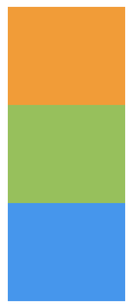
relative 相对配置
相对於自己原本位置做偏移,但原来的位置会被留下来
用top、right、bottom、left设定位移量
范例:
.green{
  background-color: #8bc34a;
  position: relative;
  left: 30px;
}

我自己是会用在像是项目清单的icon做位置微调
<ul class="list">
    <li>
      <img src="img/icon.png" alt="">
      item1
    </li>
    <li>
      <img src="img/icon.png" alt="">
      item2
    </li>
    <li>
      <img src="img/icon.png" alt="">
      item3
    </li>
    <li>
      <img src="img/icon.png" alt="">
      item4
    </li>
  </ul>
.list{
  list-style: none;
  font-size: 20px;
  color: #666;
}
.list li{
  margin-bottom: 10px;
}
.list img{
  height: 25px;
}
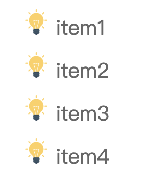
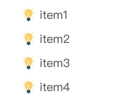
设定完後,想要图片能够垂直置中对齐文字,将img设定position: relative; top: 4px;,图片就垂直置中文字了
.list img{
  height: 25px;
  position: relative;
  top: 4px;
}
absolute 绝对配置
定位方式是相对於浏览器左上角,视窗滚动时,区块也会跟着滚动
用top、right、bottom、left设定位移量
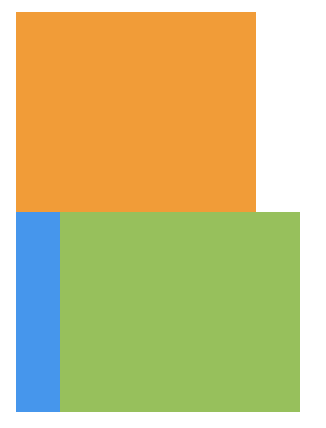
范例:设定absolute後,原本的区块位置会被下面的取代
.green{
  background-color: #8bc34a;
  position: absolute;
  left: 30px;
}
当我要制作item定位时,就会与relative一起使用,让我们来看下面的范例
我要显示这样子的版面,让文字浮在图片上面,所以我将文字设定absolute
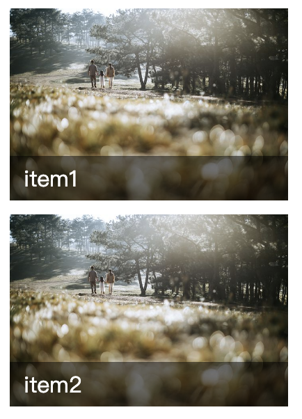
<div class="list">
    <div class="item">
      <div class="img">
        <img src="img.jpg" alt="">
      </div>
      <div class="txt">
        item1
      </div>
    </div>
    <div class="item">
      <div class="img">
        <img src="img.jpg" alt="">
      </div>
      <div class="txt">
        item2
      </div>
    </div>
</div>
.item{
  width: 200px;
  margin-bottom: 10px;
  position: relative;
}
.list .img{
  height: 138px;
}
.list img{
  width: 100%;
  height: 100%;
  object-fit: cover;
}
.list .txt{
  position:absolute;
  width: 100%;
  background-color: rgba(0,0,0,.5);
  bottom: 0;
  padding: 5px 10px;
  color: #fff;
  box-sizing: border-box;
}
但是却变成这样子,所有.item的.txt区块都堆叠在下方
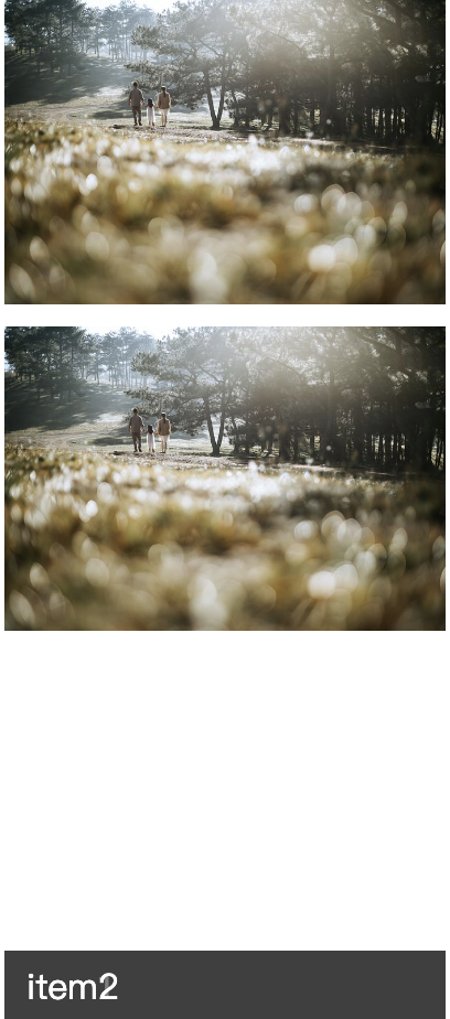
所以在.item(父元素)加上position: relative;所有txt定位就会以父元素的bottom来定位,否则会以body的bottom
.item{
  width: 200px;
  margin-bottom: 10px;
  position: relative;
}
fixed 固定配置
定位方式是相对於浏览器左上角,视窗滚动时,区块不会跟着滚动
用top、right、bottom、left设定位移量
范例:设定fixed,top:30px, left:30px,无论卷轴如何滚动区块都会维持在设定的位置
.green{
  background-color: #8bc34a;
  position: fixed;
  top: 30px;
  left: 30px;
}
通常会用在scrollTop或是侧边固定的预约/客服资讯
这这网站的预约资讯就固定在右边,是方便使用者看完资讯後可以立即预约
图片来源
scrollTop按钮当你滚动页面,想要返回到最上层,点固定在右下角的按钮就可以了
图片来源
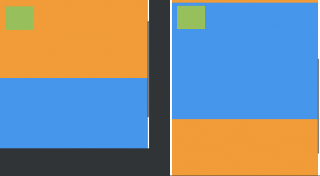
sticky
sticky可以说是relative与fixed的结合,用在scroll事件的监听上。
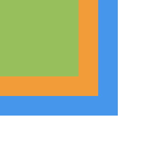
范例:在滑动时,绿色区块距离父元素的距离达到sticky定位(top:0)时,就会固定到适当位置,固定後不管卷轴如何向下滚动,都会定位在top:0位置
<div class="box">
  <div class="item red"></div>
  <div class="item green"></div>
  <div class="item blue"></div>
  <div class="item red"></div>
  <div class="item blue"></div>
</div>
.green{
  background-color: #8bc34a;
  position: sticky;
  top: 0;
}
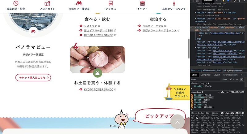
绿色区块一开始的位置
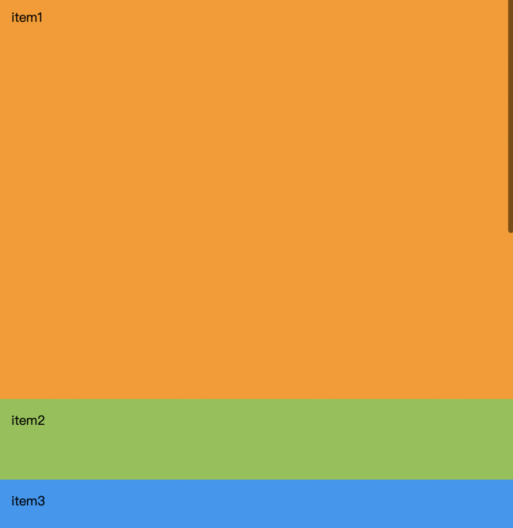
卷轴向下滑动,绿色区块一样固定在top:0的位置
使用sticky需要注意的地方:
- 需指定top、right、bottom、left其中一个值,sticky才会生效
- 父元素不能是overflow:hidden或者overflow:auto属性
- 父元素的高度不能低於sticky元素的高度
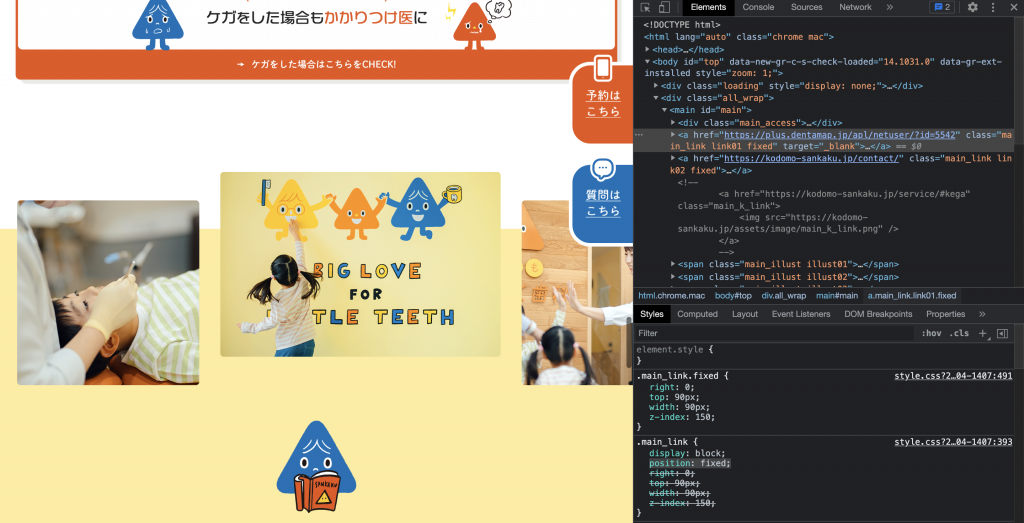
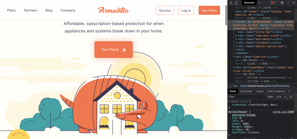
通常会用在header区块,当卷轴滚动时header固定在上方
像下图这网站,他在滚动时他会固定在上方是使用sticky
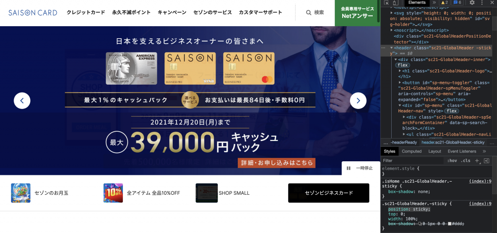
图片来源
但也有人会使用fixed
图片来源
z-index 堆叠顺序
设定position属性後,就可以设置z-index,数字越大,堆叠的顺序越上层
<div class="box">
    <div class="item red"></div>
    <div class="item green"></div>
    <div class="item blue"></div>
  </div>
.item{
  width: 100px;
  height: 100px;
  padding: 15px;
  box-sizing: border-box;
  position: absolute;
  z-index: 4;
}
.red{
  background-color:#ff9800;
  z-index: 10;
}
.green{
  background-color: #8bc34a;
  width: 80px;
  height: 80px;
  z-index: 30;
}
.blue{
  background-color:#2196f3;
  width: 120px;
  height: 120px;
}
结论
制作网页要符合使用者习惯,加上手机浏览网站的人非常多,为了方便使用者操作,header通常都会随着卷轴滚动固定在上方,侧边会有scrollTop固定在侧边,让使用者可以快速回到网页最顶端。
以上是定位的介绍,相信你对定位有基础的了解了,在区块设置css就能更上手了
>>: Flutter体验 Day 29-flame Collidable
[Day1] 何谓自然语言处理
其实google的话就会有很多相关自然语言处理的定义与文章,自然语言处理英文为Natural Lan...
Day14:今天来谈一下Microsoft Defender for Endpoint中的威胁与弱点管理
Microsoft Defender for Endpoint的威胁与弱点管理(TVM)功能 会根据...
[DAY 29] 复刻 Rails - View 威力加强版 - 1
其实我们的 Mavericks 已经做得差不多了,但就是那个 View 总觉得还可以再更好,如果仔细...
不只懂 Vue 语法: 在 Vue 2 为何无法直接修改物件型别资料里的值?
问题回答 在 Vue 2,我们需要使用 .set() 等 Vue 语法来修改在 data 里的物件或...
Alpine Linux Porting (一点二?)
今天稍微回头update一下musl这边的porting状况。 之前遇到message queue跟...