Day 16 - UML x Interface — TextField
今天的 TextField 和明天的 FormControl 都是在介绍跟表单有关的介面和元件,而这主要是 Material-UI 实作的方式,在明天讲完後,也会提一下 Ant Design 和 Chakra 是怎麽做的,以及分享一下我个人实作上的经验、踩过的雷等等。
TextField 在 Material-UI 架构下是帮你定义好 FormControl 这些东西的 Input,但你也可以自己去用 FormControl 相关的元件来自定义。
UML
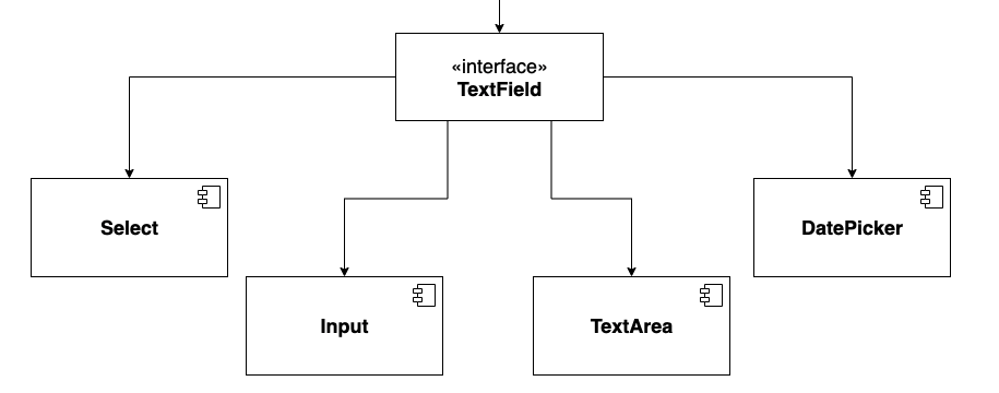
TextField
TextField 其实单纯是一个可以输入东西的 Input,但能根据不同的 Props 来 render 不同的元件(如 Select)和情境。
之所以会需要 TextField 是因为长得像 Input 这种样式的元件 (Input, TextArea, Select, DatePicker )有一些共同的功能可以整合成一个 Interface 来统一管理 API。
这些功能有表单相关的 required, disabled, helper text, type 以及验证时的错误样式,另外还有 label, fullWidth 和其他跟 Input 更相关的或是一些常见的使用情境则会包进 inputProps 来传。
各种使用情境:
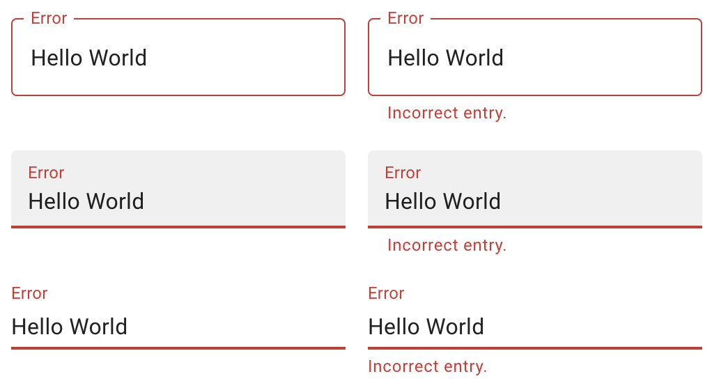
错误状态处理
实作方式可以是在这些元件外面都包一层的 TextField,或是把这些元件包进 TextField 里面,并透过 一些 props 来决定要 render 的元件,以下会在 Select 的地方用程序码来介绍到这两者的差别。
那以下会介绍的 Component 都很直觉,我就不再一一介绍使用情境,直接来看看 TextField 是怎麽实作他们的,而底层的实作一样会在之後的实战篇再介绍!
Input
其实在 Material-UI 这边就是被整合成 TextField 的预设型态,就不再多赘述,详情在 Day22 实作 TextField/Input 的时候会再介绍!
TextArea
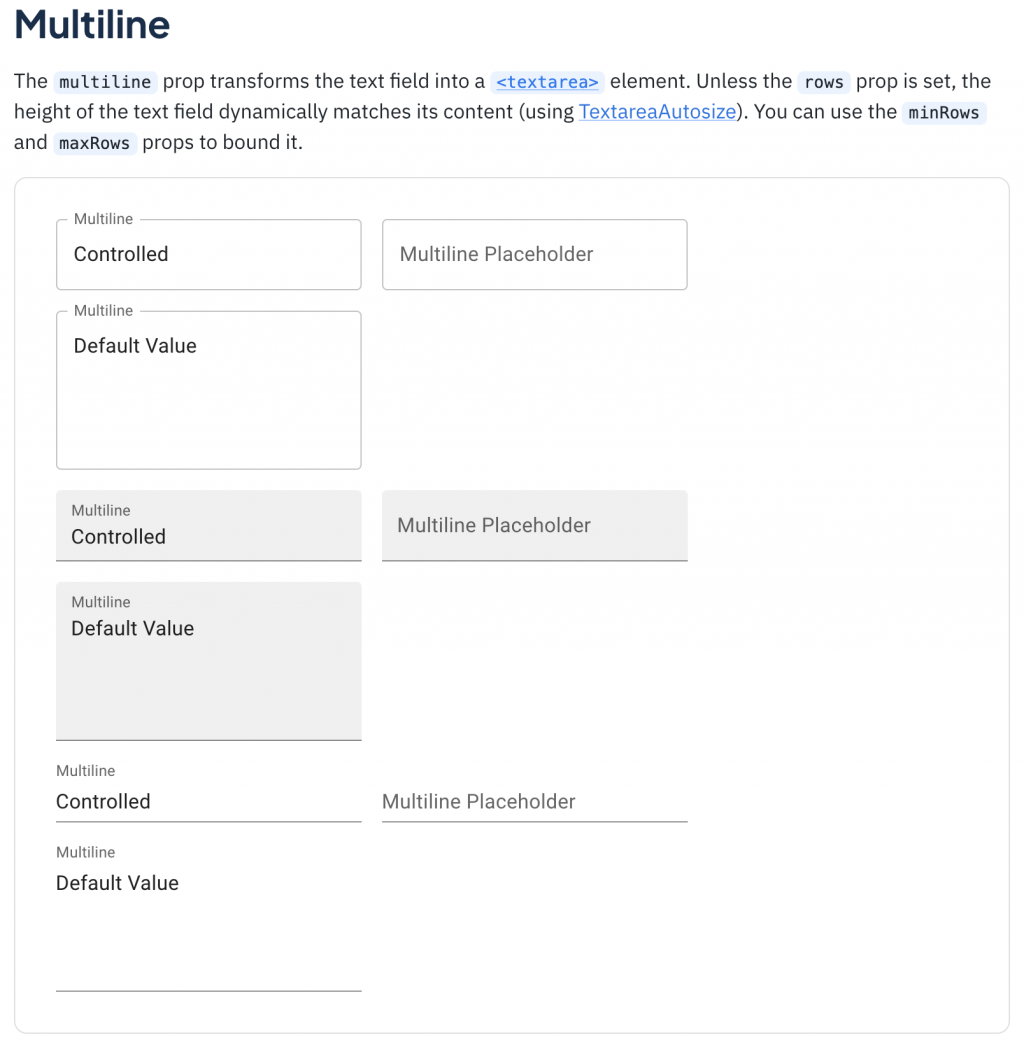
TextArea 跟 Input 的主要差别其实就是 TextArea 是多行的,并可能会有去限制行数、字数等等功能。
上面有提到说会在这边去介绍用 props 来决定 render 的元件的两种方式,而这边就做了一个很好的示范,单单传了 multiline 的属性给 TextField ,就可以决定要 render 的是 TextArea 了,进一步还能用 maxRows 来定最多几行。
(简化版)
 <div>
    <TextField
      id="outlined-multiline-flexible"
      label="Multiline"
      multiline
      maxRows={4}
      value={value}
      onChange={handleChange}
    />
    <TextField
      id="outlined-textarea"
      label="Multiline Placeholder"
      placeholder="Placeholder"
      multiline
    />
    <TextField
      id="outlined-multiline-static"
      label="Multiline"
      multiline
      rows={4}
      defaultValue="Default Value"
    />
  </div>
Select
Select 就是在表单中可用来选择「选项」的元件。
在 Material-UI 中它有两种作法:
**1. 直接使用 Select **
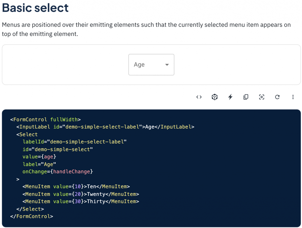
2. 在 TextField 中用 type='select' 来使用
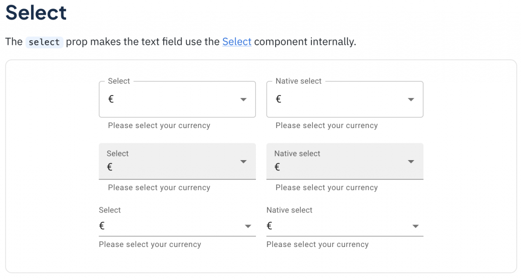
type='select'
<TextField
  select
  label="Select"
  value={currency}
  onChange={handleChange}
  helperText="Please select your currency"
>
  {currencies.map((option) => (
    <MenuItem key={option.value} value={option.value}>
      {option.label}
    </MenuItem>
  ))}
</TextField>
那 Material-UI TextField 的底层实作如下,可以看见有一个 select 的三元判断式来判断要 render 的是 Select 还是 Input,同时也能看到 label 和 helperText 也是做类似的事情,由此可以来感受一下 TextField 的方便性。
// Material TextField Source Code
	<TextFieldRoot
    disabled={disabled}
    error={error}
    fullWidth={fullWidth}
    ref={ref}
    required={required}
    color={color}
    variant={variant}
    ownerState={ownerState}
    {...other}
  >
    {label && (
      <InputLabel htmlFor={id} id={inputLabelId} {...InputLabelProps}>
        {label}
      </InputLabel>
    )}

    {select ? (
      <Select
        aria-describedby={helperTextId}
        id={id}
        labelId={inputLabelId}
        value={value}
        input={InputElement}
        {...SelectProps}
      >
        {children}
      </Select>
    ) : (
      InputElement
    )}

    {helperText && (
      <FormHelperText id={helperTextId} {...FormHelperTextProps}>
        {helperText}
      </FormHelperText>
    )}
  </TextFieldRoot>
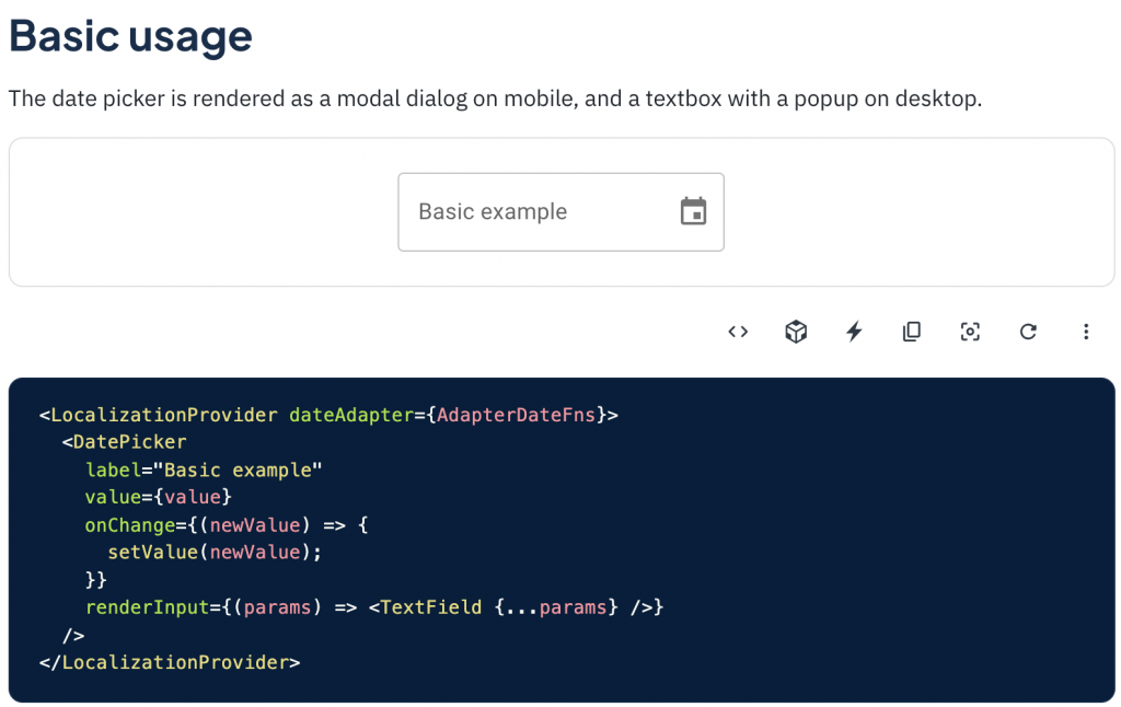
DatePicker
在网页中要处理跟日期有关的操作时,DatePicker 绝对是首当其冲,但主要是提供选取单一天数的需求,後续其他的格式,可能会再衍伸 RangePicker(选一段时间) 或 TimePicker(选时/分/秒) 等等。
另一种 TextField
在开头时有介绍到 TextField 可以像上面讲的当作使用的主体,并透过 props 来改变要 render 的元件。
但我们也可以尝试把 TextField 当成一个可以实现上述功能的容器,并会在各 Componet 底层去引用它,而实际使用时是去使用元件本身,如 . 等等。
直接来看看这种方式的 input 底层可能会是怎样:
<TextField
  disabled={disabled}
	error={error}
	fullWidth={fullWidth}
	...TextFieldProps
  >
  <input
    {...inputProps}
		value={value}
		onChange={onChange}
		...
  />
</TextField>
独立使用时:
<Input
  placeholder="please enter text"
  value="Example"
  readOnly
/>
再来看看 TextArea 可能会更理解:
<TextField
  disabled={disabled}
	error={error}
	fullWidth={fullWidth}
	...TextFieldProps
  >
  <textarea
    {...textareaProps}
		value={value}
		onChange={onChange}
		...
  />
</TextField>
独立使用时:
<Textarea
  placeholder="输入文字..."
  maxLength={50}
  value="Example"
  readOnly
/>
小结
其实使用 TextField 来抽象化这些元件的方式还有待讨论,像是这边就列出了两种,而两种都还是有使用不直觉的问题,那就是 inputProps 的存在,使用 Input 或 TextField 传 props 还要特别用 InputProps 而不是直接在最上层就取用那些 attribute 其实挺不直觉,或是使用者不会知道说他是在使用包在 TextField 里的 Input,而不是 input 本身,这件事会不会影响到 API 的直觉程度也会有很大的差别,但老样子,团队用起来顺手就好,软件开发很难有一个完美的解法,只有最适合的。
明天我们就要进入跟 TextField 容易搞混的 FormControl ,谈谈网页中表单操作的抽象化 Interface,结尾也会稍微讲一下除此之外的其他选择。
<<: Day 17 : PHP - MySQLi的面向过程和面向对象是什麽?又该如何做选择?
>>: Day16 Gin's Routing Structure And Context
30天学会Python: Day 9- 程序码也能取名字
自订函式(User Definded Function) 自己定义函式有几个优点: 增加程序码的可读...
Day 4 网路宝石:AWS VPC Region/AZ vs VPC/Subnet 关系介绍
今天我们来介绍 AWS Region 与 AWS VPC 之间的关系,那我们开始吧! AWS Re...
[Day1] 整体规划以及是否适合
我是 浅羽 目前是凤山高中电脑资讯社社长 也是 高雄资讯联盟总召 那我目前主要使用的语言是 Rust...
Day09表单(HTML)
表单 原本介绍的标签都比较属於呈现给使用者 但是今天要介绍的表单呢就不仅是单单呈现而已 因为他会将使...
AutoCAD ActiveX #3 Draw
AddLine Creates a line passing through two points....