Android Studio初学笔记-Day14-Switch和Toggle Button
Switch和Toggle Button
今天要讲两个简单的元件,在还没碰到这两个元件之前,想要做到开关的效果可能会用到两个Button来达成,虽然说也能达到功能,也有些设计者比较喜欢Button的效果,不过我觉得接下来这两个元件可以达到的变化更多,甚至可以设计出独一无二的样式。接下来就让我来介绍这两个元件的用法及效果:
介面程序码
<LinearLayout xmlns:android="http://schemas.android.com/apk/res/android"
    xmlns:app="http://schemas.android.com/apk/res-auto"
    xmlns:tools="http://schemas.android.com/tools"
    android:layout_width="match_parent"
    android:layout_height="match_parent"
    android:orientation="vertical"
    tools:context=".MainActivity">

    <Switch
        android:id="@+id/st1"
        android:layout_marginTop="150dp"
        android:layout_gravity="center"
        android:layout_width="wrap_content"
        android:layout_height="wrap_content"
        android:showText="true"
        android:textOff="关"
        android:textOn="开" />
    <TextView
        android:id="@+id/tx1"
        android:layout_gravity="center"
        android:layout_width="wrap_content"
        android:layout_height="wrap_content"
        android:textSize="40sp"
        android:text="禁用" />
    <ToggleButton
        android:id="@+id/tg1"
        android:layout_gravity="center"
        android:layout_width="100dp"
        android:layout_height="wrap_content"
        android:textOff="关灯"
        android:textOn="开灯"
        android:textSize="25sp"
        android:enabled="false"
        android:disabledAlpha="@android:integer/config_longAnimTime" />
    <TextView
        android:id="@+id/tx2"
        android:layout_gravity="center"
        android:layout_width="wrap_content"
        android:layout_height="wrap_content"
        android:textSize="40sp"
        android:text="关" />

</LinearLayout>
- Switch和ToggleButton中都有属性textOn和textOff,很直观的就是设定当开关打开或关闭时的文字,不过在Switch中需要加一行android:showText=”true”才能将文字显示在按钮上。
- 而在ToggleButton中还有一行disabledAlpha的属性,其功能是设定当此ToggleButton没有被致能时的透明度。
接着来看一下开关的功能设定
MainActivity程序码
public class MainActivity extends AppCompatActivity {
    private ToggleButton toggleButton;
    private Switch st1;
    private TextView tx1;
    private TextView tx2;
    @Override
    protected void onCreate(Bundle savedInstanceState) {
        super.onCreate(savedInstanceState);
        setContentView(R.layout.activity_main);

        toggleButton = (ToggleButton)findViewById(R.id.tg1);
        st1 = (Switch)findViewById(R.id.st1);
        tx1 = (TextView)findViewById(R.id.tx1);
        tx2 = (TextView)findViewById(R.id.tx2);

        st1.setOnCheckedChangeListener(new CompoundButton.OnCheckedChangeListener() {
            @Override
            public void onCheckedChanged(CompoundButton buttonView, boolean isChecked) {
                tx1.setText(isChecked?"启用":"禁用");
                toggleButton.setEnabled(isChecked);
            }
        });
        toggleButton.setOnCheckedChangeListener(new CompoundButton.OnCheckedChangeListener() {
            @Override
            public void onCheckedChanged(CompoundButton buttonView, boolean isChecked) {
                tx2.setText(isChecked?"开":"关");
            }
        });

    }
}
这里有趣的是两个的开关事件都是透过setOnCheckedChangeListener(),接着用setOnCheckedChange()函数来放置想要的功能,而这里面放的引数是CompoundButton,而属於CompoundButton的关键是其按钮功能要是有两种状态(选中及未选中),且按钮按下後会自动变更状态,而後面的布林变数isChecked便是代表现在的状态,可以透过此变数来取得现在的状态後再设定其功能。
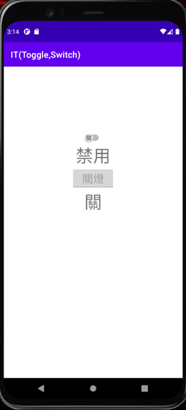
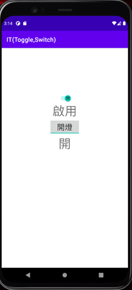
成果
今天Switch和Toggle Button就讲到这,谢谢大家~
<<: [Day 29] JS 实作练习 - YouTube API
>>: [Day21] swift & kotlin 游戏篇!(3) 小鸡BB-游戏制作-分数与提示排版
Day 21 LeetCode 198. House Robber
当想不到今天要做什麽时就来解 LeetCode。 You are a professional ro...
Day-16 OS初体验
OS初体验 tags: IT铁人 甚麽是OS OS是Operating System的缩写,比如说现...
Day29 Redx初步介绍
使用目的 随着时代的进步,人们对单一页面的要求日渐复杂化,从过去的静态页面,到後来需要包括服务器回应...
Day11 X Lazy Loading
还记得昨天 Virtualized List 篇章开头放的 Facebook demo 影片吗?有...
介绍Vertex(4) | ML#Day21
继训练好模型之後,这篇介绍「部署」和「预测」的使用。 Vertex提供非常无脑的一键部署方式,不需要...