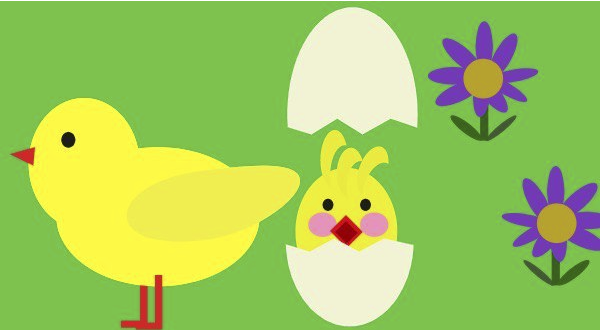
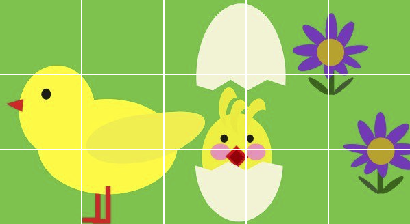
CSS微动画 - 图片不裁切,纯css实现分格淡出
Q: 还有什麽特别的可以写吗?
A: 可能... 再回去Loading吧(๑¯∀¯๑)
本篇要来做整张图分隔淡出的效果!换的方式想 ... 就是上面好几格白的,让它们渐渐变透明就好了吧?直接看看如何实现罗!
父层先来整张图
.container定义容器大小,并在子层放上15个.item。
<style>
  .container {
    width: 600px;
    height: 330px;
    display: flex;
    flex-wrap: wrap;
    background: url('/files/bg.jpg');
    background-color: LightSkyBlue;
  }
</style>
<div class="container">
  <div class="item"></div>
  <div class="item"></div>
  <div class="item"></div>
  <div class="item"></div>
  <div class="item"></div>
  <div class="item"></div>
  <div class="item"></div>
  <div class="item"></div>
  <div class="item"></div>
  <div class="item"></div>
  <div class="item"></div>
  <div class="item"></div>
  <div class="item"></div>
  <div class="item"></div>
  <div class="item"></div>
</div>
子元件样式
接着将每一个子元件设定宽高及border。
<style>
  .item {
    width: calc(20% - 2px);
    padding: 9% 0;
    border: 1px solid white;
  }
</style>
最後就是animation了!
不同的元素给予不同的animation-delay,希望可以让元素有交错的方式淡入。为了如下方影片示意,both的设定是很重要的!
<style>
  .item {
    animation: fadeIn 1s both;
  }
  .item:nth-child(3),
  .item:nth-child(6),
  .item:nth-child(15) {
    animation-delay: .2s;
  }
  .item:nth-child(1),
  .item:nth-child(5),
  .item:nth-child(12) {
    animation-delay: .2s;
  }
  .item:nth-child(7),
  .item:nth-child(9),
  .item:nth-child(11) {
    animation-delay: .4s;
  }
  .item:nth-child(4),
  .item:nth-child(10),
  .item:nth-child(13) {
    animation-delay: .6s;
  }
  .item:nth-child(2),
  .item:nth-child(8),
  .item:nth-child(14) {
    animation-delay: .8s;
  }
  @keyframes fadeIn {
    0% {
      background-color: white;
    }
    100% {
      background-color: transparent;
    }
  }
</style>

both 是设定属性 animation-fill-mode
animation-fill-mode在第19篇时有用到forwards,动画演绎结束後,元素的样式会停留在动画的最後一个样子。本篇设定的both除了跟forwards一样在动画演绎结束後,元素的样式会停留在动画的最後一个样子以外,在动画演绎之前,元素的样式会停留在动画的0%,所以本篇如果没有设定animation-fill-mode: both的话会是怎麽样呢?

由於animation-delay的设定,动画在演绎之前,会保留原本的样式,在delay的时间结束时才开始演绎动画,看起来就跟上面的示意影片不一样了~
本篇小插曲 - 在认识到animation-fill-mode前...
这个效果是之前在做零件的形象网站时做的,大概才入门前端後的第二个月。当时光是切版就耗费小编很多脑细胞,还要写animation实在是烧脑。但由於时间很赶,所以没有特别花时间研究其他属性,所以小编当时用了其他方法写了一样的效果。那时候为了每张图的动画要长不一样... 小编写了很多@keyframes阿,现在想来真真是不科学。(长叹
下方展示一下当时的写法(跟本次成品在时间上有点小差异,但两者都是当时想达到的效果),试想想当时有8张图,每张的动画效果都要长不一样,每次修改又死了好几K的脑细胞。所以在认识animation-fill-mode後,改写原本的写法,将程序码的行数大幅减少,应该算是有进步吧?
<style>
  .item:nth-child(3),
  .item:nth-child(6),
  .item:nth-child(15) {
    animation-name: style1;
  }
  .item:nth-child(1),
  .item:nth-child(5),
  .item:nth-child(12) {
    animation-name: style2;
  }
  .item:nth-child(7),
  .item:nth-child(9),
  .item:nth-child(11) {
    animation-name: style3;
  }
  .item:nth-child(4),
  .item:nth-child(10),
  .item:nth-child(13) {
    animation-name: style4;
  }
  .item:nth-child(2),
  .item:nth-child(8),
  .item:nth-child(14) {
    animation-name: style5;
  }
  @keyframes style1 {
    0% {
      background-color: white;
    }
    20%, 100% {
      background-color: transparent;
    }
  }
  @keyframes style2 {
    0%, 20% {
      background-color: white;
    }
    40%, 100% {
      background-color: transparent;
    }
  }
  @keyframes style3 {
    0%, 40% {
      background-color: white;
    }
    60%, 100% {
      background-color: transparent;
    }
  }
  @keyframes style4 {
    0%, 60% {
      background-color: white;
    }
    80%, 100% {
      background-color: transparent;
    }
  }
  @keyframes style5 {
    0%, 80% {
      background-color: white;
    }
    100% {
      background-color: transparent;
    }
  }
</style>
如果有写错的地方,欢迎点评! 会及时改进~
如果有更好的写法,欢迎指教! 希望各位不吝赐教~
如果想看更多效果,欢迎敲碗! 提供示意图小编写写看~
如果内容疑似侵权,拜托告知! 内容皆为小编理解後原创~
如果对你有点帮助,拿去用吧!
<<: [NestJS 带你飞!] DAY14 - Custom Decorator
35.Local Storage
Local Storage (更准确地说是“Web Storage”)适合存储你希望进行持久化的较小...
Day14-Webhook 实作(三)LINEBot 之 MessageBuilder(I)
大家好~ 今天来试着传送不同类型讯息回覆使用者吧! 以下范例为以如何使用不同的 MessageBui...
战略思考与规划(Strategic Thinking and Planning)
使命与愿景(Mission and Vision) .一个组织不是无缘无故存在的。它是为目的而建立...
[DAY-17] 热情从何处来
2021 最後一季拉!!! 倒数 3 个月 当兵有破百 每年的此时此刻也进入破百的阶段拉!!! 前...
#3 The V8 Engine
在谈论V8引擎时,我们得先了解什麽是 JavaScript 引擎。 JavaScript Engin...