Material UI in React [ Day 27 ] Styles API (part 2)
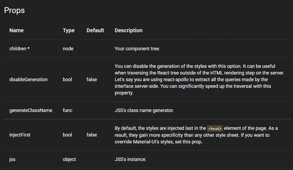
StylesProvider
他和 Theme Provider 很像,其实就是用 context 在传递样式 object 的方法。
import React from 'react';
import ReactDOM from 'react-dom';
import { StylesProvider } from '@material-ui/core/styles';

function App() {
  return (
    <StylesProvider jss={jss}>...</StylesProvider>
  );
}

ReactDOM.render(<App />, document.querySelector('#app'));
ThemeProvider
这部分之前已经讲解过了就不再赘述了,官方文件内有详细的内容。
useTheme() => theme
这个 hook 之前的介绍也讲解过了,返回了一个 theme ,你可以function component中使用它。
export default function MyComponent() {
  const theme = useTheme();

  return <div>{`spacing ${theme.spacing}`}</div>;
}
withStyles(styles, [options]) => higher-order component
使用 higher-order component 的模式与一个具有function component的样式表相连。它不会修改传递给它的组件;相反的,它返回一个带有 classes 属性的新组件。这个 classes 对象包含了在 DOM 中注入的类名(class names)。
你可能会注意到一些有趣的细节:
- 它添加了一个 classes 属性,这样您可以从外部重写注入的类名。
- 它将 refs 转发给内部的组件。
- 而 innerRef 属性已不再使用了改用 ref。
- 它不会拷贝静态文件。例如,您可以用它来定义一个 getInitialProps() 的静态方法 (next.js)。
接收参数格式
- styles(* Function | Object *):和 makeStyles 一样可以是 function 或是样式 object。
- options (Object [optional]):
- options.defaultTheme (Object [optional]): 如果 theme 不是通过 Theme Provider 提供的,则使用预设主题。
- options.withTheme (Boolean [optional]): 预设为 false。将 theme object 提供给组件作为参数。
- options.name (String [optional]): 样式表的名称。
- options.flip (Boolean [optional]): 当设置为 false 时,此工作表将选择退出 rtl 转换。设置为 true 时,样式反转,当设置为 null 时,它遵循 theme.direction。
- 接收规则 jss.createStyleSheet([styles], [options]).
Returns
higher-order component: 应该用於包装组件。
const styles = {
  root: {
    backgroundColor: 'red',
  },
};

function MyComponent(props) {
  return <div className={props.classes.root} />;
}

export default withStyles(styles)(MyComponent);
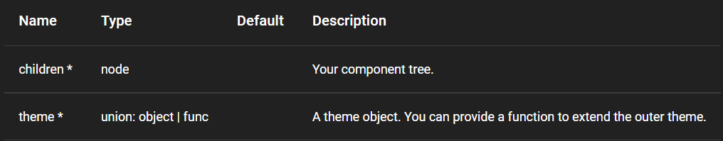
withTheme(Component) => Component
提供 theme object 作为参数,以便组件可以渲染。
接收参数格式
Component: 将被包装的组件。
Returns
Component: 新建的组件。
import React from 'react';
import { withTheme } from '@material-ui/core/styles';

function MyComponent(props) {
  return <div>{props.theme.direction}</div>;
}

export default withTheme(MyComponent);
那麽今天的内容就到这边了,至此相信大家对这个UI库已经有一些基本的认识了吧,明天会讲解 Customization (自订) 组件的部分。
Day11-React 表单验证篇-不使用 hook 或第三方函式库
React 的表单验证篇总共会三篇,这篇我们会自己手刻一个验证输入值是否合法的表单,而在後面两篇文章...
Day01 测试写起乃 - 前言
大家好,我是CK!这次要来挑战学习测试纪录大全! 为何要选择挑战测试? 由於是菜鸟工程师而且许多职缺...
Day24. form_tag 与 simple_form_for 的用法 - 表单 part2
前一天,我们使用了simple_form_for提到了新增表单写法,而今天要讲一个上传情境。这个上传...
【这些年我似是非懂的 Javascript】Day 28 - 物件 # Part 4 # 特性描述器 Combo
昨天分享了特性组合的一般单独的使用方法, 今天要来分享一下他们的 Combo 连技和相关用到的东西...
Day6:三大要素
好的好的,经过了前几篇文章之後,想必大家应该对 Coroutine 有一些了解了吧,我在这边快速复习...