Day 09 - Design System x 实作 — Typography
虽然昨天已经介绍了如何在你的网页中实作 Color System,但严格上来说今天才算是这系列第一篇的实作,毕竟 Color 只涵盖了 CSS 的部分,并且是需要应用在网页跟各个 UI 元件上的,而 Typograhy 则是一个完整的 UI 元件了,会涵盖到 HTML 架构、CSS 样式,还有一些 JS 的逻辑。
而实作使用到的技术会是 以 React 为基础配上 TypeScript 的型别系统,在 CSS 处理上用 Tailwind CSS 来加速开发,最後则是使用 Storybook 来 Demo 给大家看。
想先看 Code 或是 Demo 的由此去
Github Repo: ithelp-ui-demo
Live Demo: Storybook
那以下就来讲解实作流程跟技术细节啦!
复习一下
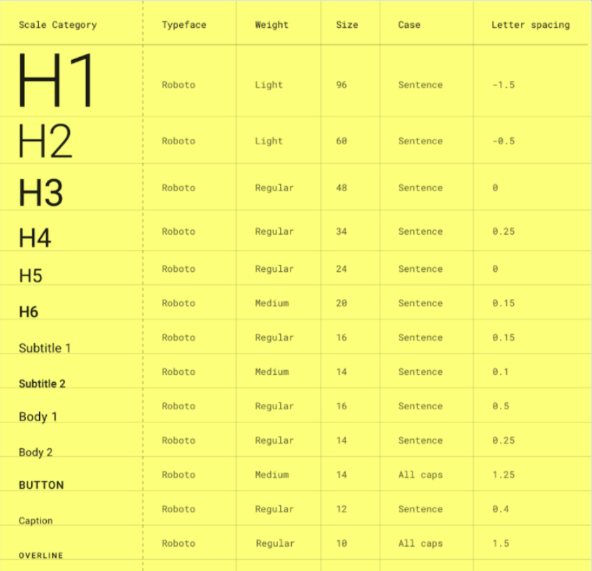
开始前先复习一下 Material-UI 那边的 Typography(忘记它是什麽的也可以看 Day 07 - Design System — 前端工程师也该知道的那些事 回顾):
在真的开始介绍之前(是要卖几次关子???)
老样子来反思一下:「我们真的需要 Typography 吗?」
其实答案真的很有可能是不用,如果是小网站其实像这样全域改写一下原生 HTML Tag 的值就好了,特意去做一个 Typography 可能有点杀鸡焉用牛刀。
h1 {
    font-size: 3rem; /* 48px */
    font-weight: 600;
    line-height: 1.5;
    letter-spacing: 0.1em;
  }
  h2 {
    font-size: 2.25rem; /* 36px */
    font-weight: 600;
    line-height: 1.5;
    letter-spacing: 0.1em;
  }
  h3 {
    font-size: 1.875rem; /* 30px */
    font-weight: 500;
    line-height: 1.5;
    letter-spacing: 0.05em;
  }
  h4 {
    font-size: 1.75rem; /* 28px */
    font-weight: 500;
    line-height: 1.5;
    letter-spacing: 0.05em;
  }
  h5 {
    font-size: 1.5rem; /* 24px */
    font-weight: 500;
    line-height: 1.5;
    letter-spacing: 0.025em;
  }
  h6 {
    font-size: 1.375rem; /* 22px */
    font-weight: 500;
    line-height: 1.5;
    letter-spacing: 0.025em;
  }
  p {
    font-size: 1rem; /* 16px */
    font-weight: 400;
    line-height: 0;
    letter-spacing: 0;
  }
  span {
    font-size: 0.8125rem; /* 13px */
    font-weight: 400;
    line-height: 0;
    letter-spacing: 0;
  }
  caption {
    font-size: 0.75rem; /* 12px */
    font-weight: 400;
    line-height: 0;
    letter-spacing: 0;
  }
那如何判断需不需要呢?
基本上就是看系统复不复杂、设计有没定义出超过原生 HTML Element 数量的层级,或是需不需要应对各式各样的情境,像是换行、Ellipsis(过长变成 ... )等等。
大原则是:DRY(Don't Repeat Yourself)
当你觉得你一直在重复写很多类似的设定时,就是时候把他们抽出来整理成可复用的元件了!
而 Typography 就是来应对各式各样关於文字的情境,因此如果情境太少,像上面那样处理即可,但如果是大型系统的话,Typography 就绝对是必要的,文字的处理没有统一的话,之後 Debug 会要一个个修修到死。
真的确认我们需要 Typograhy 之後,就来实作吧!
实作方式会按照在 Day 04 - 行前说明 — 谈谈元件化开发与开发流程 讲到的元件开发流程:Spec → Interface → Implement,从理论走入实践!
但其实 Spec 是在厘清需求的部分,需求主要是看公司产品和跟 PM 怎麽谈,而这系列重点在於元件本身的观念跟实作,在这边就先不去琢磨那部分。
因此在这边和之後的实作流程都会是按照基本元件会被预期的功能来定义介面,再来实作元件跟样式。
Typography Interface
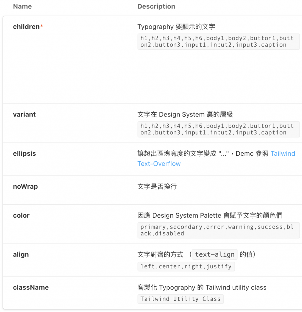
先介绍一下 Typography 基本的介面会包含什麽:
写成 TypeScript 会像这样:
export interface TypographyProps {
  align?: TypographyAlignType;
  children: ReactNode;
  className?: string;
  color?: ColorType;
  ellipsis?: boolean;
  noWrap?: boolean;
  variant?: TypographyVariant;
}
很明显的属性这边就不介绍了,但可以细部介绍一下 TypographyAlignType、ColorType 和 TypographyVariant 是怎麽定义的。
而因为使用 Tailwind 的 utility class,所以要做的只是写出 Props 和 Utility Class 的键值对,像是文字对齐方向(Text-Align),就可以像下面这样写,拿 TypographyAlignType 当 props: align 的型别,之後只要丢 'left' ~ 'justify' 就可以成功改变 Typography 的 Text Align 了。
export const TypographyAlign = {
  left: "text-left",
  center: "text-center",
  right: "text-right",
  justify: "text-justify",
};

export type TypographyAlignType = keyof typeof TypographyAlign;

<Typography align="left">Text Align</Typography>
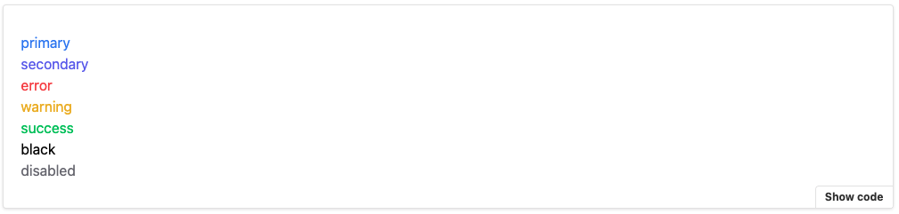
Color 和其他的 Props 都可以参照这个方式去定义,而在 Color 这边则是以 500 为基准去使用 Tailwind 内建的 Palette,这边只是大致列一下文字在网页中会有的颜色情境,当然 Design System 更完整的网页会把它定义得更详细,但之後也只是在扩充 Color 而已。
而因应其他地方也都会用到这些颜色,因此就把它抽出来,让其他元件需要颜色时也可以引用。
// /system/typings.ts
export const Color = {
  primary: "text-primary-500",
  secondary: "text-secondary-500",
  success: "text-success-500",
  error: "text-error-500",
  warning: "text-warning-500",
  black: "text-black-500",
  disabled: "text-gray-500",
};

export type ColorType = keyof typeof Color;
最後则是将 Typography 会有的层级透过 TypographyVariantType 定义出来,而非原生 HTML 有的层级再透过 TypographyVariant 去给值。
export type TypographyVariantType =
  | `h${1 | 2 | 3 | 4 | 5 | 6}`
  | `button${1 | 2 | 3}`
  | `input${1 | 2 | 3}`
  | `body${1 | 2}`
  | "caption";

export const TypographyVariant = {
  body1: "text-base	font-normal	tracking-normal	leading-6",
  body2: "text-sm font-normal	tracking-normal leading-5",
  button1: "text-base font-medium	tracking-wide	leading-10",
  button2: "text-base	font-medium	tracking-wide	leading-8",
  button3: "text-sm font-medium	tracking-normal leading-6",
  input1: "text-base font-normal tracking-normal leading-10",
  input2: "text-base font-normal tracking-normal leading-8",
  input3: "text-base font-normal tracking-normal leading-6",
}
原生 HTML 有的就照上面提到的直接覆写就好,而其余非原生层级就像 Align 和 Color 那样去指派个别的 Utility Class。
根据不同层级需要设定的属性主要有 大小 (font-size)、粗细 (font-weight)、行高 (line-height)、字距 (letter-spacing) 等等。
能把层级当作 Props 使用後,接着要实作将这些 Variant 转换成真正的 HTML Tag 的 getComponentFromVariant:
export type TypographyComponent =
  | `h${1 | 2 | 3 | 4 | 5 | 6}`
  | "p"
  | "span"
  | "label"
  | "div"
  | "caption";

function getComponentFromVariant(
  variant: TypographyVariantType
): TypographyComponent {
	if (variant.startsWith("caption")) {
	    return "caption";
	  }

  if (variant.startsWith("h")) {
    return variant as TypographyComponent;
  }

  if (variant.startsWith("body")) {
    return "p";
  }

  return "span";
}
转换的规则是:variant 是 caption 就先配到 caption, h 开头的也配对到原生的 h1~h6,而 body 系列的都当成 p,除此之外都是 span。
元件实作
把介面跟实作细节讲完後,Typography 的实作其实相对单纯,就是把 Props 都丢下去而已。
以下分两个部分来讲解:
1. 根据 Variant 来 Render 不同的 HTML Tag
用 getComponentFromVariant 来将 variant 转换成对应的 HTML Tag,并以此当作 React 的 Component 来 Render,而转换规则就如上面介绍的那样。
2. CSS 相关的 Props
主要是当成 TypographyColor、TypographyAlign、TypographyVariant 这些键值对(Key-Value Pair)物件的 Key,以此来拿到 Value 定义好的 Tailwind utility class。
像是 TypographyAlign["left"] 就会对应到 "text-left" 这个 utility class
export const Typography: React.FC<TypographyProps> = (props) => {
  const {
    align = "left",
    children,
    className,
    color = "black",
    ellipsis = false,
    noWrap = false,
    variant = "body1",
  } = props;

  const Component = getComponentFromVariant(variant) as any;

  return (
    <Component
			className={`
	      ${color ? TypographyColor[color] : ""}
	      ${align ? TypographyAlign[align] : ""}
	      ${ellipsis ? "overflow-ellipsis overflow-hidden" : ""}
	      ${noWrap ? "whitespace-nowrap" : ""}
	      ${className ? className : ""}
	      ${variant ? TypographyVariant[variant] : ""}
	      `}
    >
      {children}
    </Component>
  );
};
至此就完成 Typography 的实作啦!
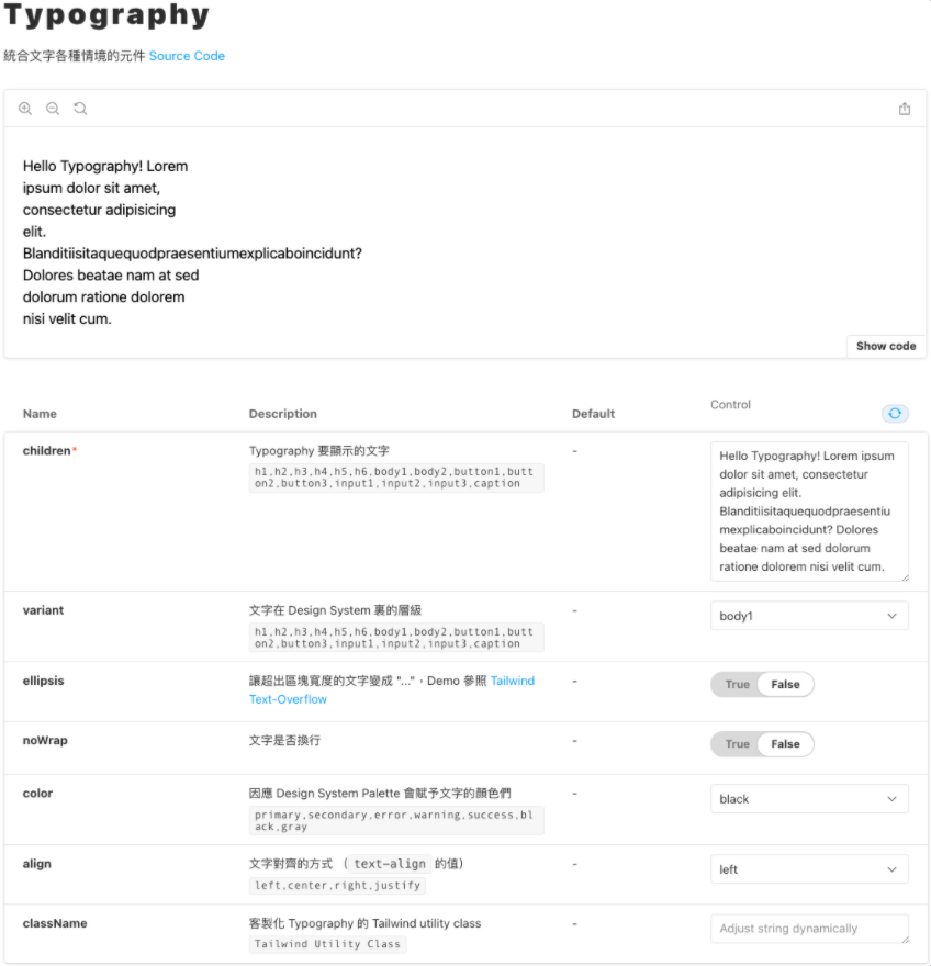
Playground
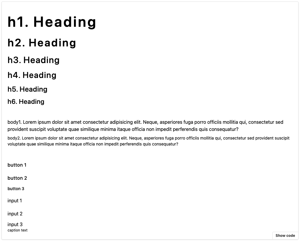
大家可以在这玩玩看不同的 Props 变化,像这样:
Variants:
Colors:
在这边不得不推坑一下 Storybook 是一个很方便 Demo 元件的工具,不用再让大家为了共用元件在专案里找翻天,就算找到了还要确认符不符合当前的需求。
有了 Storybook 後,直接引入写一个小 Demo 就可以一目了然!
当然设定上还是有些小坑啦,但那就之後有机会再跟大家说哩!
小结
Typograhpy 就这样介绍完啦!其实讲解 Code 还有挺多眉角要注意,很怕没有好好传达到自己想讲的眉角的,所以如果在实作上有哪里不清楚的都欢迎留言告诉我!
而这里其实还没牵扯到太多的 JS 互动,所以也还挺单纯的,但还是一样比起实作,更重视能让大家知道实作一个 UI 元件的流程,以及大概理解一下 Typography 这个挺重要但容易被会忽略的文字超集合元件!
如果觉得对你有帮助的话,希望大家可以不吝在 Github Repo 上给个 Star ><
明天要介绍的是 Icon 这个元件的实作,实作流程差不多,但我认为把它实作出来背後的概念还挺有趣的,那就明天见啦!
<<: Day9 周末居酒屋-明太子山药 ft 香煎牛小排、鱼卵沙拉
>>: Day09 - [丰收款] 安全无虞後,开始建立订单:ATM虚拟帐号篇 (1)
修复:Windows 10中的USB装置无法辨识/识别
您在经常使用USB随身碟、SD记忆卡、外接硬碟时,可能电脑会弹出「USB装置无法识别。连结到这部电脑...
Day 16 - SNMP、Banner Grabbing 与 Firewall Rules
出於书本 Chapter 8. Network Infrastructure SNMP 扫描 什麽是...
推荐! 开发的线上辅助工具
今天在分享几个方便好用的工具。 一个是 Android Asset Studio ,有9种图标的变形...
Day5-React Hook 篇-认识 useContext
让开发者可以更容易的从母元件传递 state 到深层的子元件,并让多个用到的 state 资料的元件...
Day 8:OkHttp 获取网路资料方式
本篇文章同步发表在 HKT 线上教室 部落格,线上影音教学课程已上架至 Udemy 和 Youtu...