Android Studio初学笔记-Day8-元件客制化
元件客制化(LinerLayout和Button)
前几天讲了EditText和Button,不过这两者的样式看上去总有些死板,甚至也不曾在自己手机里的APP中看见他们以这个形式出现,所以今天就来讲讲怎麽让他们改头换面,看起来更美观一点。
先带各位认识一些简单的标签。
主要标签
<shape>
- 负责设定你要的形状,包括四种。rectangle: 矩形、oval: 椭圆形、line: 线型
、ring: 环型。
接下来则是shape的属性设定:
<solid>
- 设定实心处的颜色。
<stroke>
- 设置边线包括颜色、宽度等。
<paddind>
- 设置文字与上、下、左、右边的间距。
<gradient>
- 设置颜色的渐层,有linear(线性渐层)、sweep(扫描渐层)、radial(放射渐层),如果使用此类型,需设置android:gradientRadius。
<corner>
- 设置圆角,不过此方法仅适用shape为rectangle时。
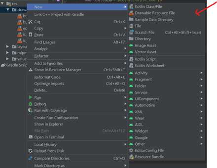
以上大致讲解完各个标签功能,接着就让我们来看看实际的用法设定和效果。打开res/drawable资料夹并新增档案,新增方式如图。
Button.xml的程序码
<shape xmlns:android="http://schemas.android.com/apk/res/android">
    <solid
        android:color="@color/purple_200"/>
    <stroke
        android:width="2dp"
        android:color="@color/teal_200"/>
    <corners
        android:radius="30dp"/>
    <padding
        android:left="10dp"/>
</shape>
Button2.xml 的程序码
<shape xmlns:android="http://schemas.android.com/apk/res/android"
    android:shape="oval">
    <stroke
        android:width="2dp"
        android:color="@color/purple_200"/>
    <gradient
        android:width="2dp"
        android:type="linear"
        android:startColor="@color/teal_200"
        android:endColor="@color/purple_700"/>
    <padding
        android:right="10dp"/>
</shape>
edittext.xml的程序码
<shape xmlns:android="http://schemas.android.com/apk/res/android">
    <stroke
        android:width="1dp"
        android:color="@color/teal_200"/>
    <corners
        android:radius="20dp"/>
    <solid
        android:color="@android:color/transparent"/>
</shape>
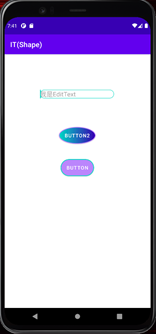
最後将这些档案设置到各个元件的background中
程序码
<androidx.constraintlayout.widget.ConstraintLayout xmlns:android="http://schemas.android.com/apk/res/android"
    xmlns:app="http://schemas.android.com/apk/res-auto"
    xmlns:tools="http://schemas.android.com/tools"
    android:layout_width="match_parent"
    android:layout_height="match_parent"
    tools:context=".MainActivity">

    <LinearLayout
        android:layout_width="200dp"
        android:layout_height="30dp"
        android:layout_marginTop="100dp"
        android:layout_marginLeft="100dp"
        android:background="@drawable/edittext"
        android:orientation="vertical"
        app:layout_constraintStart_toStartOf="parent"
        app:layout_constraintTop_toTopOf="parent">

        <EditText
            android:id="@+id/editTextTextPersonName"
            android:layout_width="wrap_content"
            android:layout_height="wrap_content"
            android:layout_gravity="center_vertical"
            android:layout_marginLeft="10dp"
            android:ems="10"
            android:hint="我是EditText"
            android:textSize="20sp"
            android:inputType="textPersonName"
            android:background="@null" />

    </LinearLayout>

    <Button
        android:id="@+id/button"
        android:layout_width="wrap_content"
        android:layout_height="wrap_content"
        android:text="Button"
        android:background="@drawable/button"
        app:backgroundTint="@null"
        app:layout_constraintBottom_toBottomOf="parent"
        app:layout_constraintEnd_toEndOf="parent"
        app:layout_constraintHorizontal_bias="0.498"
        app:layout_constraintStart_toStartOf="parent"
        app:layout_constraintTop_toTopOf="parent"
        app:layout_constraintVertical_bias="0.443" />

    <Button
        android:id="@+id/button2"
        android:layout_width="wrap_content"
        android:layout_height="wrap_content"
        android:text="Button2"
        android:background="@drawable/button2"
        app:backgroundTint="@null"
        app:layout_constraintBottom_toBottomOf="parent"
        app:layout_constraintEnd_toEndOf="parent"
        app:layout_constraintHorizontal_bias="0.498"
        app:layout_constraintStart_toStartOf="parent"
        app:layout_constraintTop_toTopOf="parent"
        app:layout_constraintVertical_bias="0.307" />

</androidx.constraintlayout.widget.ConstraintLayout>
Button的颜色其实是可以透过android:backgroundTint=””的属性修改的,不过如果是要套用xml档中的颜色设定,则需要设定app:backgroundTint=”@null”,否则不会有颜色的改变喔。
成果
今天客制化元件就讲到这边,谢谢大家~
<<: WhatsApp Business 商业帐号的独特功能
Batch Processing (2) - MapReduce Job Execution
MapReduce and Distributed Filesystems MapReduce 有点...
Day 23. slate × Operation × L-transform
上一篇文章我们深入了解了 Operation 的 transform function 是如何实作...
Day16-Kubernetes 那些事 - Resource Quotas
前言 昨天的文章讲完 Deployment 以及 ReplicaSet 後相信大家应该对於如何产生更...
Android学习笔记17
kotlin结合koin比起dagger很方便的方式接着就试着做做看吧 module就是一个容器,可...
Day 13【连动 MetaMask - Back-End Services】这显然是厂商的疏失
【前言】 诸君日安,大魔王要出现啦!接下来要说的是Nonce 的使用、前後端连动,以及帐户验证。今...