Day 8 : HTML – 为什麽Flex没有justify-items和justify-self,而grid却有?
如标题!这篇就是要来聊聊为什麽Flex没有,而grid却有
以下我们都会以讨论justify-self为主,因为它和justify-items本质上是一样的,且使用justify-content的效果会和使用justify-items一样
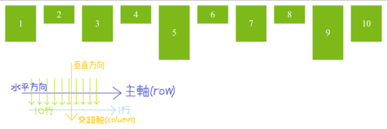
首先,Flex是一维空间,在还没设置flex-wrap:wrap前,它是单行的
所以所有元素都会「挤」在主轴(row)上,也就是水平方向
从这个现象,就可以很明显的发现主轴(row)和交错轴(column)在对齐上的差异:
「主轴只有一列,且堆叠了很多个内元素。交错轴有十行,但都只堆叠一个内元素」
如下图所示:
这代表什麽?代表如果想控制交错轴上的元素,就必须用align-self,因为每行的内元素都「单独」对齐
但在主轴上,self就没有存在的意义,因为内元素通通都「挤」在一起
如果看不太懂上面的说法,我们也可以透过self和content的可用属性来理解
Content可以用space-around、space-between、space-evenly的属性,但self不行,它只有start、end…等
两者的差异在於:「content适用於该轴有很多元素的情况,而self仅适用於该轴只有一个元素的情况」,故self没办法使用space-*的用法
也有一种说法是,Flex可以用flex-direction:column轻松转换主轴、交错轴的方向,所以就能在水平方向用align-self去取代justify-self
那麽我如果想在水平方向使用justify-self,且不使用flex-direction:column呢?
你可以用margin-*:auto的方式呈现
用讲的太抽象了,来看一下范例吧!
首先,先看一下我们HTML和CSS的代码
HTML:
<div class="container">
    <div class="box box_1">1</div>
    <div class="box box_2">2</div>
    <div class="box box_3">3</div>
    <div class="box box_4">4</div>
    <div class="box box_5">5</div>
</div>
CSS:
.container {
    border:solid 5px darkgray;
    background-color:beige;
    width:800px;
    display:flex;
}
.box {
    background-color:rgb(173, 209, 243);
    width:100px;
    height:70px;
    line-height:70px;
font-size:40px;
    text-align:center;
}
.box_1 {
}
.box_2 {
}
.box_3 {
}
.box_4 {
}
.box_5 {
}
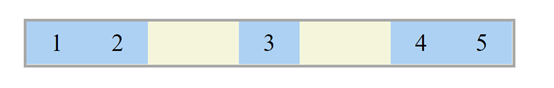
结果如下图所示:
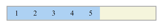
Ex1: 在container设定justify-content:flex-start,而.box_5设定margin-left:auto,其box_5的呈现会和justify-self:flex-end一样
.box_1 {
    margin-left:auto;
}
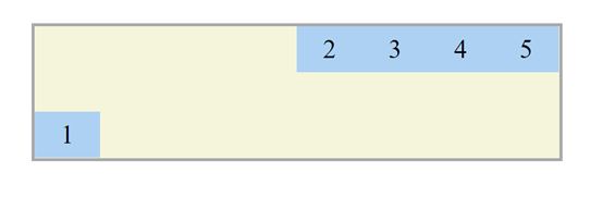
结果如下图所示:
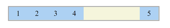
Ex2: 在container设定justify-content:flex-end,而.box_1设定margin-right:auto,其box_1的呈现会像justify-self:flex-start一样
.box_3 {
    margin-right:auto;
}
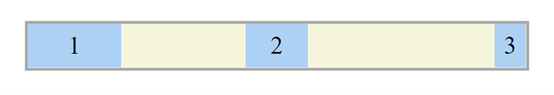
结果如下图所示:
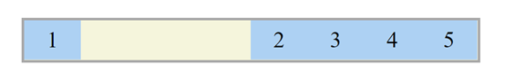
Ex3 : 在.box_3设定margin-left:auto、margin-right:auto,其box_3的呈现会和justify-self:center一样
.box_3 {
	margin-left:auto;
    margin-right:auto;
}
结果如下图所示:
Ex4: 在container设定justify-content:flex-end、height:200px,而.box_1设定margin-top:auto、margin-right:auto,其box_1的呈现会像justify-self:flex-start、align-self:flex-end一样
.box_1 {
    margin-top:auto;
    margin-right:auto;
}
结果如下图所示:
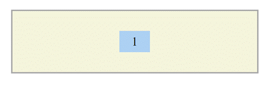
Ex5: 把box_2~5移除,并在.box_1设定margin:auto其box_1的呈现会像justify-self:center、align-self:center一样
.box_1 {
    margin:auto;
}
结果如下图所示:
那如果今天每个box的宽度都不一样呢?那我们该怎麽让它置中?
这里就不能用margin-*:auto了,因为box宽度不一样,所以不会在container里置中 (会有偏差)
解决方法: absolute (绝对定位)
这里我们先把HTML的box_4和box5移除
<div class="container">
        <div class="box box_1">1</div>
        <div class="box box_2">2</div>
        <div class="box box_3">3</div>
</div>
然後将CSS设定如下:
.container {
    position:relative;
}
.box_1 {
    width:150px;
}
.box_2 {
    width:100px;
    position:absolute;
    left:50%;
    transform:translate(-50%, 0); /* 在x轴上往左移动自身的一半,也就是50px */
}
.box_3 {
    width:50px;
    margin-left:auto;
}
结果如下图所示:
以上就是大致上的原因和替代方案
说了这麽多,总结来讲就是CSS的开发者认为,justify-self不是个必要的存在
所以才延伸出很多种解释justify-self不是必要的说法
Grid是二维的,所以它的「水平方向(justify)」和「垂直方向(align)」都有存在self的必要
希望这篇有解答到大家的疑惑!
如果不太理解transform:translate(-50%, 0);,可以去以下网站看一下:
https://www.itread01.com/content/1541780346.html
<<: [Day 07] - Spring Boot 实作登入验证(一)(TOKEN or SESSION?)
day 22 - NSQ Consumer & graceful shutdown
一个服务发出讯息之後, 可以由多个服务分别注册多个channel来监听, 同一个TOPIC底下的每个...
Day9 You have to trust that the dots will somehow connect in your future
Plotting regression line 继昨天画出XY关系图後,我们就会进一去想知道XY...
大共享时代系列_009_共享农场
有没有想过除了从菜市场、超级市场买菜以外,试着跟人在离家不远的农场,共享农作、畜牧来获取需求的天然的...
JS Library 学习笔记:首先当然来试试 jQuery (一)
要撰写前端功能,直接使用JavaScript是绝对可行的,但要更有效率、具有良好开发体验的话,使用L...
30天打造品牌特色电商网站 Day.22 图片排版实作
分享完关於图片的排版设计,今天我们就来进行排版的实作啦! 之前有介绍过的<float>&...