CSS微动画 - Loading来了!九宫格可以很多变化
Q: 还是Loading吗?
A: 一大系列!接下来的样式会比较不同~
上两篇做完圆圈的Loading效果,本篇来个方形的Loading,并给予不同的样式~
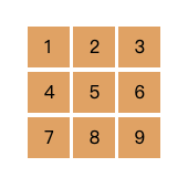
/* 以下每个范例都将使用相同的基础html及css,如下:*/
<style>
  .container {
    display: inline-flex;
    flex-wrap: wrap;
    justify-content: space-between;
    width: 120px;
  }
  .item {
    width: 32%;
    height: 0;
    padding-top: 31%;
    margin-bottom: 3%;
    background-color: SandyBrown;
  }
</style>
<div class="container">
  <div class="item"></div>
  <div class="item"></div>
  <div class="item"></div>
  <div class="item"></div>
  <div class="item"></div>
  <div class="item"></div>
  <div class="item"></div>
  <div class="item"></div>
  <div class="item"></div>
</div>

贪食蛇样式Loading
有时候@keyframes的写法很简单,如这个例子只由0%的opacity: 1演绎到100%的opacity: 0,并透过animation-delay让每个动画演绎的起始时间延迟以达到此Loading的动画效果。
<style>
  .item {
    animation: hideItem .8s infinite;
  }
  .item:nth-child(1) { animation-delay: 0s; }
  .item:nth-child(2) { animation-delay: 0.1s; }
  .item:nth-child(3) { animation-delay: 0.2s; }
  .item:nth-child(6) { animation-delay: 0.3s; }
  .item:nth-child(9) { animation-delay: 0.4s; }
  .item:nth-child(8) { animation-delay: 0.5s; }
  .item:nth-child(7) { animation-delay: 0.6s; }
  .item:nth-child(4) { animation-delay: 0.7s; }
  .item:nth-child(5) { opacity: 0; }

  @keyframes hideItem {
    100% { opacity: 0; }
  }
</style>

缩放样式Loading
这个例子也是运用animation-delay的属性,让元素演绎动画之前各别延迟不同的秒数,藉由延迟的秒数差做出不同的效果。如果不用animation-delay做得出一样的效果吗?答案是可以的!这时候就要针对每个不同的元素,在设定@keyframes的脚本时给予不同的设定。
<style>
  .item {
    animation: scaleItem .75s infinite ease-in-out;
  }
  .item:nth-child(1) {
    animation-delay: 0s;
  }
  .item:nth-child(2),
  .item:nth-child(4) {
    animation-delay: .15s;
  }
  .item:nth-child(3),
  .item:nth-child(5),
  .item:nth-child(7) {
    animation-delay: 0.3s;
  }
  .item:nth-child(6),
  .item:nth-child(8) {
    animation-delay: 0.45s;
  }
  .item:nth-child(9) {
    animation-delay: 0.6s;
  }

  @keyframes scaleItem {
    0%, 100% {
      transform: scale(.1);
    }
    30%, 70% {
      transform: scale(1);
    }
  }
</style>

旋转样式Loading
<style>
  .item {
    animation: rotateItem 3s infinite;
  }

  @keyframes rotateItem {
    0%, 100% {
      transform: rotate(-45deg) scale(.8);
    }
    25% {
      transform: rotate(-90deg) scale(1);
    }
    50% {
      transform: rotate(45deg) scale(.8);
    }
    75% {
      transform: rotate(90deg) scale(1);
    }
  }
</style>

同一个样式可以演绎各式各样的动画,只看希望怎麽演绎它;同一个动画可以有很多种写法,可以依照需求、个人习惯去做调整。复制贴上虽然是最快的,在看范例的同时不妨试着修改参数,当对属性的运用越熟练时,就可以依照自己的想法做出更多变化,何不试着玩出其他变化呢?
如果有写错的地方,欢迎点评! 会及时改进~
如果有更好的写法,欢迎指教! 希望各位不吝赐教~
如果想看更多效果,欢迎敲碗! 提供示意图小编写写看~
如果内容疑似侵权,拜托告知! 内容皆为小编理解後原创~
如果对你有点帮助,拿去用吧!
<<: AI ninja project [day 21] 自动编码器 Autoencoders
>>: [ 卡卡DAY 6 ] - React Native style 必懂之 Flexbox 弹性盒子(上)
CSS 命名基础介绍 DAY40
今天要来介绍 CSS 命名 首先先来介绍 驼峰式命名: https://zh.wikipedia.o...
DAY3:离职率预测(下)
人工智慧共创平台-离职率预测(下) 资料清洗 ax = sns.countplot(x="...
Day 9 - Rancher 丛集管理指南 - 架设 K8s(下)
本文将於赛後同步刊登於笔者部落格 有兴趣学习更多 Kubernetes/DevOps/Linux 相...
Day24 axios基本语法(GET、POST请求)?
大家好我是乌木白!今天要和大家讲 axios 基本语法~ 在处理 AJAX 的时候,有一些套件可以...
Day23-"其他排序方法"
插入排序法 挑选A放在第一位,再挑选B与放在第一位的A比较分数,由於B比A的分数还低,因此把A排在...