#8 Web Layout: RWD
What is RWD?
“Responsive web design (RWD) is a design and technical approach that aims to adapt the layout and interaction of a site or app to work optimally across a wide range of device resolutions, screen densities and interaction modes with the same underlying codebase.“ from RWD Basics - jQuery Mobile Demos
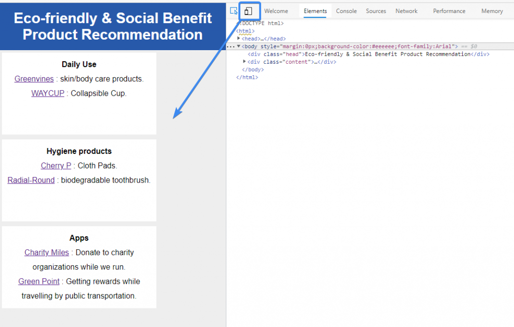
Display the web layout across different resolutions
Basing on the previous Web layout practice, we’ll have to add a new element--<meta name="viewpoint" content="width=device-width, initial-scale=1, maximum-scale=1" />--to the basic web layout.
- initial-scale = 1 → means the initial scale is the same
- maximum-scale = 1 → means the maximized scale is the same
When the width is limited, CSS3 @media query will detect mobile device so that the content adapts to its width automatically.
@media screen and (max-width:600px){
	.content{width:100%;}
}
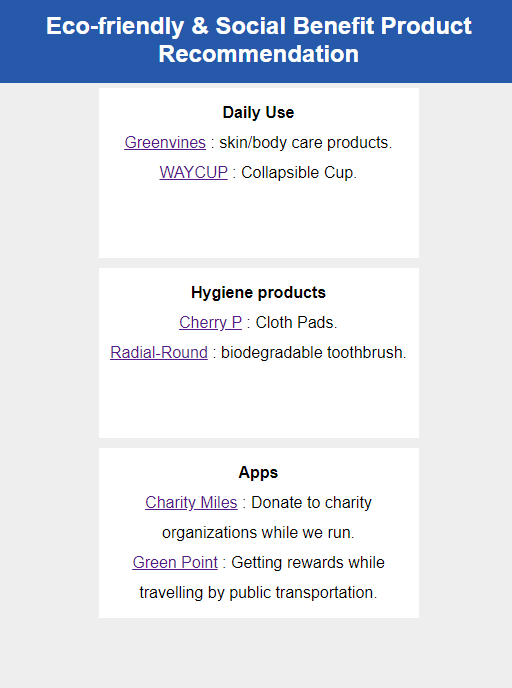
Adjust the design a bit
(also the final look of today’s practice)
- Center the box on the mobile design by
text-align:center. - Decrease the headline’s font-size by
.head{font-size:24px;}.
@media screen and (max-width:600px) {
    .head{font-size:24px;}
    .content{width:100%;text-align:center;}
}
Music of Today: It's Time by Imagine Dragons
Like/Share/Follow
If you guys find this article helpful, please kindly do the writer a favor — LIKE this article.
Feel free to comment and share your ideas below to learn together!
Day26 LINE BOT & NBA 战况查询
本次 Github 连结 我们在这个区块要完成的功能有: 查询今日战况 查询特定日期战况 网页观察 ...
Day 05:我不是资深工具人
前言 路人甲:资工在做什麽的? 路人乙:写程序、组装电脑之类的吧! 上述的对话大家多少应该听过,我们...
我朋友最近跟我阐述了一个惨痛的系统购买经验(一)
我朋友最近跟我阐述了一个惨痛的系统购买经验,我觉得很有价值,特以第一人称观点描述记录下来,本故事内容...
【Day 26】迁移学习(Transfer Learning)(上)
Transfer Learning的意思是,假设你现在有一些跟你的task没有直接相关的data,那...
【Day01】数据输入元件 - Button
参赛前言 第一次参赛是 2019铁人赛(连结),也是刚接触 React 不久,透过那次真的觉得收获良...