Material UI in React [Day5] Theme ( Spacing & Breakpoints & z-index)
今天会接续昨天的部分继续讲解 Theme 的 Spacing,这部分其实很简单各位可以透过这里直接引用官网的范例即可。
Spacing
自定义的话可以用以下几种方式:
- number
const theme = createTheme({
  spacing: 4,
});

theme.spacing(2) // = 4 * 2
- function
const theme = createTheme({
  spacing: factor => `${0.25 * factor}rem`,
});

theme.spacing(2); // = 0.25 * 2rem = 0.5rem = 8px
- array
const theme = createTheme({
  spacing: [0, 4, 8, 16, 32, 64],
});

theme.spacing(2); // = 8
theme.spacing() 最多可以接受4个参数,参数与 CSS 的规则一样,分别为上、右、下、左:
padding: theme.spacing(1, 2, 3, 4), // '8px 16px 24px 32px'
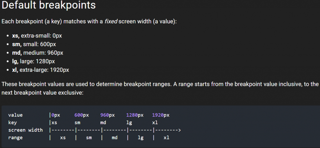
Breakpoints
这里和之前说明 Grid 时所提及的一样,透过官方文件能够更清楚的了解到他们各自的预设值与写入方式:
可以透过以下方式直接更改:
- theme.breakpoints.up(key)
- theme.breakpoints.down(key)
- theme.breakpoints.only(key)
- theme.breakpoints.between(start, end)
import React from 'react';
import { makeStyles } from '@material-ui/core/styles';
import Typography from '@material-ui/core/Typography';
import { green } from '@material-ui/core/colors';

const useStyles = makeStyles((theme) => ({
  root: {
    padding: theme.spacing(1),
    [theme.breakpoints.down('sm')]: {
      backgroundColor: theme.palette.secondary.main,
    },
    [theme.breakpoints.up('md')]: {
      backgroundColor: theme.palette.primary.main,
    },
    [theme.breakpoints.up('lg')]: {
      backgroundColor: green[500],
    },
  },
}));

export default function MediaQuery() {
  const classes = useStyles();
  return (
    <div className={classes.root}>
      <Typography>{'down(sm): red'}</Typography>
      <Typography>{'up(md): blue'}</Typography>
      <Typography>{'up(lg): green'}</Typography>
    </div>
  );
}
或是重新自订 theme 中的 breakpoints
- theme.breakpoints.values:预设为上面表格值,key是您的屏幕名称,值是该断点应开始的最小宽度。
- theme.breakpoints.unit:预设为 px,用於断点值的单位。
- theme.breakpoints.step:预设为 5 (0.05px),用於实现独占断点的增量。
// 下面是预设值
const theme = createTheme({
  breakpoints: {
    values: {
      xs: 0,
      sm: 600,
      md: 960,
      lg: 1280,
      xl: 1920,
    },
  },
})
也可以随意使用任意数量或任意数量的断点,以自己希望的任何方式命名它们。
const theme = createTheme({
  breakpoints: {
    values: {
      tablet: 640,
      laptop: 1024,
      desktop: 1280,
    },
  },
});
z-index
这部分官方文件提供一些default,修改方式也跟上述差别不大,也没有特别的 function 利用,所以我就不再赘述了。
那麽今天的讲解就先到这边,明天会将最後的 Globals 讲解完毕,并继续官网侧边栏的组件继续讲解
<<: Day 1 : Kotlin Multiplatform Mobile ,欢迎新的跨平台挑战者
Proxmox VE 客体机磁碟大小调整
在客体机刚建立的初期,也许我们会将磁碟的容量配置的少一些,若之後使用量增加後需要更大的磁碟空间,在...
写在VSCode Extension系列文之後 - 12th铁人赛颁奖典礼得奖致词
2021/08/02 大家好,我是韦恩。 新的一年的铁人赛又到了,在这个时候,回顾下上次比赛结尾时的...
Day 23 : 案例分享(7.2) 库存与制造 - 供应商直运、制造出货、采购出货(自动化库存调拨)
案例说明及适用场景 销售订单出货时,公司可以决定要走公司仓出库路线、或是由供应商直送(用於代销),或...
【SEO优化】12个问题会影响排名因素问题
有在操作SEO优化,总是许多seo行销公司在谈论排名因素。你知道,Google的神奇算法公式的秘密成...
[WMX3] 6.GetEngineStatus
主要功能为取得WMX3Engine目前的连线状态,常见的状态有: Idle : WMX3Engine...