【网页设计 入门 】如何使用 Bootstrap 与 Github Pages 制作 个人网站 ?
简单架设 x 不失质感
目录
- 源起 : 开发者网站
- 开发工具 : Adobe Brackets
- 基础的 html 与 css 语法
- Bootstrap 前端框架
- Github Pages 静态网页
源起 : 开发者网站
近期为了上架 iOS App ,建置了开发者网站
我的需求是 :
- 简单、不能太难看的网页设计
- 稳定、不能太花钱的服务器
所以我选择 bootstrap + github pages 方案 :
- bootstrap 前端框架 -> 满足了简单与美观的要求
- github pages 静态网页 -> 符合稳定甚至不花钱的服务

教程中,除了说明选用的原因与使用方法,还会简单介绍平时常用的开发工具,以及一些基础的 Html 与 CSS 语法 ;
目的是让零基础的初学者,除了会架设自己的个人网站,对於网页设计的技术也能有基础的概念。
开发工具 : Adobe Brackets
平时常用的前端开发工具是 Adobe 的 Brackets

最新消息
2021 的 9 月 1 日,Adobe 停止支援。(官方推荐 Visual Studio Code)

(不过,此工具是开源专案,有开源社群的维护与更新,应该还可以再使用一段时间。)
下载
官网上已经找不到下载点,必须到 GitHub 页面的 Releases 下载
- 官方网站 : http://brackets.io/
- GitHub : https://github.com/adobe/brackets
- Release : https://github.com/adobe/brackets/releases
扩充
其中一个选择 Brackets 因素,是因为很多的插件可以使用。
通常第一次启动会点击右侧下方第二个图示,开启「扩充功能管理员」:

已安装插件(参考):
- Custom Work
- Emmet
- Beautify
- Brackets Markdown Preview
- Brackets Icons
其中两个最重要的插件 : Custom Work 与 Emmet
Extension : Custom Work
改变工作区的布局,可以增强分页的功能与使用。
Extension : Emmet
前端开发的好用工具,在其他的网页开发工具中,应该都可以找的到这个扩充。(VSCode、Sublime)
工具的使用方法,就是透过语法的缩写 加上 Tab 按键,自动完成 html 的标签格式 :

Emmet 官方速查表 :

基础的 html 与 css 语法

- 在左侧的侧边栏,建立一个副档名为 html 的档案
- Emmet 操作 输入 html:5 加上 Tab 按键
- 自动产生的文字 就是 html 的标准样板
<!DOCTYPE html>
<html lang="en">
<head>
    <meta charset="UTF-8">
    <title>Document</title>
</head>
<body>

</body>
</html>
html 标准样板

(构成的基本元素是 xml 的标签,通常情况下会成对存在)
- DOCTYPE html : 标注声明档案用於 HTML5
- html 标签 : 描述整个网页
- head 标签 : 描述网页的各种配置
- 网页的编码 : UTF-8
- 网页的标题 : Document
- body 标签 : 网页的可视内容,也是开发者最常要编辑的地方
- head 标签 : 描述网页的各种配置
示范 : h1 + hr 元件
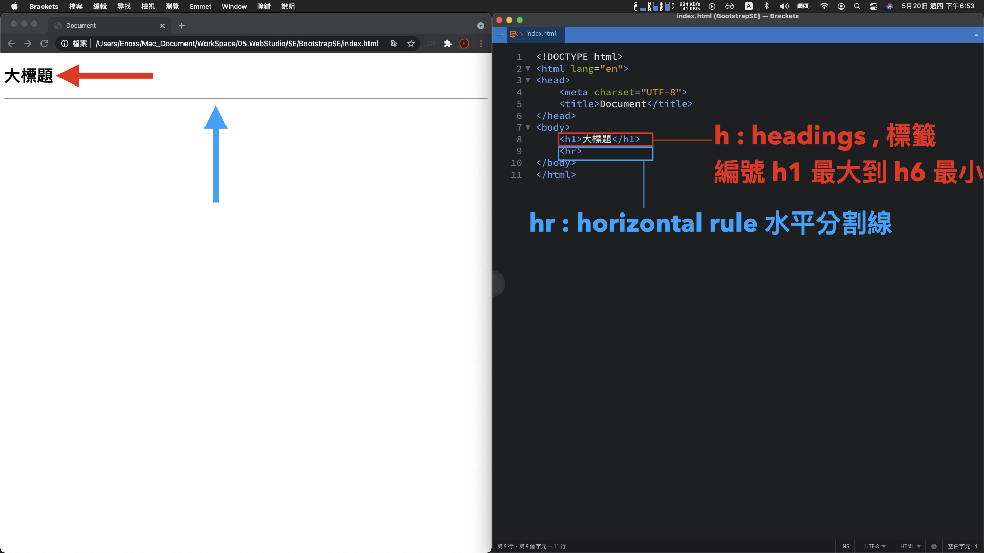
<h1>大标题</h1>
<hr>
h1 标签 : 大标题文字
- 标题 Headings , 编号从 h1 最大 到 h6 最小
hr 标签 : 水平分割线
- 缩写 horizontal rule , 水平分割线
示范 : 六种常见标签与符号

- a 标签
- button 标签
- img 标签
- table 标签
- ul 标签
- br 标签 与 nbsp 符号
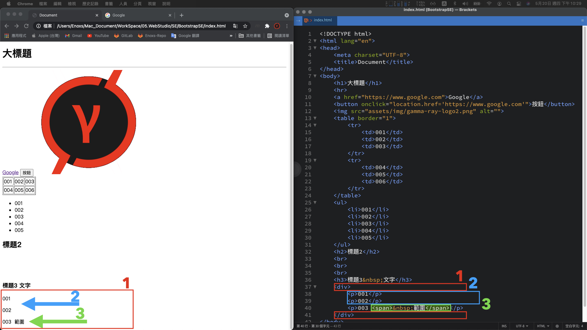
1. a 标签 : 网址连结
<a href="https://www.google.com">Google</a>
- a Anchor 锚点 -> 访问 google 搜寻的超连结页面
2. button 标签 : 按钮元件
<button onclick="location.href='https://www.google.com'">按钮</button>
- button 按钮
- onclick 点击事件
- location.href 访问 Google 网址
- 搭配 javascript 的程序语言一起使用
基本概念:
网页画面中任何可以互动或者动态改变的元素,
背後都有可能是使用 javascript 实作,包含待会介绍的 bootstrap。
3. img 标签 : 图片
<img src="assets/img/gamma-ray-logo2.png" alt="">
- image 图片 -> assets/img/图片.png
- src : 图片路径
4. table 标签 : 2 x 3 的表格
<table border="1">
    <tr>
        <td>001</td>
        <td>002</td>
        <td>003</td>
    </tr>
    <tr>
        <td>004</td>
        <td>005</td>
        <td>006</td>
    </tr>
</table>
- table 表格 -> table 、 tr 、 td 标签
- border : 边框属性
- 搭配 javascript 使用 ,呈现大量资料的数据
5. ul 标签 : 项目列表
<ul>
    <li>001</li>
    <li>002</li>
    <li>003</li>
    <li>004</li>
	<li>005</li>
</ul>
- ul Unordered List 无序列表 -> 搭配 li List 标签 一起使用
Bootstrap:
常会被用於向下展开的选单元件
6. br 标签 与 nbsp 符号 : 换行与空格
<h2>标题2</h2>
---
---
---
<h3>标题3 文字</h3>
- br break space 跳行标签 -> 间隔三行距离
- nbsp No-Break Space 不换行空格符号 -> 间隔一个空格
用途:
用在调整画面的布局,相比调整 css 的样式,会比较简单并且直觉。
示范 : 组织画面结构
- div 标签
- p 标签
- span 标签
1. div 标签 : 区块容器
<div></div>
- div division 区块 -> 存在多组并且区块内可以增加更多的小区块
用途 :
网页设计的布局排版,大部分会透过这个标签堆叠而来。(加上 css 样式 )
p 标签 : 段落容器
<p>001</p>
<p>002</p>
<p>003</p>
- p paragraph 段落文字 -> 三段已经换行的文字
用途:
一般的文字呈现,也通常会是使用这个标签
span 标签 : 范围容器
<p>003 <span> 范围</span></p>
- span 范围 -> 原本应该要换行的段落标签中,保持同一行并且区分两者。
用途:
当想要更细致的切分区块时,在标签内部使用 span 范围标签。
有了这三种切分画面的标签,就能够很好的组织画面结构,并且套用各自的 css 样式,开发者就可以更精准的描述画面应该要呈现的样子。
示范 : 套用 css 样式
1. 最简单方式
在标签中新增一个 style 属性,然後添加 css 的语法

<p style="color: white; background-color: black;">001</p>
黑底白字的段落元素:
- color: white; -> 白色文字
- background-color: black; -> 黑色背景
上述的这种方法,html 的标签 与 css 的语法 互相交缠在一起。
当 css 语法数量较多或者有大量的 html 标签套用 style 样式,程序码就不容易阅读。
2. 集中在 style 标签
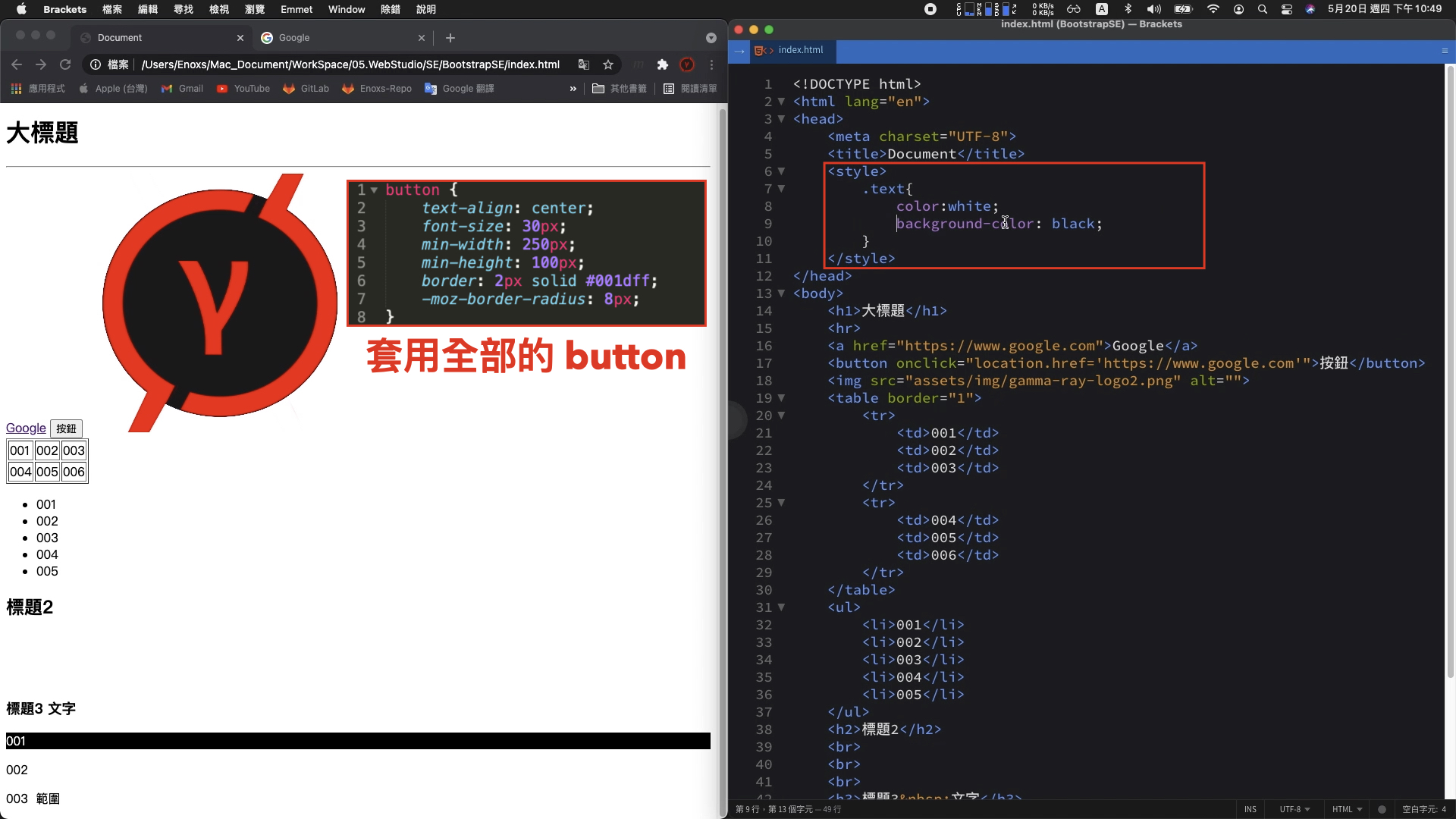
这边的 style 样式,可以独立出来全部集中在 head 内的 style 标签
<head>
	<style>
		<!-- 区分标签 : 名称加上左右大括号 -->
		button{
			text-align: center;
			font-size: 30px;
			min-width: 250px;
			min-height: 100px;
			border: 2px solid #001dff;
			-moz-border-radius: 8px;
		}
		.text {
    		color: white;
    		background-color: black;
		}
	</style>
</head>
<body>
	<p class="text">001</p>
</body>
- button : 套用页面全部的 button 元件
- (一般情况,一次性的套用全部标签是比较少见,更常见的做法会是使用 class 属性)
- .text : 套用 classs 属性为 text 的样式
3. 独立 css 档案
关於 html 标签 与 css 语法的搭配,进阶一点可以将两者分拆成独立档案

index.css :
.text {
    color: white;
    background-color: black;
}
使用这种方式,原本 html 的档案内就不需要使用 style 标签,只需要透过这个 link 标签,就可以 将 css 样式导入。
除了保持 html 档案内容的纯粹性,此方法也是 Bootstrap 前端框架主要的使用方式。
Bootstrap 前端框架
为什麽要选择 Bootstrap ?
回顾一下,当时对於这个官方网站的需求是 「简单、不能太难看的网页设计 」
简单的作法
最原始的做法,撰写好一个 html 包含 css 的网页後,上传服务器。
简单是简单,只不过如果没有 UI 设计师的支援光靠工程师自己的美感,就只会跟大学时期缴交的作业差不多。

如此情况,要独立的完成这项工作,只能选择现成的模板或者框架。
gitlab pages example
经过一番查找,发现 gitlab pages example 收录了许多现成、可以快速建置的网页模板。

- url : https://gitlab.com/pages
搜寻时常看到的关键字: hexo、hugo、Jekyll,成品看起来是都不错

只不过我发现这些模板各自使用 NodeJS、Go、Ruby 程序语言开发,安装时需要输入各种指令或者配置各种参数

对我而言,美感是有了但不够简单。
Wix 或 WordPress

这种用拖拉方式建立网站的方法,对於已经熟悉程序语言的工程师来说,反而会失去原本对网页细节调整的优势。
而且时间上整体的流程,从注册後各种参数的设置主题、外挂的选择以及最终外观细节的调整,我认为并不会比较短。
更何况熟悉网站的操作,本身也是需要一定的学习成本。

因此,纯粹的前端框架 Bootstrap 就是一个合乎需求的方案
这个方案的使用方式,就跟原始的做法一样,撰写完 html 的网页後直接丢上服务器。
而且对於原本就是为了上架 App 而制作的开发者网站,Bootstrap 还多了 RWD 响应式网页的优势,完成主体的页面建置後顺便就支援手机画面的浏览。

下载
Bootstrap 官网 : https://getbootstrap.com/

- Examples > Downloads Example
下载解压缩後,其中最重要的资料夹是 assets/dist/ 资料夹,这里面是包含 bootstrap 框架所有的 css 与 javascript 程序码。
复制整个 assets 资料夹到网站的专案路径,然後删除用不到的。只留下 bootstrap.bundle.min.js 与 bootstrap.min.css 这两个档案。

范例
比对 bootstrap-example 的资料夹以及 Bootstrap 网页的下载页面,两者名称互相对应

Album 专辑范例
网页呈现的画面 与 本地端 Album 资料夹 index 档案,开启的画面一样。

换句话说,bootstrap-example 资料夹的档案也是官方网站范例网页的原始档。
知道两者关系後,接下来就是要在范例中找到喜欢的布局,然後调整成想要的样子。
例如 Gamma Ray 软件工作室官方网站的三个页面
首页 & Jumbotron

100App+ & Album

Mark Account & Carousel

修改的细节
以 Jumbotron 范例的调整进行说明
比较画面:

- 顶部区块 : 导航栏切换不同的语系
- 中间区块 : 背景颜色为黑色,按钮的部份较大,还有连结的网站图示
- 底部区块 : 撰写了许多文字,呈现工作室的资讯
修改的第一步
将 Jumbotron 范例的 index 档案,复制到专案。
使用浏览器开启,渲染的结果可以发现虽然文字部分还是一样,但整体的布局样式已经跑板。

这是因为导入 css 样式的 link 标签,使用的是相对路径,将路径中上一层的位置删除,重新整理就会显示正常。
- <link href="../assets/dist/css/bootstrap.min.css" rel="stylesheet">
+ <link href="assets/dist/css/bootstrap.min.css" rel="stylesheet">
Jumbotron 范例的 html 文字结构 :
<!doctype html>
<html lang="en">
  <head>
    <!-- something ... -->
    <title>Jumbotron example · Bootstrap v5.0</title>
    <!-- Bootstrap core CSS -->
	<link href="assets/dist/css/bootstrap.min.css" rel="stylesheet">
    <style>
      <!-- something ... -->
    </style>
  </head>
  <body>
<main>
  <div class="container py-4">
    <header class="pb-3 mb-4 border-bottom">
      <!-- something ... -->
    </header>

    <!-- something ... -->

    <footer class="pt-3 mt-4 text-muted border-top">
      © 2021
    </footer>
  </div>
</main>
  </body>
</html>
有了之前的 html 与 css 语法说明,应该能够理解 head 标签 style 标签 与 body 标签,各自具备什麽功能。
不过 在 body 的内容区块,之前尚未说明的,还有 main、header、footer 等标签区块。
这些并不是 bootstrap 自定义的格式,而是 html5 最新规格的语意标签
HTML 5 语意标签 :

<header> : 网页的标头,放置网站标题
<nav> : 网页的选单、导览。
<main> : 网页的主要内容。
<aside> : 网页的侧栏、附加内容。
<article> : 一篇文章内容。
<section> : 自订区块。
<footer> : 网页的页尾,放置联络方式、着作权宣告等等。
<mark> : 强调一小块内容。
<time> : 显示日期时间。

(参考来源 : https://training.pada-x.com/docs/article.jsp?key=html5-semantic-elements)
对应画面与程序码 :

<head>
	<!-- Bootstrap core CSS -->
	<link href="assets/dist/css/bootstrap.min.css" rel="stylesheet">
</head>
<body>
	<main>
	  <div class="container py-4">
	    <header class="pb-3 mb-4 border-bottom">
	      <a href="/" class="d-flex align-items-center text-dark text-decoration-none">
	        <svg xmlns="http://www.w3.org/2000/svg" width="40" height="32" class="me-2" viewBox="0 0 118 94" role="img"><title>Bootstrap</title><path fill-rule="evenodd" clip-rule="evenodd" d="M24.509 0c-6.733 0-11.715 5.893-11.492 12.284.214 6.14-.064 14.092-2.066 20.577C8.943 39.365 5.547 43.485 0 44.014v5.972c5.547.529 8.943 4.649 10.951 11.153 2.002 6.485 2.28 14.437 2.066 20.577C12.794 88.106 17.776 94 24.51 94H93.5c6.733 0 11.714-5.893 11.491-12.284-.214-6.14.064-14.092 2.066-20.577 2.009-6.504 5.396-10.624 10.943-11.153v-5.972c-5.547-.529-8.934-4.649-10.943-11.153-2.002-6.484-2.28-14.437-2.066-20.577C105.214 5.894 100.233 0 93.5 0H24.508zM80 57.863C80 66.663 73.436 72 62.543 72H44a2 2 0 01-2-2V24a2 2 0 012-2h18.437c9.083 0 15.044 4.92 15.044 12.474 0 5.302-4.01 10.049-9.119 10.88v.277C75.317 46.394 80 51.21 80 57.863zM60.521 28.34H49.948v14.934h8.905c6.884 0 10.68-2.772 10.68-7.727 0-4.643-3.264-7.207-9.012-7.207zM49.948 49.2v16.458H60.91c7.167 0 10.964-2.876 10.964-8.281 0-5.406-3.903-8.178-11.425-8.178H49.948z" fill="currentColor"></path></svg>
	        <span class="fs-4">Jumbotron example</span>
	      </a>
	    </header>

	    <div class="p-5 mb-4 bg-light rounded-3">
	      <div class="container-fluid py-5">
	        <h1 class="display-5 fw-bold">Custom jumbotron</h1>
	        <p class="col-md-8 fs-4">Using a series of utilities, you can create this jumbotron, just like the one in previous versions of Bootstrap. Check out the examples below for how you can remix and restyle it to your liking.</p>
	        <button class="btn btn-primary btn-lg" type="button">Example button</button>
	      </div>
	    </div>

	    <div class="row align-items-md-stretch">
	      <div class="col-md-6">
	        <div class="h-100 p-5 text-white bg-dark rounded-3">
	          <h2>Change the background</h2>
	          <p>Swap the background-color utility and add a `.text-*` color utility to mix up the jumbotron look. Then, mix and match with additional component themes and more.</p>
	          <button class="btn btn-outline-light" type="button">Example button</button>
	        </div>
	      </div>
	      <div class="col-md-6">
	        <div class="h-100 p-5 bg-light border rounded-3">
	          <h2>Add borders</h2>
	          <p>Or, keep it light and add a border for some added definition to the boundaries of your content. Be sure to look under the hood at the source HTML here as we've adjusted the alignment and sizing of both column's content for equal-height.</p>
	          <button class="btn btn-outline-secondary" type="button">Example button</button>
	        </div>
	      </div>
	    </div>

	    <footer class="pt-3 mt-4 text-muted border-top">
	      © 2021
	    </footer>
	  </div>
	</main>
</body>
- header 标头 : svg 标签的图片 与 span 标签的文字,组成一个 a 标签的超连结。
- main 主体 : 上下切分成两个 div 区块
- 上方 div : h1 标题、p 段落文字、button 按钮组合
- 下方 div : 两个左与右的区块,分别对应上与下的 div
- 左侧 div : h2 标题、p 段落文字、button 按钮
- 右侧 div : h2 标题、p 段落文字、button 按钮
- footer 页尾 : 版权符号加上 2021 的文字
每一标签中 class 属性套用 css 的样式,就是刚才 link 标签 bootstrap.min.css 档案中,已经定义好的样式内容。
上中下三个区块的调整,范例说明 bootstrap 几个重要概念
- 标头部分
- 中间主体
- 底部文字
标头部分
我需要的并不是一个纯粹的网站标题,而是一个可以切换多国语系的导航选单。
在 Examples 页面浏览,发现 Headers 范例部分由上方数下来第五个导航列看起来符合需求。

开启原始档案,有了刚才画面与程序码的对照经验,我们知道要寻找的内容是 header 标签。
不过这边 header 标签不只一个,所以除了用计数的方式寻找,也可以透过画面的文字定位。

<header class="p-3 mb-3 border-bottom">
    <div class="container">
      <div class="d-flex flex-wrap align-items-center justify-content-center justify-content-lg-start">
        <a href="/" class="d-flex align-items-center mb-2 mb-lg-0 text-dark text-decoration-none">
          <svg class="bi me-2" width="40" height="32" role="img" aria-label="Bootstrap"><use xlink:href="#bootstrap"/></svg>
        </a>

        <ul class="nav col-12 col-lg-auto me-lg-auto mb-2 justify-content-center mb-md-0">
          <li><a href="#" class="nav-link px-2 link-secondary">Overview</a></li>
          <li><a href="#" class="nav-link px-2 link-dark">Inventory</a></li>
          <li><a href="#" class="nav-link px-2 link-dark">Customers</a></li>
          <li><a href="#" class="nav-link px-2 link-dark">Products</a></li>
        </ul>

        <form class="col-12 col-lg-auto mb-3 mb-lg-0 me-lg-3">
          <input type="search" class="form-control" placeholder="Search..." aria-label="Search">
        </form>

        <div class="dropdown text-end">
          <a href="#" class="d-block link-dark text-decoration-none dropdown-toggle" id="dropdownUser1" data-bs-toggle="dropdown" aria-expanded="false">
            <img src="https://github.com/mdo.png" alt="mdo" width="32" height="32" class="rounded-circle">
          </a>
          <ul class="dropdown-menu text-small" aria-labelledby="dropdownUser1">
            <li><a class="dropdown-item" href="#">New project...</a></li>
            <li><a class="dropdown-item" href="#">Settings</a></li>
            <li><a class="dropdown-item" href="#">Profile</a></li>
            <li><hr class="dropdown-divider"></li>
            <li><a class="dropdown-item" href="#">Sign out</a></li>
          </ul>
        </div>
      </div>
    </div>
  </header>
找到目标的程序码後,复制贴到原本的 header 代码。
而为了避免导航列的样式有所遗漏,最好是将 navbar.css 与 link 标签也一并复制。

<head>
	<!-- Custom styles for this template -->
	<link href="headers.css" rel="stylesheet">
</head>
储存後,网页标头的导航列已经出现。不过仔细查看发现三个问题:

- 问题一 : ICON 图示的部分 没有出现
- 问题二 标头的导航列 没有贴合在顶部
- 问题三 点击最右侧的选单 画面没有回应
这边这三个问题的修正方法,也刚好分别代表三种除错思路。
问题一 : ICON 消失,因为范例中使用的是 svg 向量图示
原始的程序码,定义在 main 标签上方的 svg 标签里面
将 svg 标签删除後,改使用 img 标签,套用我们自己的 logo 图片,然後再顺便使用 span 标签 与 style 属性,添加标题名称
 <header class="pb-3 mb-4 border-bottom">
	<a href="/" class="d-flex align-items-center text-dark text-decoration-none">
-		<svg xmlns="http://www.w3.org/2000/svg" width="40" height="32" class="me-2" viewBox="0 0 118 94" role="img"><title>Bootstrap</title><path fill-rule="evenodd" clip-rule="evenodd" d="M24.509 0c-6.733 0-11.715 5.893-11.492 12.284.214 6.14-.064 14.092-2.066 20.577C8.943 39.365 5.547 43.485 0 44.014v5.972c5.547.529 8.943 4.649 10.951 11.153 2.002 6.485 2.28 14.437 2.066 20.577C12.794 88.106 17.776 94 24.51 94H93.5c6.733 0 11.714-5.893 11.491-12.284-.214-6.14.064-14.092 2.066-20.577 2.009-6.504 5.396-10.624 10.943-11.153v-5.972c-5.547-.529-8.934-4.649-10.943-11.153-2.002-6.484-2.28-14.437-2.066-20.577C105.214 5.894 100.233 0 93.5 0H24.508zM80 57.863C80 66.663 73.436 72 62.543 72H44a2 2 0 01-2-2V24a2 2 0 012-2h18.437c9.083 0 15.044 4.92 15.044 12.474 0 5.302-4.01 10.049-9.119 10.88v.277C75.317 46.394 80 51.21 80 57.863zM60.521 28.34H49.948v14.934h8.905c6.884 0 10.68-2.772 10.68-7.727 0-4.643-3.264-7.207-9.012-7.207zM49.948 49.2v16.458H60.91c7.167 0 10.964-2.876 10.964-8.281 0-5.406-3.903-8.178-11.425-8.178H49.948z" fill="currentColor"></path></svg>
-		<span class="fs-4">Jumbotron example</span>
+		<img src="assets/img/gamma-ray-logo2.png" alt="" width="36" height="36" class="me-2" viewBox="0 0 118 94">
+		<span class="fs-4" style="color: red;font-weight: bold;">Gamma Ray Studio</span>
	</a>
 </header>
重新整理後,图片与标题 就会出现

除错思路:
检查原始档案的顶部,看一下是不是有东西被遗漏,
有缺少的部分找东西替代或者用原始码补上。
问题二 : 功能列没有贴合顶部,因为 main 标签与 header 标签的位置顺序导致
此问题如果只在 header 的范例中,查看原始码是找不到原因的,因为所有的内容都在 main 标签里面。
另外一个更好的方案,观察同样有状态列的 Carousel 范例,他的 header 标签 是在 main 标签 的上方。

所以同样在程序码中 调整位置,重新整理後位置确实已经贴合在顶部。
 <body>
- <main>
    <header class="p-3 mb-3 border-bottom">
    <div class="container">
      <div class="d-flex flex-wrap align-items-center justify-content-center justify-content-lg-start">
        <a href="/" class="d-flex align-items-center mb-2 mb-lg-0 text-dark text-decoration-none">
          <img src="assets/img/gamma-ray-logo2.png" alt="" width="36" height="36" class="me-2" viewBox="0 0 118 94">
                    <span class="fs-4" style="color: red;font-weight: bold;">Gamma Ray Studio</span>
        </a>

        <ul class="nav col-12 col-lg-auto me-lg-auto mb-2 justify-content-center mb-md-0">
          <li><a href="#" class="nav-link px-2 link-secondary">Overview</a></li>
          <li><a href="#" class="nav-link px-2 link-dark">Inventory</a></li>
          <li><a href="#" class="nav-link px-2 link-dark">Customers</a></li>
          <li><a href="#" class="nav-link px-2 link-dark">Products</a></li>
        </ul>

        <form class="col-12 col-lg-auto mb-3 mb-lg-0 me-lg-3">
          <input type="search" class="form-control" placeholder="Search..." aria-label="Search">
        </form>

        <div class="dropdown text-end">
          <a href="#" class="d-block link-dark text-decoration-none dropdown-toggle" id="dropdownUser1" data-bs-toggle="dropdown" aria-expanded="false">
            <img src="https://github.com/mdo.png" alt="mdo" width="32" height="32" class="rounded-circle">
          </a>
          <ul class="dropdown-menu text-small" aria-labelledby="dropdownUser1">
            <li><a class="dropdown-item" href="#">New project...</a></li>
            <li><a class="dropdown-item" href="#">Settings</a></li>
            <li><a class="dropdown-item" href="#">Profile</a></li>
            <li><hr class="dropdown-divider"></li>
            <li><a class="dropdown-item" href="#">Sign out</a></li>
          </ul>
        </div>
      </div>
    </div>
  </header>
+ <main>
 </main>
 </body
除错思路:
原始的程序码,如果看不出问题时,直接去参照已经正确的完整范例,观察两者之间 有什麽不一样
然後调整、测试,你想要的结果,通常都会在这一过程中被尝试出来。
问题三 : 点击选单没有反应,因为 bootstrap 动态网页的程序码没有导入
缺少 header 范例底部的 script 标签
headers/index.html :
<!-- ... 略 ... -->
	<script src="../assets/dist/js/bootstrap.bundle.min.js"></script>
</body>
</html>
复制到程序码,相对路径的部分同样需要调整。
 <!-- ... 略 ... -->
+    <script src="assets/dist/js/bootstrap.bundle.min.js"></script>
-    <script src="../assets/dist/js/bootstrap.bundle.min.js"></script>
  </body>
 </html>
完成後,重新整理选单展开正常 :

此问题也是之前基本 html 语法 button 标签提过的动态网页概念,副档名为 .js 的档案就是 bootstrap 的 javascript 脚本。
之所以要放在最後面,是因为希望前面的 html 标签都加载完成後,才执行元件绑定的动作。
这样可以避免,因为时间差找不到画面元素,造成动画可能失效情况发生。
除错思路有二 :
1. 除了之前原始档案顶部的检查,最好也检查一下底部有没有遗漏
2. 如果跟画面互动有关的问题,大部分都会跟 javascript 的东西有关,可以查看是不是缺少了 script 的标签或者是 .js 的档案
以上三个问题的解决方法,也是三种最常见的排查方案 :
之後如果自己在调整网页问题时,先检查原始档案的头尾然後在比对其他范例,通常大部分的问题都会在这一过程中找到解决的方法。
中间主体

最基本的文字修改,有了之前画面与程序码的对应,应该可以知道 :
- 标题的部分 -> 修改 h1 与 h2 的标签内容
- 下方的文字 -> 修改 段落文字 p 的标签内容
除了文字的修改,还要再透过三个部分的调整,说明 Bootstrap 的使用方式与基本概念 :
调整一 : 将这三个区块都变成左下角黑底白字的样式

最快的方法,查看这一个区块,了解这个 div 的 class 属性都是使用了哪些样式
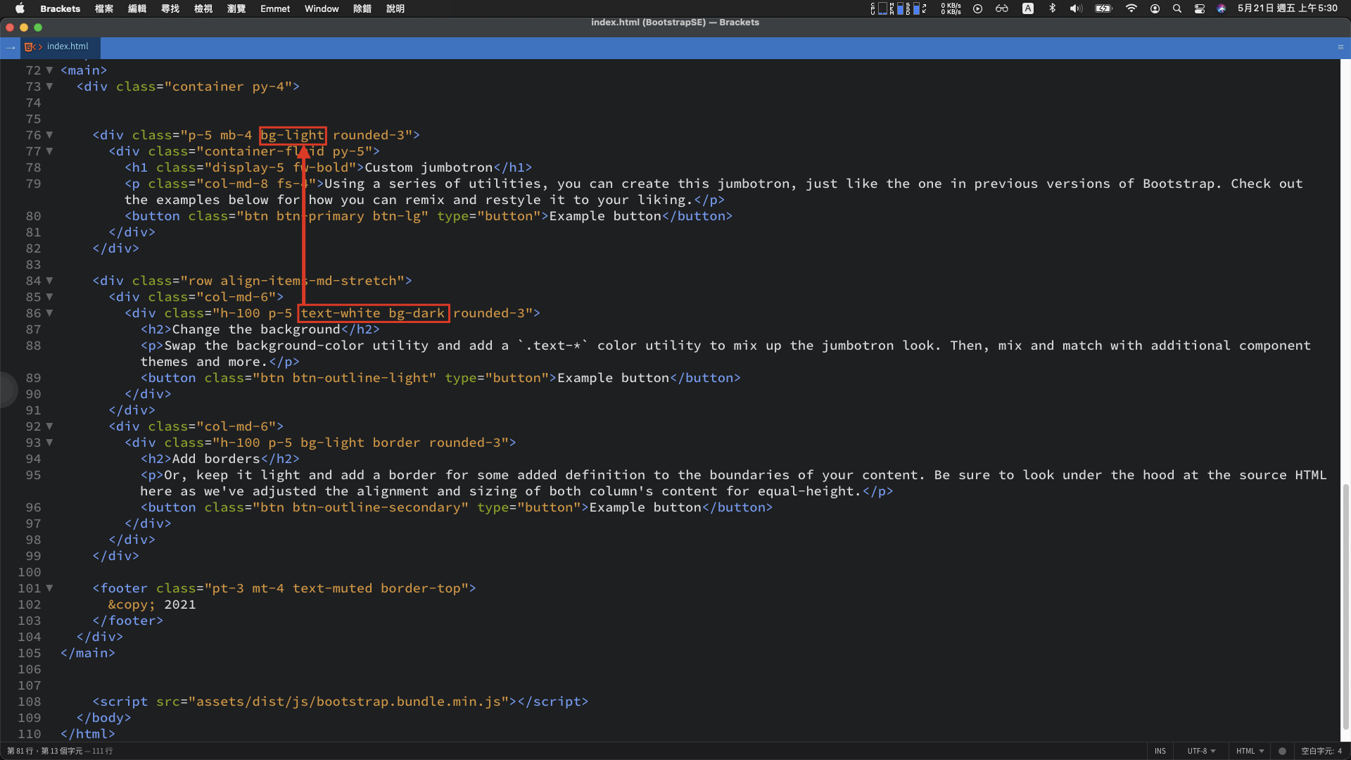
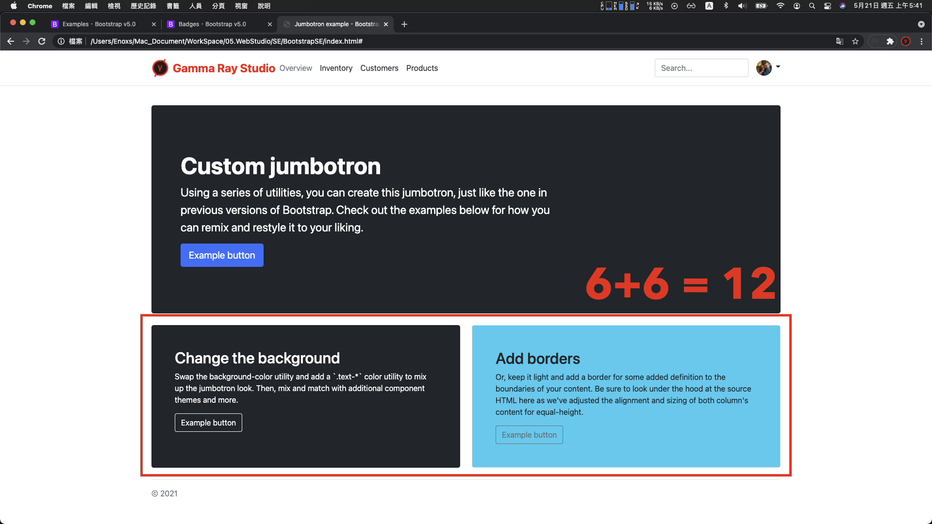
当中 text-white 与 bg-dark,明显的看得出就是黑底白字样式。将这两个名称复制後,替换第一个 div class 属性的 bg-light。
重新整理後,黑底白字的样式已经出现:

另外一种查找方法,可以使用官网中的 Docs 页签,搜寻 bg-dark 文字

有更多的样式可以替换

例如: 使用这个 bg-info、text-dark 右下角的 div 区块就变成蓝底黑字

调整二 : 下方的 div 区块宽度
当前范例中,观察单一的 div 区块的 class 样式是两个 col-md-6
<div class="col-md-6">
    <div class="h-100 p-5 text-white bg-dark rounded-3">
      <h2>Change the background</h2>
      <p>Swap the background-color utility and add a `.text-*` color utility to mix up the jumbotron look. Then, mix and match with additional component themes and more.</p>
      <button class="btn btn-outline-light" type="button">Example button</button>
    </div>
  </div>
  <div class="col-md-6">
    <div class="h-100 p-5 bg-light border rounded-3">
      <h2>Add borders</h2>
      <p>Or, keep it light and add a border for some added definition to the boundaries of your content. Be sure to look under the hood at the source HTML here as we've adjusted the alignment and sizing of both column's content for equal-height.</p>
      <button class="btn btn-outline-secondary" type="button">Example button</button>
    </div>
  </div>
</div>
数字是 6 + 6 = 12
复制一个 div,然後将 class 属性中的 col-md-6 全部改成 col-md-4,呈现的结果维持同一行

数字是 4 + 4 + 4 也等於 12
这个是 Bootstrap 中 构建 RWD 排版,重要的网格系统 (Grid System)
官网文件(Docs) > Layout > Grid 可以看到相关资讯。

(更多详细资料 -> Google 搜寻 : Bootstrap 网格系统)
网格系统简单来说是一种排版工具 :
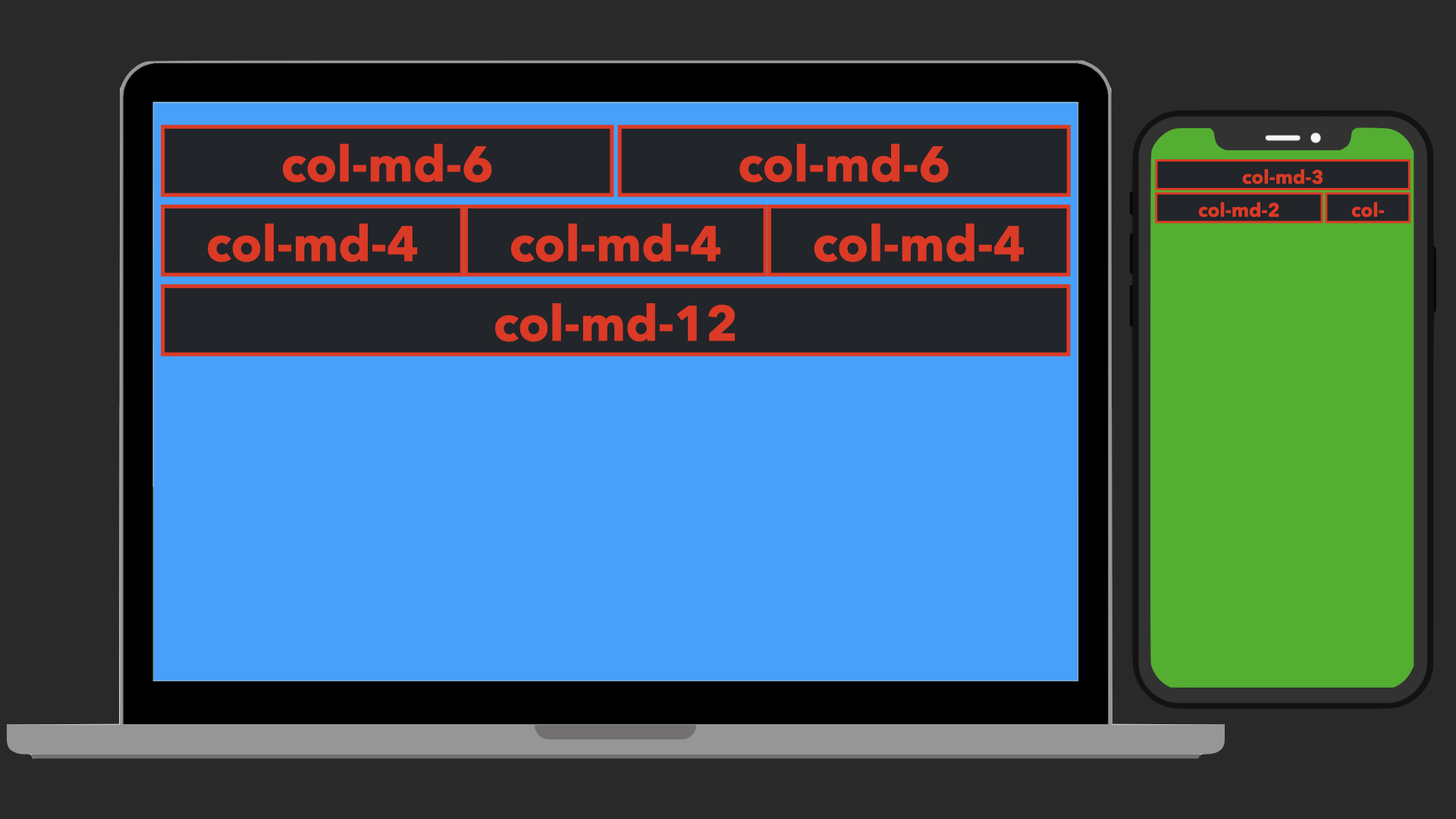
- 萤幕尺寸比较大的时候 : 一行最多会以 12 列为单位,超过就会换行
- 萤幕尺寸比较小的时候 : 画面会根据萤幕大小适当的调整宽度并且可能换行显示
当移动设备要访问这个网站时,就能够浏览到合适的布局。
这边如果想要查看不同装置的呈现效果:
- 按键 F12 开启控制台
- 点击控制台左上角第二个 device 图示
- 点击画面左上角选单,就可以使用不同装置的萤幕浏览网页。

调整三 : div 区块中的元件
官网文件 > Components > 各种元件的样式
查看 Button 元件,除了能够调整背景与文字颜色,还可以替换成仅有外框线的按钮。

程序码差异的部分,就是在 class 属性的样式。
所以如果要将按钮的尺寸加大,只要将 btn-lg 的样式,贴到 button 的 class 属性。
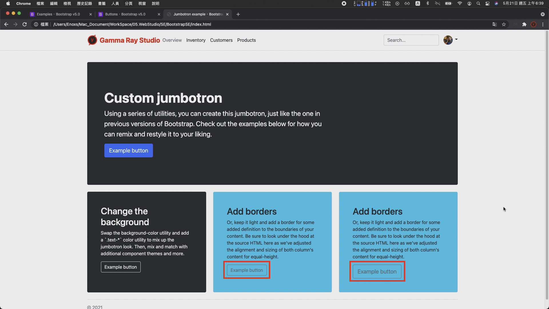
重新整理,就可以发现按钮的大小,已经比之前的格式又大了一些。
底部文字
经过前面两个部分的示范调整,应该已经知道如何透过 Examples 页面的范例与 Docs 页面的文件组合使用,完成网页建置的动作。
最後,调整的下方底部的这一大段资讯就是这两者的综合运用。
使用的范例是Blog 底部的文字 :

具体的流程 :
- 在范例中找到文字的 div 标签复制到专案档案
- 接着删除使用不到的文字内容以及右侧的侧边栏连结
- 将宽度从 col-md-8 调整成 col-md-12
如此,整体的画面布局就已经成形 :

当然距离最终的成品,还需要许多的试错与调整。不过有了上面三个部份的示范,应该已经克服最初的困难不在毫无头绪。
剩下的部分随着参照与调整的数量增加,自然而然就会知道使用哪些样式可以达成什麽样的效果,
而这一试错的过程,我认为也是网页设计初期学习的绝佳方案。
Github Pages 静态网页
GitHub 网页代管服务,仅能存放静态网页
为什麽选择使用 github pages?
我认为它具有三大优点 : 简单、免费、稳定
简单部分:
只要注册了 GitHub 帐号并且创建特定名称的专案,就可以立即使用。
剩下的操作的方法,跟一般的 git 操作一样。
免费的部分
GitHub Pages 的使用限制 :
- 容量大小 1 GB 以下
- 流量每个月不超过 100 GB
对於仅仅是要架设个人网站或者部落格,呈现相关资讯的需求相当够用。
稳定的部分
GitHub 是世界上最大的代码托管平台(开源社群)
并且於 2018 年 被微软收购,加上大公司的支持,服务器的稳定性更可以让人放心一些。
除了这三个好处以外,如果你刚好也是名软件工程师,我认为还有另外一个好处 :
顺便证明你会使用 git 版本控制以及理解版本控制的重要性。
这个好处对於刚入行的工程师比较重要,因为我认为在没有足够多的作品以及足够多的技能,可以证明自己的强悍程度时,
一个用 github pages 展示的作品集,可以说明很多事情。
对於履历内容的呈现或者面试时双方交流的内容,都能够起到一个不错的加分效果。

https://rhzenoxs.github.io/Tunffli-View/
注册
- GitHub 网站 : https://github.com/
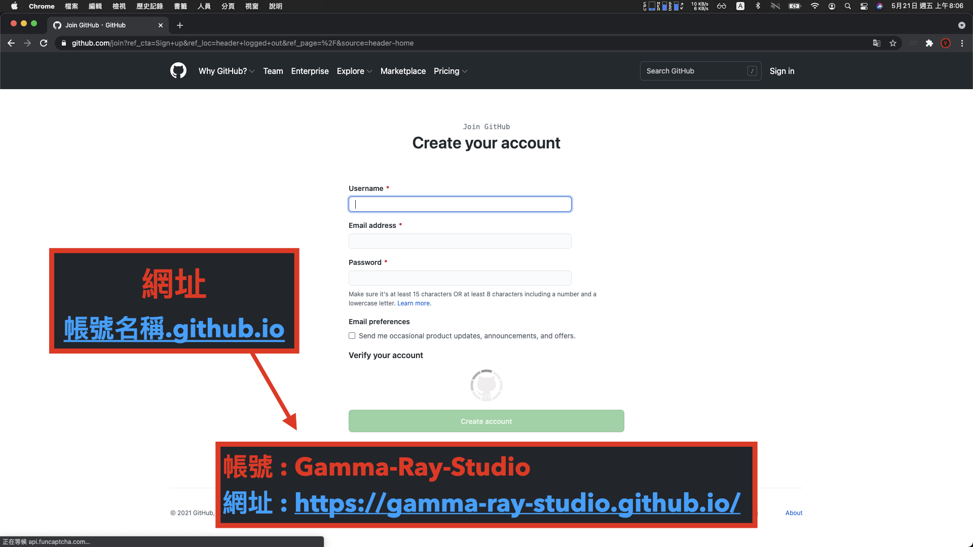
注意网站的网址会是帐号名称後方加上 .github.io,虽然还是可以使用 DNS 变更网域,但相对麻烦。
所以在创建帐号时就要想好网址要呈现的样子。
像我这个 Gamma Ray 的官方网站,帐号的名称就是 Gamma-Ray-Studio
所以他的网址就会变成 gamma-ray-studio.github.io
专案
注册完成後,下一步创建一个帐号名称加上 .github.io 的专案
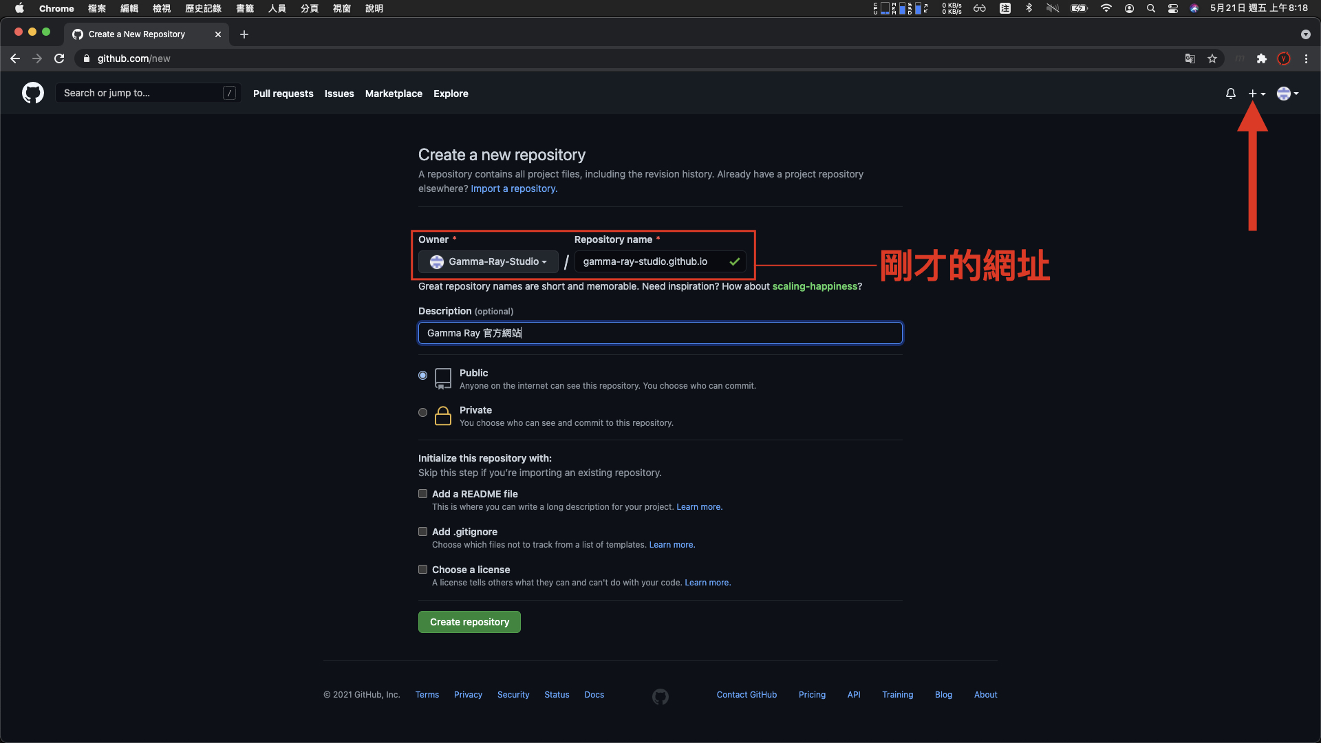
(以我这个 gamma-ray-studio 的帐号来说,也就是刚才的网址作为专案名称。)
上传
一般 git 专案提交与推送的方法
如果不太熟悉如何使用 git 工具可以参照下列的这几个 git 笔记的影片,有更深入说明 :
- 【git 基础教程 #1】什麽是 git ? | Sourcetree 介绍 与 入门基础操作教学
- 【git 基础教程 #2】如何开始多人协作 ? | 5 项 git 操作教学
- 【git 基础教程 #3】如何追踪历史纪录? | 如何重置提交讯息? | 版本追踪进阶操作
- 【什麽是 git flow ?】 5 项分支全详解 | Sourcetree 实战演练
- 【git 提交讯息格式】如何描述提交资讯 ? | 9 种标头型态 | 结构说明
这边直接以 Sourcetree 工具进行示范
- sourcetree : https://www.sourcetreeapp.com/
点击 New > Clone from URL > 填入 git 网址 > 选择本地端的路径 > clone

克隆完成後,是一个空的专案,这时候就可以将之前已经完成的网页档案,放入到专案内,然後提交、推送

完成後重新整理,可以看见专案的内容已经更新

稍微等待一下,访问 github pages 网址,就可以看见个人网站已经完成架设。

- Github Pages - Gamma Ray Studio : https://gamma-ray-studio.github.io/zh-cht/index.html
参考资料
- Adboe Brackets : http://brackets.io/
- Bootstrap 官网 : https://getbootstrap.com/
- HTML5 语意标签 : https://training.pada-x.com/docs/article.jsp?key=html5-semantic-elements
<<: 工程师养成日记:从自学到进入职场,非本科系也能写扣领薪水!
[访谈] APCS x 特殊选才 Andy Chen
在接下来的铁人文中会陆续访问来自不同接触过 APCS 的人。除了准备过 APCS 的同学外,期望也可...
[进阶指南] 严格模式( Day29 )
我们可以在开发环境中使用 <React.StrictMode>进入严格模式 严格模式帮...
[Day14] 传值或传址(上)
JavsScript 的资料型别分成两大类,第一类是基本型别,第二类是物件型别,型别的介绍可以参考前...
CMoney菁英软件工程师战斗营前端课程_Week 11
Hi 本周已开始分领域课程 第一堂课不外乎就是介绍基本HTML语法 每周四都会有个小演习 这次题目是...
【Day 6_ Arm的开发者友善工具组Arm Mobile Studio】
前几篇文章中提到Arm除了推出许多专为优化游戏体验而生的解决方案外,也致力於协助游戏开发者在制作游戏...