Day 5 (CSS)
1.好用icons
font Awesome 4.7(後面版本要钱)
https://fontawesome.com/v4.7/icons/
进去後会问要不要去新版>>不要
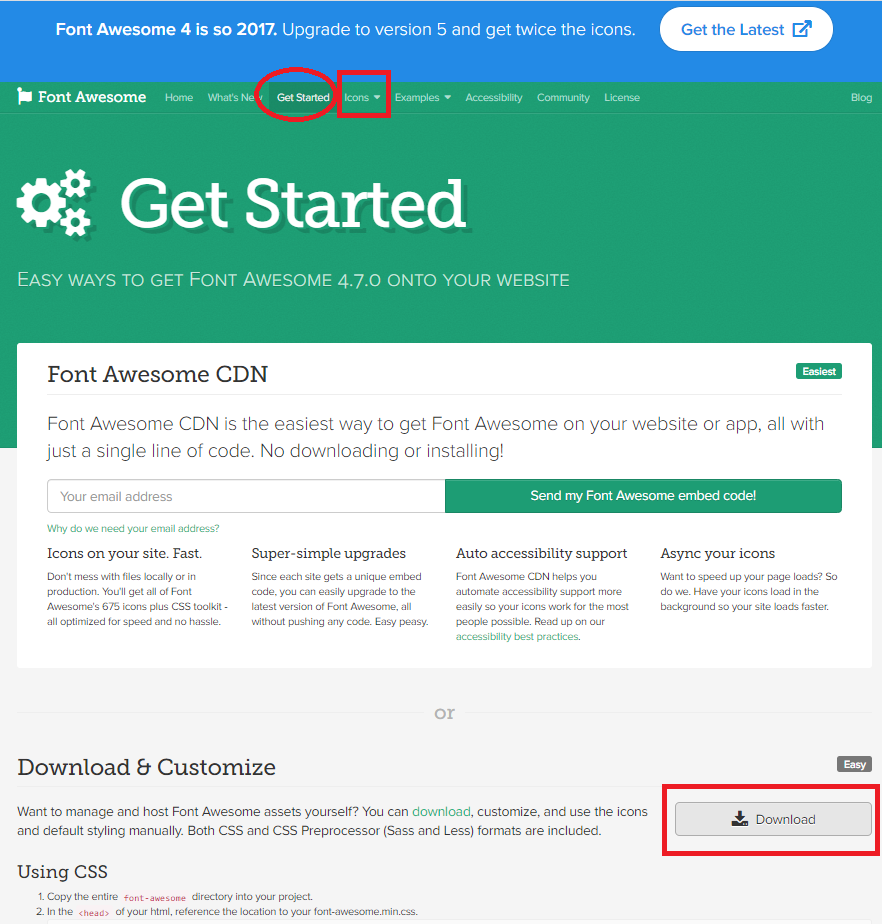
Get Started > Download4
解压缩到要用的资料夹,会有.css(font-awesome.css)
(要记得整包一起放,function在里面)
如何使用该资料库?
回到https://fontawesome.com/v4.7/icons/
icons>>用寻找
1.找要的功能
2.贴上 https://fontawesome.com/v4.7/icon/address-book
3.link.css(font-awesome.min.css是压缩档,不要使用)
<head>
    <link rel="stylesheet" href="css/font-awesome.css">
</head>
<body>
<i class="fa fa-address-book" aria-hidden="true"></i>
</body>
2.好用的颜色选择网站
https://coolors.co/efbc9b-ee92c2-9d6a89-725d68-a8b4a5
- 按空白键换色
- 点相机可以放照片进去寻找颜色
3.网页预设距离?(左上角落)
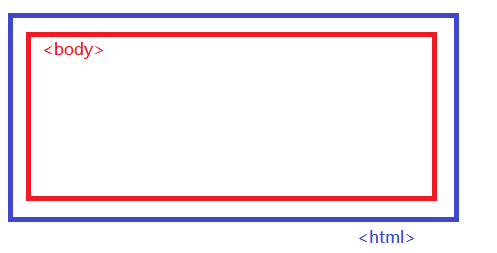
(1)html padding内 (x)
(2)body margin外 (v)
4.全站预设增加box-sizing: border-box,使版面更好计算
box-sizing: border-box
=> width设定好,box-sizing会去符合 (width不变)
因预设 * {box-sizing: border-box;}
故随着 width: 500px; 改变
      * {
        margin: 0;
        padding: 0;
        box-sizing: border-box;
      }

      div {
        background-color: aqua;
        width: 500px;
      }
5.margin数值如果相对应
title:我跟你100公尺!
content:我跟你也100公尺!
- 距离会互相"吃到"显示100而未显示200
- 若数值不同,以数值大为主
档案(padding-margin)
      #title {
        margin-bottom: 100px;
      }
      #content {
        margin-top: 100px;
      }

      <body>
        <div id="title">方框1</div>
        <div id="content">方框2</div>
      </body>
6.如果没有任何padding或marging设定时
.d2{margin-top: 50px;} => 不知原因,会同时把大家拉下去!
    .d1 {
    width: 50%;
    height: 200px;
    background-color: aqua;
  }
  .d2 {
    width: 50%;
    height: 100px;
    background-color: rgb(174, 0, 255);
    /* 没有其他设定就会全部一起往下拉 */
    margin-top: 50px;
  }
  .d3 {
    width: 50%;
    height: 100px;
    background-color: rgb(255, 0, 0);
  }

<body>
  <div class="d1">
    <div class="d2"></div>
    <div class="d3"></div>
  </div>
</body>
- 解决方法1:让他们都有被设定到
   .d1 {
      padding-top: 1px;
    }
    .d2 {
      margin-top: 49px;
    }
- 解决方法2:d1设一个边框
    .d1 {
      border: 1px solid red;
    }
    .d2 {
      margin-top: 50px;
    }
- 解决方法3:display: inline-block;
      .box > div {
        width: 100px;
        height: 100px;
        background-color: royalblue;
        /* 方法3.*/
        display: inline-block;
      }
7.因为div预设display: block;
https://www.w3schools.com/tags/tag_div.asp
此div区块会占满"横的区块",虽然可以使用语法让他显示方式不同(眼睛能看到的)
故会自动换行(档案20-original)
使其同一行 解决:
 <div class="demo">
      <div id="reddiv_B" style="display: inline-block">Red</div>
      <div id="greendiv_B" style="display: inline-block">Green</div>
      <div id="bluediv_B" style="display: inline-block">Blue</div>
    </div>
8.display:每一个HTML元素都有一个预设的display值
- < div > => display: block(元素的宽度预设会撑到最大[padding 0 margin 0]无缝隙)
- display: inline-block
- display: inline
- display: none
- display: grid
- display: flex
display:none和visibility:hidden的差别
https://dotblogs.com.tw/kirkchen/2009/12/22/12603
- visibility: visible
- visibility: hidden
9.框架
-
table => html标签
tr td th -
grid => css 样式
row 列(横) col 栏(直)
10.flex 拿来排版好用,优点:
- 弹性排版
- 随意控制方向(横、直、顺、逆向)
- 对齐很简单(尤其是垂直置中)
- 三大特性
=>flex-grow延伸比 flex-shrink收缩比 flex-basic基本比(RWD-响应式网页好用) - 自动帮你算尺寸(可以不换行压缩)
11.flex方向判断
(1)不要看成x.y轴
=> 是row column ,因为主轴会换
(2)主轴的设定
=> flex-direction:
(3)flex-basis: 200px;
=> 非高or宽度,此为主轴长度
12.文字置中
方法1.height=line-height
    .box {
      height: 100px;
      line-height: 100px;
      text-align: center;
    }
方法2.
        display: flex;
        /* 主轴置中 */
        justify-content: center;
        /* 单行置中 */
        align-items:center ;
13.flex
display: flex(父)
有缩写 https://www.w3schools.com/cssref/css3_pr_flex.asp
flex-grow 延伸比
flex-shrink 收缩比
flex-basis 基本比
flex-grow:(子) => 比例
flex-shrink:(子) => 压缩:0缩放不压缩,1为压缩(预设)
flex-basis:(子) => 主轴长度(row or column)
flex-direction: row-reverse(父); => 主轴方向:row reverse反向
flex-direction: column(父); => 主轴方向:column
- → row
- ← row reverse
- ↓ column (预设)
- ↑ column reverse
(主轴)
justify-content:控制"主轴"的对齐 (父)
center => 照主轴置中
space-evenly => 分散
space-around => 分散
space-between => 贴两边分散
flex-start; => 主轴开始
flex-end; => 主轴结束
(次轴)
align-items:控制"次轴"的对齐(父)=>同前
align-self控制次轴的对齐(子)
align-self: center;
align-items(父) => 只针对单子物件的对齐
align-content(父) => 针对多行子元素的对齐
比较:
align-content(父)=>全部置中
align-self(子)=>其一下去
align-items(父)=>一个一个置中,会换行
-
flex-wrap: wrap;(父) => 换行而不挤压
-
全部置中
      /* 次轴对齐 */
      align-items: center;
      /* 主轴对其 */
      justify-content: center;
14. grid => CSS样式(表格)
-
display: grid;(父)
-
grid-template-columns: 1fr 2fr 3fr;
-
grid-template-columns: repeat(3, 1fr);
-
grid-template-areas:""
    .grid-container
      {
        display: grid;
        padding: 10px;
        gap: 10px;
        grid-template-areas:
        /* 以下为表格样式 */
        "MyHeader MyHeader MyHeader"
        "AD . ."
        "AD . ."
        ". . .";
      }
      div.item1 {
        background-color: orange;
        /* 命名 */
        grid-area: MyHeader;
      }

      div.item2 {
        background-color: paleturquoise;
        /* 命名 */
        grid-area: AD;
      }

    <div class="grid-container">
      <div class="item1">1</div>
      <div class="item2">2</div>
      <div>3</div>
      <div>4</div>
      <div>5</div>
      <div>6</div>
    </div>
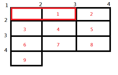
- grid-column
=>功能:似table的rowspean
      .grid-container > div:nth-of-type(1)
      {
        grid-column-start: 1;
        grid-column-end: 3;
        /* 缩写 */
        grid-column: 1/3;
      }
<<: 快速了解 Tailwind CSS 的 JIT 模式
大共享时代系列_009_共享农场
有没有想过除了从菜市场、超级市场买菜以外,试着跟人在离家不远的农场,共享农作、畜牧来获取需求的天然的...
我的CMS实战心路历程 - 章序
章序 嘿!各位线上的朋友们,大家是否有定期阅读的习惯呢,这次刚好藉着跟随iThome铁人赛30天文章...
[ Day 20 ] - AJAX
AJAX 是什麽? AJAX 全名是 Asynchronous JavaScript And XML...
C#入门之文本处理(下)
前面我们将了,如果通过 C# 从文本中获取内容,并进行一些简单的处理。今天我们来看看,怎么将获取的内...
新手学习JavaScript:day29 - Todolist(2)
嗨!大家好,昨天我们做了新增以及划掉的功能,今天让我们来完成删除跟切换标签,最後让完成的任务进入到完...