网页动起来-30天学会HTML+CSS,制作精美网站
在设计网页时通常会加一些动画特效,吸引使用者的目光及添加与使用者的互动性。
过去制作动画时以Flash为主,CSS3也可以建立动画,不再只能用JavaScript或jQuery 才做得到了
transition 渐变
transition-duration渐变效果时间
- time:可以设定秒(s)或毫秒(ms),如果有多个属性要分开执行,要用逗号隔开
transition-property渐变效果属性
transition-property: none|all|property;
- none:不会产生渐变效果
- all:所有属性会有渐变效果
- property:设定有渐变效果的名称,有多个属性用逗号隔开
<h1>test</h1>
h1{
	height:100px;
	background-color:yellow;
	transition-property:color,background,height;
	transition-duration:3s;
}
h1:hover{
	color:red;
	background-color:green;
	height:300px
}
transition-delay渐变时间延迟
transition-delay: time;
- time:设定延迟时间,单位可以是秒(s)或毫秒(ms),
transition-timing-function渐变速度
transition-timing-function: value;
- ease:预设值,低速开始,加快,结束减速
- ease-in:低速开始
- ease-out:低速结束
- ease-in-out:低速开始,低速结束
- linear:均速
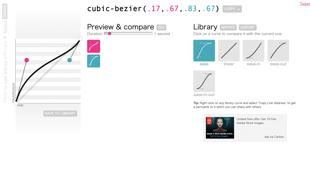
- cubic-bezier(x1,y1,x2,y2):利用贝兹曲线自定义速度模式
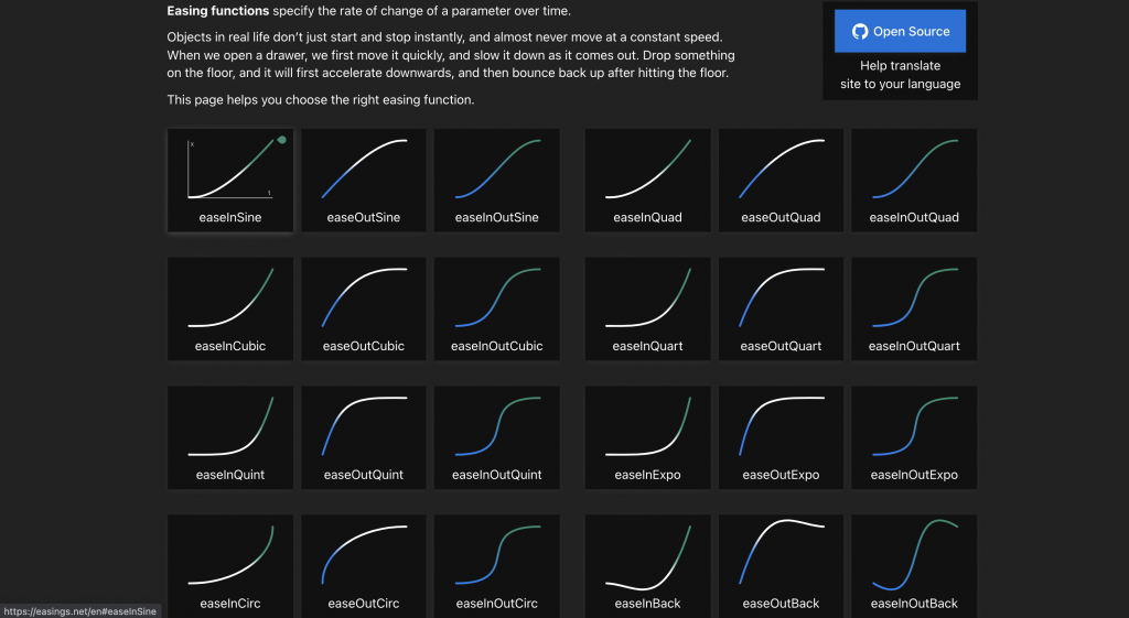
以下推荐两个设定cubic-bezier不错的网站给大家参考
-
自订曲线:建立曲线,创造动画不同的执行速度
-
Easing Functions:这网站列出很多已经建好的函式形式,可以直接套用
transition简易写法
顺序为:
transition: property duration timing-function delay | initial | inherit
.box{
	width:100px;
	height:100px;
	background:blue;
	transition:width,height 3s;
	-moz-transition:width,height 3s; /* Firefox 4 */
	-webkit-transition:width,height 3s; /* Safari and Chrome */
	-o-transition:width,height 3s; /* Opera */
}
.box:hover{
	width:400px;
	height:300px;
}
animation 动画
使用时要再加上前缀,让属性在每个浏览器能够支援
-moz-     /* firefox浏览器 */
-webkit-  /* Safari, google浏览器 */
-o-       /* Opera浏览器(早期) */
-ms-      /* Internet Explorer  */
animation-name 动画名称
animation-name是设定@keyframes动画名称
animation-name: keyframe动画名称
要与animation-duration属性搭配,不然动画不会执行
animation-duration 动画时间
animation-duration: time;
- time:完成动画所需完成时间。可以设定秒(s)或毫秒(ms),如果有多个属性要分开执行,要用逗号隔开
animation-direction 动画方向
animation-direction: normal|alternate;
- normal:预设
- reverse:反向
- alternate:正向,再反向(奇数正常播放,偶数反向播放)
- alternate-reverse:反向,再正向
animation-delay 动画延迟时间
animation-delay: time;
- time:可以设定秒(s)或毫秒(ms)
animation-duration 和 animation-delay前者是动画持续时间,後者为动画延迟时间
animation-timing-function
动画的速度曲线
animation-timing-function: value
- ease:预设值,低速开始,加快,结束减速
- ease-in:低速开始
- ease-out:低速结束
- ease-in-out:低速开始,低速结束
- linear:均速
- cubic-bezier(x1,y1,x2,y2):利用贝兹曲线自定义速度模式
animation-iteration-count动画次数
animation-iteration-count: number |infinite
number:播放次数,预设是1,0的不会执行
inifinite:无限次数执行
animation-play-state 动画执行或暂停
animation-play-state: paused|running
- running:预设,动画是执行状态
- paused:动画暂停
animation-fill-mode动画延迟与完成
- none:预设,无样式
- forwards:动画完成後,保持最後关键影格样式
- backwards:动画在延迟时,保持最初动画关键影格
- both:遵照forwards及backwards,动画在延迟时,保持最初动画关键影格样式。动画完成後,保持最後动画关键影格样式
animation简易法
顺序为:
animation: name duration timing-function delay iteration-count direction;
<div class="box"></div>
.box{
	width:100px;
	height:100px;
	background:orange;
	position:relative;
	animation:mymove 5s infinite;
	-webkit-animation:moveBox 5s infinite; /*Safari and Chrome*/
}

@keyframes movebox{
	from {left:0px;}
	to {left:200px;}
}
 /*Safari and Chrome*/
@-webkit-keyframes movebox{
	from {left:0px;}
	to {left:200px;}
}
@keyframes 关键影格
@keyframes animationname {
	keyframes-selector {
		css-styles;
	}
}
- animationname:影格名称
- keyframes-selector:可以使用百分比(0%-100%)、from-to(from与0%相同、to与100%相同)
- css-styles:CSS属性
搭配frome-to来做动画设定
.box{
	position:relative;
	animation:moveBox 5s infinite;
}
@keyframes moveBox{
	from {top:0px;}
	to {top:200px;}
}
搭配百分比来做动画设定
.box{
	position:relative;
	animation:moveBox 5s infinite;
}
@keyframes moveBox{
	0% {background: red;}
  50% {background: green;}
  100% {background: blue;}
}
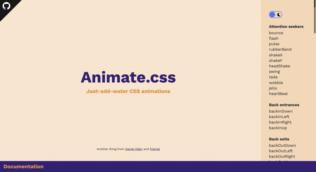
CSS动画特效库
除了自己写动画,网路上也有CSS 的动画特效库
Animation.css
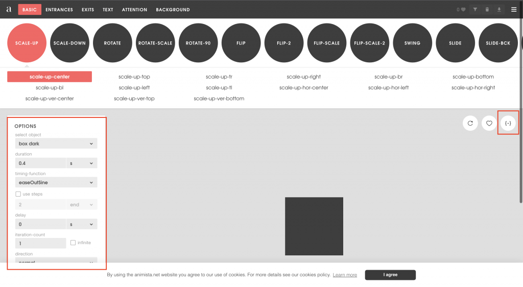
需要引入css档案,安装方式有两种
方法一:CDN方式
<link href="https://cdnjs.cloudflare.com/ajax/libs/animate.css/4.1.1/animate.min.css" />
方法二:npm或yarn
npm
npm install animate.css --save
yarn
yarn add animate.css
下载完後再import
import "animate.css"
只要在标签元素添加class名称animate__animated以及任一动画名称如 animate__bounce(记得前缀 animate__!)就会有效果了
<h1 class="animate__animated animate__bounce">An animated element</h1>
里面提供数十种的淡入、淡出、旋转等效果,不需要额外引入JS,只要选好自己的样式後,点选右上角的 {‧} 按钮,检视原始码,把他复制到你的档案里面了
结论
介绍了渐变与动画,你一定会问他们两者之间有什麽差别,transition是需要被触发才会执行,像是滑鼠移入(hover)效果,animation则是直接就执行。。
<<: Day26 跟着官方文件学习Laravel-Service Provider
Day 18:AWS是什麽?30天从动漫/影视作品看AWS服务应用 -《新世纪福音战士》
身为机人控,《新世纪福音战士》真的是爱作XD虽然可能有人看不太懂,或是被结尾粪作气到。但作为机器人动...
Day 26.
更新: Bug解掉了,在第28天 今天真的没办法思考.. 还没抓到昨天的错误是为什麽,然後接下来的学...
Python - 费式数列之呼吸
费式数列 (引用至维基面科) 斐波那契数列(义大利语:Successione di Fibonacc...
Day 24:作品集
前言 这个市场想要找工作的准工程师非常多,我们要证明自己除了学科(考题、技术问答)以外,更重要的是证...
[DAY 16] _Si7020温湿度读写
今天来说说温湿度读取的部分吧,首先来看看这颗的Datasheet: https://www.sila...