DAY16-Style Components

前言:
今天我们要来介绍React里很强大的一个工具!没错就是Style Components!废话不多说,我们直接开始吧!
这是什麽鬼东东:
Style Components其实是一个满新的东西,主要功能是结合的JS和CSS,也就是所谓的CSS in JS,而当这个功能和React中的自定义组件一起使用时,效率就快很多了。
今天阿森会先介绍怎麽安装这个插件,而介绍一个就相当於介绍完React中新增插件的方法了,因为大多都大同小异。
再来我会举昨天HeroSection的内容作为例子,介绍自定义组件如何和Style Components一起合作。
安装插件:
当你今天要安装任何一个插件时,所需要的步骤都一样,就是→google他→找到npm doc→找到npm install或yarn add的code→到你的terminal贴上。
就是这麽简单!
所以我们先搜寻Style Components npm:
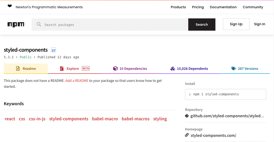
会找到这个网站,这时候右边install的指令就是我们的目标的,把他复制起来贴在你react workspace资料夹的terminal:

按下enter後就会自动安装了,要确定是否安装或是版本可以打开前面提到的package.json做确认。

这样你就完成插件的安装了!
怎麽用出你的Style:
接下来我举昨天提到过的例子,我们再打开一次HeroSection资料夹中的index.js:
import React, { useState } from 'react'
	import {HeroContainer,
					HeroBg,
				  HeroContent,
					HeroH2,
					HeroH2Wrapper
} from './HeroElements'

const HeroSection = () => {
const [hover, setHover] = useState(false)
const onHover = () => {
    setHover(!hover)
}

    return (
        <HeroContainer >
            <HeroBg />
            <HeroContent>
                <HeroH2Wrapper>
                <HeroH2>Hi</HeroH2>
                <HeroH2>I'm Sen Chao!</HeroH2>
                <HeroH2>Nice to meet</HeroH2>
                <HeroH2>you!</HeroH2>
                </HeroH2Wrapper>
            </HeroContent>
        </HeroContainer>
    )
}

export default HeroSection
在React中,大写开头的tag就是你自定义的tag,所以我们这里有:
HeroContent, HeroH2, HeroH2Wrapper, HeroContainer, HeroBg这几个Tag。
但这时候React其实是读不懂的,他预设的Tag只有像是div, img, ul等,所以我们可以用Style Components来做设定,而通常我们会再创一个叫做Elements的js档,这里就是HeroElements.js。
import styled from "styled-components";
import meblur from '../../images/bandblur.jpg'

export const HeroContainer = styled.div`
    display: flex;
    justify-content: center;
    align-items: center;
    padding: 0 30px;
    height: 950px;
    position: relative;
    z-index: 1;
    background-size: cover;
    width: 100%;
    background-image: url(${meblur});
    background-size: cover;
    background-position: center;

    &:before{
        content: '';
        position: absolute;
        top: 0;
        left: 0;
        right: 0;
        bottom: 0;
        background: linear-gradient(120deg, #ee7752, #23d5ab);
        background-size: 400% 400%;
        animation: change 10s ease-in-out infinite;
        opacity: 0.4;
        z-index: 2;
    }

    @keyframes change{
        0%{

    background-position: 0 50%;

    }

    50%{

    background-position: 100% 50%;
    }

    100%{

    background-position: 0 50%;

    }
    }
`

export const HeroBg = styled.div`
    position: absolute;
    top: 0;
    right: 0;
    bottom: 0;
    left: 0;
    width: 100%;
    height: 100%;
    overflow: hidden;
    background: linear-gradient(-45deg, #ee7752, #e73c7e, #23a6d5, #23d5ab);

`

export const HeroContent = styled.div`
    z-index: 3;
    max-width: 1200px;
    width: 100%;
    position: absolute;
    padding: 8px 24px;
    display: flex;
    flex-direction: column;
    align-items: center;

`

export const HeroH1 = styled.h1`
    color: #fff;
    font-size: 48px;
    text-align: center;

    @media screen and (max-width: 768px) {
        font-size: 40px;
    }

    @media screen and (max-width: 480px) {
        font-size: 32px;
    }
`

export const HeroP = styled.p`
    margin-top: 24px;
    color: #fff;
    font-size: 24px;
    text-align: center;
    max-width: 600px;

    @media screen and (max-width: 768px) {
        font-size: 24px;
    }

    @media screen and (max-width: 480px) {
        font-size: 18px;
    }
`

export const HeroH2 = styled.h2`
    position: relative;
    font-size: 7vh;
    letter-spacing: 15px;
    color: lightcyan;
    text-transform: uppercase;
    width: 100%;
    text-align: center;
    justify-content: center;
    -webkit-box-reflect: below 1px linear-gradient(transparent, #0008);
    line-height: 0em;
    outline: none;
    text-shadow: none;
    z-index: -10;
    margin-bottom: 10%;
    border: none;


    &:hover{

        animation: animate 6s linear infinite ;

    }

    @media screen and (max-width: 768px){
        font-size: 2vh;
        margin-bottom: 10%;
    }

    @keyframes animate
    {
        0%, 20%, 26%, 35%{
            color: #0e3742;
            text-shadow: none;
        }
        10%, 22%, 30%, 50%, 100%
        {
            color: #fff;
            text-shadow: 0 0 10px #03bcf4,
            0 0 20px #03bcf4,
            0 0 40px #03bcf4,
            0 0 80px #03bcf4,
            0 0 160px #03bcf4;
        }
    }
`

export const HeroH2Wrapper = styled.div`
    position: relative;
    justify-content: center;
    display: block;
    left: 0;
    align-items: center;
    min-height: 100vh;
    background: transparent;
    top: 25vh;
    z-index: -10;
    width: 100%;

`
在这里可以看到一开始一定会先使用这句:
import styled from "styled-components";
之後对他做操作,像是这样:
export const HeroH2Wrapper = styled.div
这里就指派了Wrapper会以div的形式export到网页中,最後会用``把css特性包裹起来。
在Style Components里如果要设定media等效果,只要在每一个元件中直接写就好,跟一般css要统一设定不太一样,我个人是觉得更方便了一些,像是这些部分:
export const HeroH2 = styled.h2`

    ...


    &:hover{

        animation: animate 6s linear infinite ;

    }

    @media screen and (max-width: 768px){
        font-size: 2vh;
        margin-bottom: 10%;
    }
`
他其实就是把css元件化,所以在定义和使用上都更加方便,实际编写的时候也不会太困难,真的是很好用的一个library。
小结:
今天大概讲了Style Components的使用方法,之後的NFT网站我也会用css和Style Components做混搭,那今天就先这样,希望大家都学会使用这样一个厉害的工具了!那我们明天再见吧!
如何用 PHP 检查字串是否为合法的日期?
How to check string is a valid date in PHP? 提供几个方案...
Day05 | Dart基本介绍 - class、factory
类别 前面说到 Dart 是一个支援OOP的程序语言(附注*),而不同於JS的Prototype-b...
Day 06-制作购物车系统环境之Visual Studio Code
首先先来个小解说。 Visual Studio Code: 简称VScode,由微软开发,是一个多语...
[GMI/GMA] 透过移动装置连上 Genero Web App
至目前的章节为止,已经可以执行 Genero FGL的程序在 Windows/MAC/Linux ...
Day 08 - 那些在 component 里的 Props 与 State
如果有错误,欢迎留言指教~ Q_Q Stateful Component vs no-Statef...