Day 13 - Flex 排版
各位看官应该都知道,Flex 是 Bootstrap 预设的排版方式,威尔猪自己也超爱用 Flex,它有效的解决了以前垂直置中的麻烦,且相对简单很多。Tailwind 使用方法其实和 Bootstrap 大同小异,只是写法更精简了点,威尔猪每次用这种 Class,都会担心语法错乱,也怕忘记 CSS 正确写法,然後就被钉在墙上了。
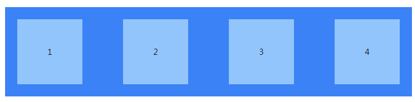
Flex Direction
分成水平、垂直和反方向排列,class 为 flex-row、flex-row-reverse、flex-col、flex-col-reverse,一般预设即为 flex-row,看以下范例:
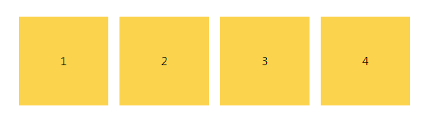
.flex-row
<div class="flex flex-row">
    <div class="w-32 h-32 mx-2 bg-yellow-300">1</div>
    <div class="w-32 h-32 mx-2 bg-yellow-300">2</div>
    <div class="w-32 h-32 mx-2 bg-yellow-300">3</div>
    <div class="w-32 h-32 mx-2 bg-yellow-300">4</div>
</div>
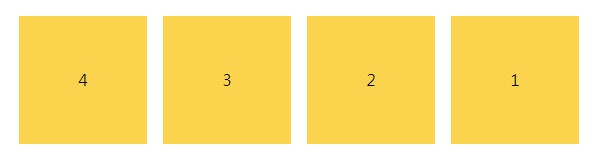
.flex-row-reverse
<div class="flex flex-row-reverse">
    <div class="w-32 h-32 mx-2 bg-yellow-300">1</div>
    <div class="w-32 h-32 mx-2 bg-yellow-300">2</div>
    <div class="w-32 h-32 mx-2 bg-yellow-300">3</div>
    <div class="w-32 h-32 mx-2 bg-yellow-300">4</div>
</div>
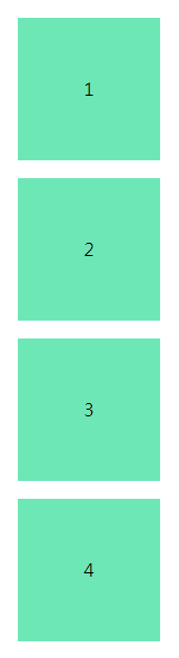
.flex-col
<div class="flex flex-col">
    <div class="w-32 h-32 mx-2 bg-green-300">1</div>
    <div class="w-32 h-32 mx-2 bg-green-300">2</div>
    <div class="w-32 h-32 mx-2 bg-green-300">3</div>
    <div class="w-32 h-32 mx-2 bg-green-300">4</div>
</div>
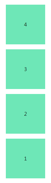
.flex-col-reverse
<div class="flex flex-col-reverse">
    <div class="w-32 h-32 mx-2 bg-green-300">1</div>
    <div class="w-32 h-32 mx-2 bg-green-300">2</div>
    <div class="w-32 h-32 mx-2 bg-green-300">3</div>
    <div class="w-32 h-32 mx-2 bg-green-300">4</div>
</div>
Flex Wrap
Wrap 使用时机为子元素超出父层宽度要自动换行时,class 分为 flex-wrap、flex-wrap-reverse、flex-no-wrap,一般预设即为 flex-no-wrap,看以下范例:
.flex-wrap
<div class="flex flex-wrap">
    <div class="w-32 h-32 mx-2 bg-purple-300">1</div>
    <div class="w-32 h-32 mx-2 bg-purple-300">2</div>
    <div class="w-32 h-32 mx-2 bg-purple-300">3</div>
    <div class="w-32 h-32 mx-2 bg-purple-300">4</div>
</div>
.flex-wrap-reverse
<div class="flex flex-wrap-reverse">
    <div class="w-32 h-32 mx-2 bg-purple-300">1</div>
    <div class="w-32 h-32 mx-2 bg-purple-300">2</div>
    <div class="w-32 h-32 mx-2 bg-purple-300">3</div>
    <div class="w-32 h-32 mx-2 bg-purple-300">4</div>
</div>
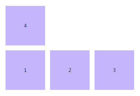
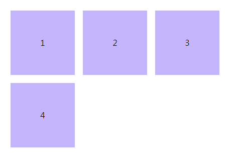
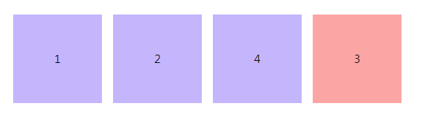
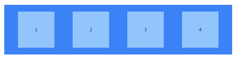
Order
常用 Order 的时机为桌机板图文需要左右互换,手机板则正常图纹上下排列。威尔猪刚学 Order 时,时常错乱,知道它可以自订排序,但怎麽排都跟威尔猪心中想的不一样,到底是要 order-1 还是 order-12?不过 Tailwind 只需要记住把想要放在最後的使用 order-last 就好了。看以下范例:
<div class="flex">
    <div class="w-32 h-32 mx-2 bg-purple-300">1</div>
    <div class="w-32 h-32 mx-2 bg-purple-300">2</div>
    <div class="w-32 h-32 mx-2 bg-red-300 order-last">3</div>
    <div class="w-32 h-32 mx-2 bg-purple-300">4</div>
</div>
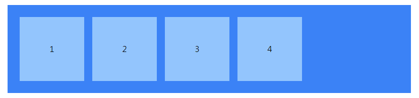
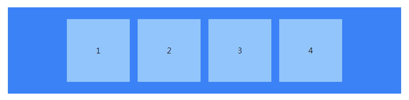
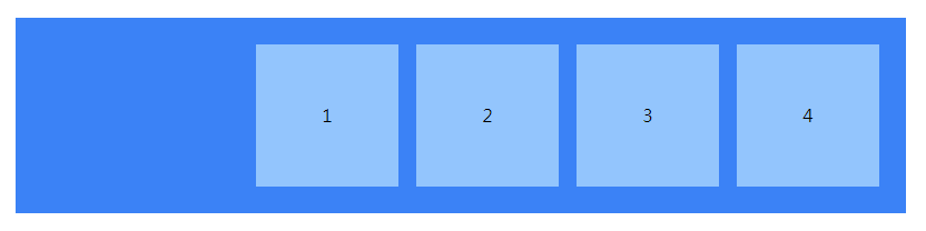
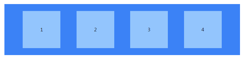
Justify Content
看倌们应该都知道 Flex 就是让元素水平排列,Justify Content 可以当成是前、中、後水平排列的位置,看以下范例:
.justify-start
预设即为 justify-content: flex-start;
<div class="flex justify-start bg-blue-500">
    <div class="w-32 h-32 mx-2 bg-blue-300">1</div>
    <div class="w-32 h-32 mx-2 bg-blue-300">2</div>
    <div class="w-32 h-32 mx-2 bg-blue-300 order-last">3</div>
    <div class="w-32 h-32 mx-2 bg-blue-300">4</div>
</div>
.justify-center
<div class="flex justify-center bg-blue-500">
    <div class="w-32 h-32 mx-2 bg-blue-300">1</div>
    <div class="w-32 h-32 mx-2 bg-blue-300">2</div>
    <div class="w-32 h-32 mx-2 bg-blue-300 order-last">3</div>
    <div class="w-32 h-32 mx-2 bg-blue-300">4</div>
</div>
.justify-end
<div class="flex justify-end bg-blue-500">
    <div class="w-32 h-32 mx-2 bg-blue-300">1</div>
    <div class="w-32 h-32 mx-2 bg-blue-300">2</div>
    <div class="w-32 h-32 mx-2 bg-blue-300 order-last">3</div>
    <div class="w-32 h-32 mx-2 bg-blue-300">4</div>
</div>
.justify-between
将元素左右两侧贴齐父层,并使每个元素间距离相等。
<div class="flex justify-between bg-blue-500">
    <div class="w-32 h-32 mx-2 bg-blue-300">1</div>
    <div class="w-32 h-32 mx-2 bg-blue-300">2</div>
    <div class="w-32 h-32 mx-2 bg-blue-300 order-last">3</div>
    <div class="w-32 h-32 mx-2 bg-blue-300">4</div>
</div>
.justify-around
将元素左右两侧保持与父层同等的距离,并使每个元素间距离相等。
<div class="flex justify-around bg-blue-500">
    <div class="w-32 h-32 mx-2 bg-blue-300">1</div>
    <div class="w-32 h-32 mx-2 bg-blue-300">2</div>
    <div class="w-32 h-32 mx-2 bg-blue-300 order-last">3</div>
    <div class="w-32 h-32 mx-2 bg-blue-300">4</div>
</div>
.justify-enenly
将每个元素间距离和左右两侧与父层距离相等。
<div class="flex justify-enenly bg-blue-500">
    <div class="w-32 h-32 mx-2 bg-blue-300">1</div>
    <div class="w-32 h-32 mx-2 bg-blue-300">2</div>
    <div class="w-32 h-32 mx-2 bg-blue-300 order-last">3</div>
    <div class="w-32 h-32 mx-2 bg-blue-300">4</div>
</div>
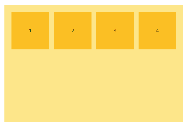
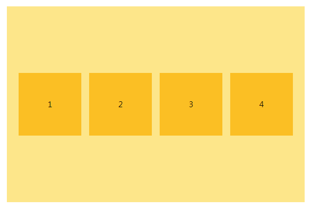
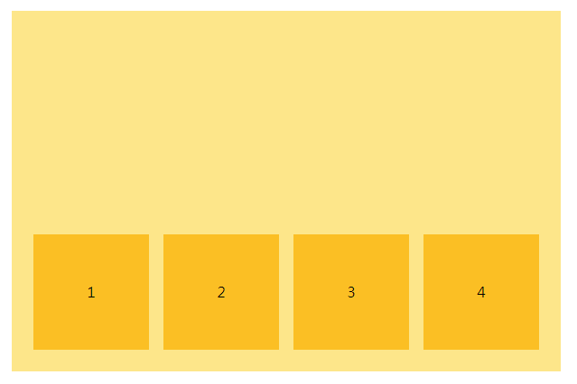
Align Items
刚刚的 Justify Content 为水平排列位置,Align Items 为垂直排列位置,也是分成上、中、下来排列。看以下范例:
.items-start
预设即为 align-items: flex-start;
<div class="flex items-start bg-yellow-200">
    <div class="w-32 h-32 mx-2 bg-yellow-400">1</div>
    <div class="w-32 h-32 mx-2 bg-yellow-400">2</div>
    <div class="w-32 h-32 mx-2 bg-yellow-400 order-last">3</div>
    <div class="w-32 h-32 mx-2 bg-yellow-400">4</div>
</div>
.items-center
<div class="flex items-center bg-yellow-200">
    <div class="w-32 h-32 mx-2 bg-yellow-400">1</div>
    <div class="w-32 h-32 mx-2 bg-yellow-400">2</div>
    <div class="w-32 h-32 mx-2 bg-yellow-400 order-last">3</div>
    <div class="w-32 h-32 mx-2 bg-yellow-400">4</div>
</div>
.items-end
<div class="flex items-end bg-yellow-200">
    <div class="w-32 h-32 mx-2 bg-yellow-400">1</div>
    <div class="w-32 h-32 mx-2 bg-yellow-400">2</div>
    <div class="w-32 h-32 mx-2 bg-yellow-400 order-last">3</div>
    <div class="w-32 h-32 mx-2 bg-yellow-400">4</div>
</div>
聪明的你现在知道垂直置中该怎麽写了吧。基本上只要了解这些,应该绝大部分的版型都可以完成了,还有一些威尔猪没有提到,除非一些很特殊的部分,到时再来看看 Flex 还有什麽其他的用法吧。以上就是今天的内容,那咱们明天见。
[Java Day07] 2.2. 初始化区块
教材网址 https://coding104.blogspot.com/2021/06/java-a...
铁人赛 Day30 -- 铁人赛最後一天啦
经历了30天的铁人赛後,再次将我之前所学的再次地复习了一遍, 也藉此更了解到我之前到底都学了什麽,可...
Day18【Web】网路攻击:SQL injection
SQL 是常见的资料库语法, 许多网站都使用 SQL 语言来取得资料。 而所谓的 SQL Injec...
【Side Project】 菜单内容(建立资料库)
上一篇我们把菜单的画面都做好了,但是如果每次要修改菜单、或是添加内容, 都需要工程师从几千行的程序码...
Day 28 Quantum Protocols and Quantum Algorithms
Quantum Key Distribution Qiskit Alice generates se...