Day 17 - UML x Interface — FormControl
上一章是在讲跟 Input 相关的表单元件会使用 TextField 来给定表单会用到的 required, disabled, helperText 以及 label 等,那像是 Radio、Checkbox 和 Switch 这种非 input 样式的表单元件会如何处理呢?
就是透过今天要讲的 FormControl Interface 啦!
因为这些元件彼此没有样式的共通性,因此 API 和包装的逻辑当然也就无法像 TextField 对 input-like 的元件们有那麽高的整合性,所以这边会拆比较多的元件组装。
接着就先不罗唆直接在下面看看 FormControl 是怎麽使用的吧!
UML
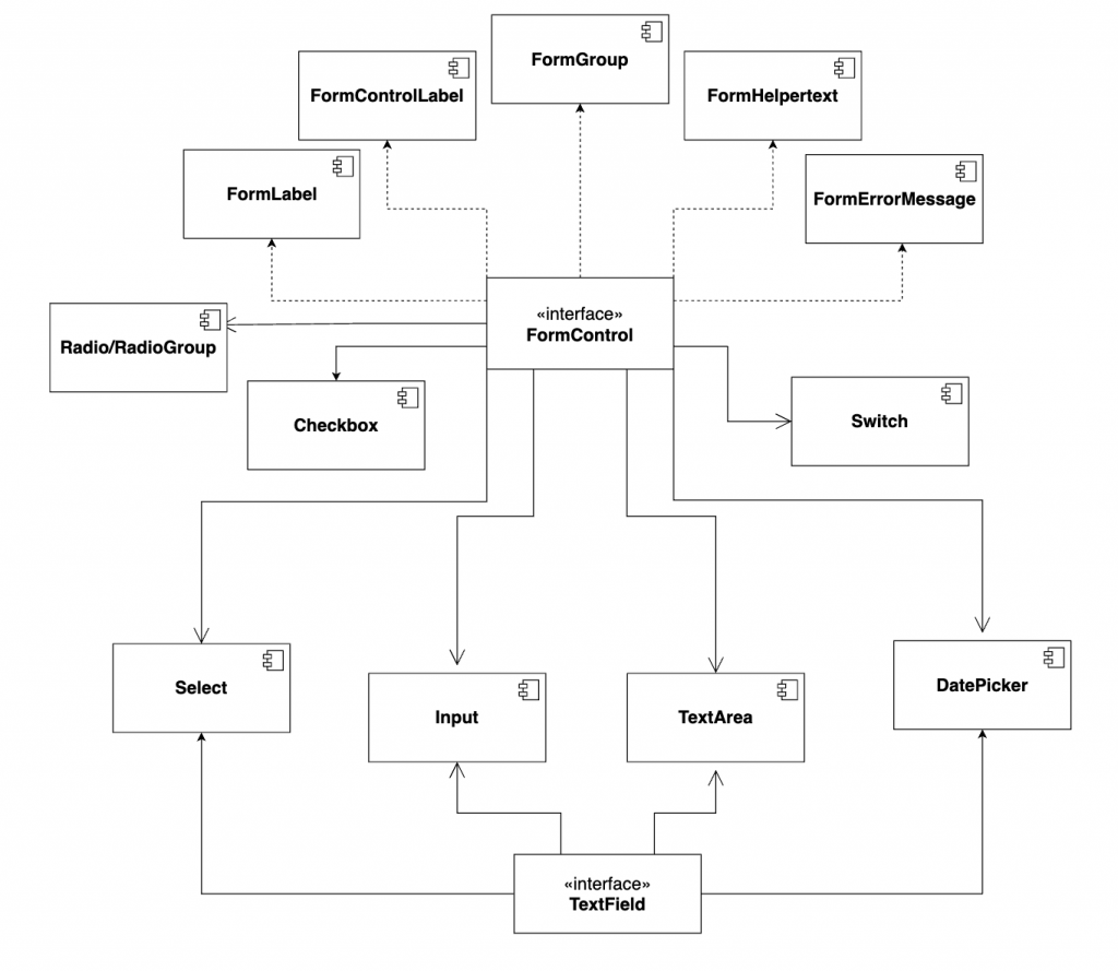
FormControl
Material-UI 在 FormControl、FormLabel、FormControlLabel、FormGroup、FormHelperText 的使用如下:
<FormControl component="fieldset">
  <FormLabel component="legend"> 整个 Group 的 label </FormLabel>
  <FormGroup>
    <FormControlLabel
      control={<Componenet1 />}
      label="Component1 的 Label"
    />
    <FormControlLabel
      control={<Componenet2 />}
      label="Component2 的 Label"
    />
  </FormGroup>
  <FormHelperText>底下的附注讯息</FormHelperText>
</FormControl>
简单来说就是在 FormControl 底下运用 Label、Group 和 HelperText 等等组出表单的样式。
接着来用 Switch 来看看 FormControl 的实际应用会清楚很多。
Switch
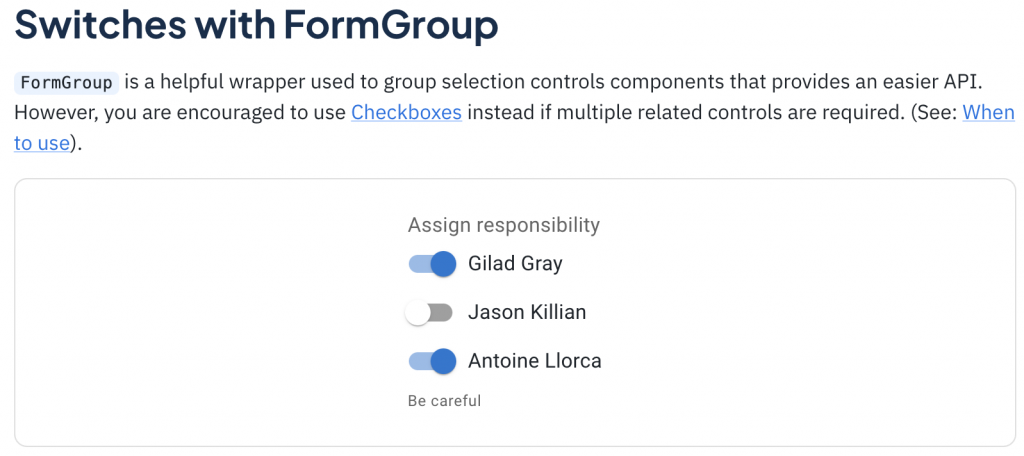
<FormControl component="fieldset">
  <FormLabel component="legend">Assign responsibility</FormLabel>
  <FormGroup>
    <FormControlLabel
      control={<Switch checked={state.gilad} onChange={handleChange} name="gilad" />}
      label="Gilad Gray"
    />
    <FormControlLabel
      control={<Switch checked={state.jason} onChange={handleChange} name="jason" />}
      label="Jason Killian"
    />
    <FormControlLabel
      control={<Switch checked={state.antoine} onChange={handleChange} name="antoine" />}
      label="Antoine Llorca"
    />
  </FormGroup>
  <FormHelperText>Be careful</FormHelperText>
</FormControl>
在使用上,我们可以注意到这段 Code 其实就只是在 FormControlLabel 的 control 放入 ,而表单相关的元素就可以透过 FormControl 这个介面来统一管理,是不是很方便呢?
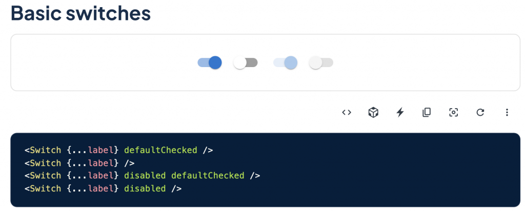
这边也补充一下单用 Switch 的话会长怎样
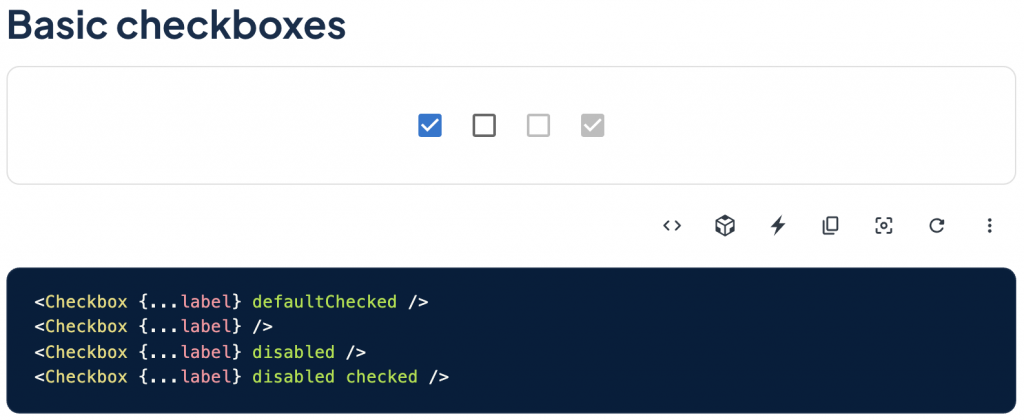
Checkbox
Checkbox 这边跟 Switch 几乎一模一样,所以就只是贴上来让大家感受一下。
<FormControl component="fieldset" className={classes.formControl}>
<FormLabel component="legend">Assign responsibility</FormLabel>
<FormGroup>
<FormControlLabel
control={<Checkbox checked={gilad} onChange={handleChange} name="gilad" />}
label="Gilad Gray"
/>
<FormControlLabel
control={<Checkbox checked={jason} onChange={handleChange} name="jason" />}
label="Jason Killian"
/>
<FormControlLabel
control={<Checkbox checked={antoine} onChange={handleChange} name="antoine" />}
label="Antoine Llorca"
/>
</FormGroup>
<FormHelperText>Be careful</FormHelperText>
</FormControl>
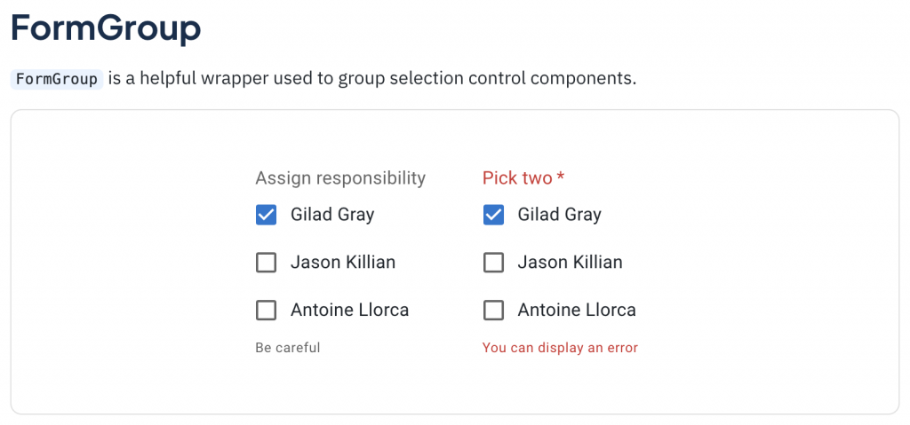
<FormControl required error={error} component="fieldset" className={classes.formControl}>
<FormLabel component="legend">Pick two</FormLabel>
<FormGroup>
<FormControlLabel
control={<Checkbox checked={gilad} onChange={handleChange} name="gilad" />}
label="Gilad Gray"
/>
<FormControlLabel
control={<Checkbox checked={jason} onChange={handleChange} name="jason" />}
label="Jason Killian"
/>
<FormControlLabel
control={<Checkbox checked={antoine} onChange={handleChange} name="antoine" />}
label="Antoine Llorca"
/>
</FormGroup>
<FormHelperText>You can display an error</FormHelperText>
</FormControl>
一样也补个基本的!
Radio/RadioGroup
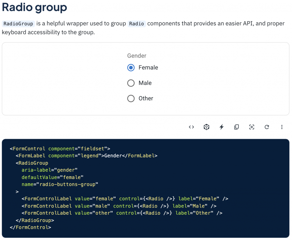
Radio 这边就比较特别一点了,因为它是单选的选项,不像 Checkbox 是多选,因此实作上会使用 RadioGroup 把 Radio 包起来处理单选的逻辑,而底下的 Radio 一样是可以被包在 FormControlLabel 里面的。
咦,刚刚的 UML 好像有些问题?
讲到这边不知道有没有眼尖的读者看到了其实 TextField 底下的元件 其实也有跟 FormControl 连在一起呢?如果照上面所说的 Input-like 是用 TextField,而 FormControl 用在其他的表单元件,那为什麽 FormControl 又会跟 TextField 连在一起呢?
虽然 FormControl 主要是在给非 Input 的表单元件用,但其实给 TextField 用也并无不可,只是不同种来实现表单相关功能的方式而已。
举例来说,Input 当然可以用 TextField 本身的属性来给 Label,但也可以在 FormControl 的底下去包 Label!
那接着再来用 Input 的 Icon 情境 来看一下会怎麽做:
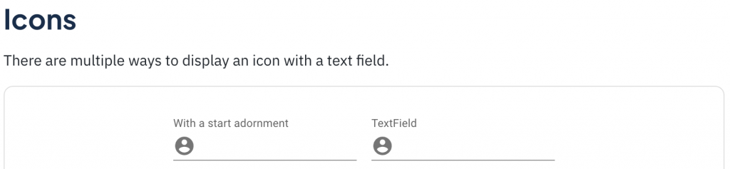
<FormControl>
  <InputLabel htmlFor="input-with-icon-adornment">With a start adornment</InputLabel>
  <Input
    id="input-with-icon-adornment"
    startAdornment={
      <InputAdornment position="start">
        <AccountCircle />
      </InputAdornment>
    }
  />
</FormControl>

<TextField
  id="input-with-icon-textfield"
  label="TextField"
  InputProps={{
    startAdornment: (
      <InputAdornment position="start">
        <AccountCircle />
      </InputAdornment>
    ),
  }}
/>
从上面的范例可以看到我们想要帮一个 Input 加上前面的 User Icon 的话就使用 FormControl 或 TextField 都可以达成同样效果哦,那如果有我还没注意到的差别的话再麻烦大家留言告诉我!
补充一下:StartAdornment 是 Material 定义前缀的方式,Start(前)+ Adornment(装饰),在这边用来当 User Icon 的 API 接口,而我自己比较习惯的命名则是 prefix,命名也是一大哲学呀!
小结
在这边先说一下这些表单相关的元件只是很常在表单中运用到我才把他们整合进来介绍,但他们各自都可以脱离 FormControl 单独做使用的哦!
而 TextField 和 FormControl 是 Material 应对表单元件的方式,除了这种方式还有 AntDesign 统一用 Form 管理的方式,而本系列一直在强调的是「观念」,关於表单元件我们所需要知道的事就是他们都会共享一些给表单用的功能,而之後的实作方式则只是因应不同的设计理念和使用情境在实作,元件的 API 使用上也是看个人喜欢。
因此,重点不是要把各个系统的实作方式都学起来,而是大局地去掌握了一下观念之後,其他的都能以一反三,并且在实作上可能会有更适合你当前情境的方式,不用因为他们是 Google 或 Facebook 出的就觉得一定好、一定得这样用罗!
那在实作上还有一个最重要的关键就是「厘清需求」,要先理解自己要做的是什麽,才能决定适合的 Pattern。
<<: TailwindCSS - 初探 Just in Time 模式 v2.2
>>: [Day 18] 来看看v-pre、v-cloak、v-once呗
CMoney软件工程师战斗营_心得感想_Week 20
这篇会是在参加cmoney战斗营中的最後一篇 但这不是句点,而会是我展开资讯人的开端。 就在前天, ...
从零开始的8-bit迷宫探险【Level 256】恭喜全部破关!游戏完成 & 结语
为什麽铁人 30 天的最後一篇标题是 Level 256 呢? 主要是致敬小精灵 Pac-Man ...
使用Emmet省下泡一杯咖啡的时间(HTML篇)
使用Emmet省下泡一杯咖啡的时间 (HTML篇) 效率满点的好工具 为什麽而学? 前身是Zen c...
JS 原始型别的包裹物件与原型的关联 DAY67
var b = new String('abcdef'); // 这里 String 为建构函式 c...
[CodeIgniter 3] 记忆体的隐形杀手:Log all queries
前言 CodeIgniter作为轻量化的PHP框架 db物件一直是操作资料库的好帮手 简化了下达sq...